Sometimes the best opportunities are hidden from plain view, or even Plano. For an up and coming restaurateur in Texas, the opportunity to create a better burger brand knocked loudly in the form of a small fracking town called Kenedy. Using an ironic nickname as the brand name, he embarked on crafting Kenedy’s first and only better burger experience with Vigor.
Location
Year Completed
Team Size
Services
Challenges
- Communicate the benefits of a better burger brand with higher pricing than the well-known QSRs
- Create intrigue and awareness for the unknown fast casual burger brand
- Design a brand identity and interior experience that sparks word of mouth
Key Insights
As an oil fracking down, the market was susceptible to economic shifts that easily dry up expendable income. However, the large appetites of the standard oil worker, and the desire for great value would nudge them into spending wisely. Coupled with a place perceived as “cool” but unpretentious, a better burger fast casual brand could flourish.


Flashing fantastic burgers in a street-like setting
The word “flash” evokes a lot of imagery that would create an immediate correlation to the brand, but the commonality is often forgettable. We worked with the founder to establish something unexpected and real. What if the burgers were made with attention to detail and tedious technique and as a result, “flash” would be an ironic name? Rather than an industrial chic hipster feel, what if the brand were influenced by the rawness and blue-collar that would connect with the market?
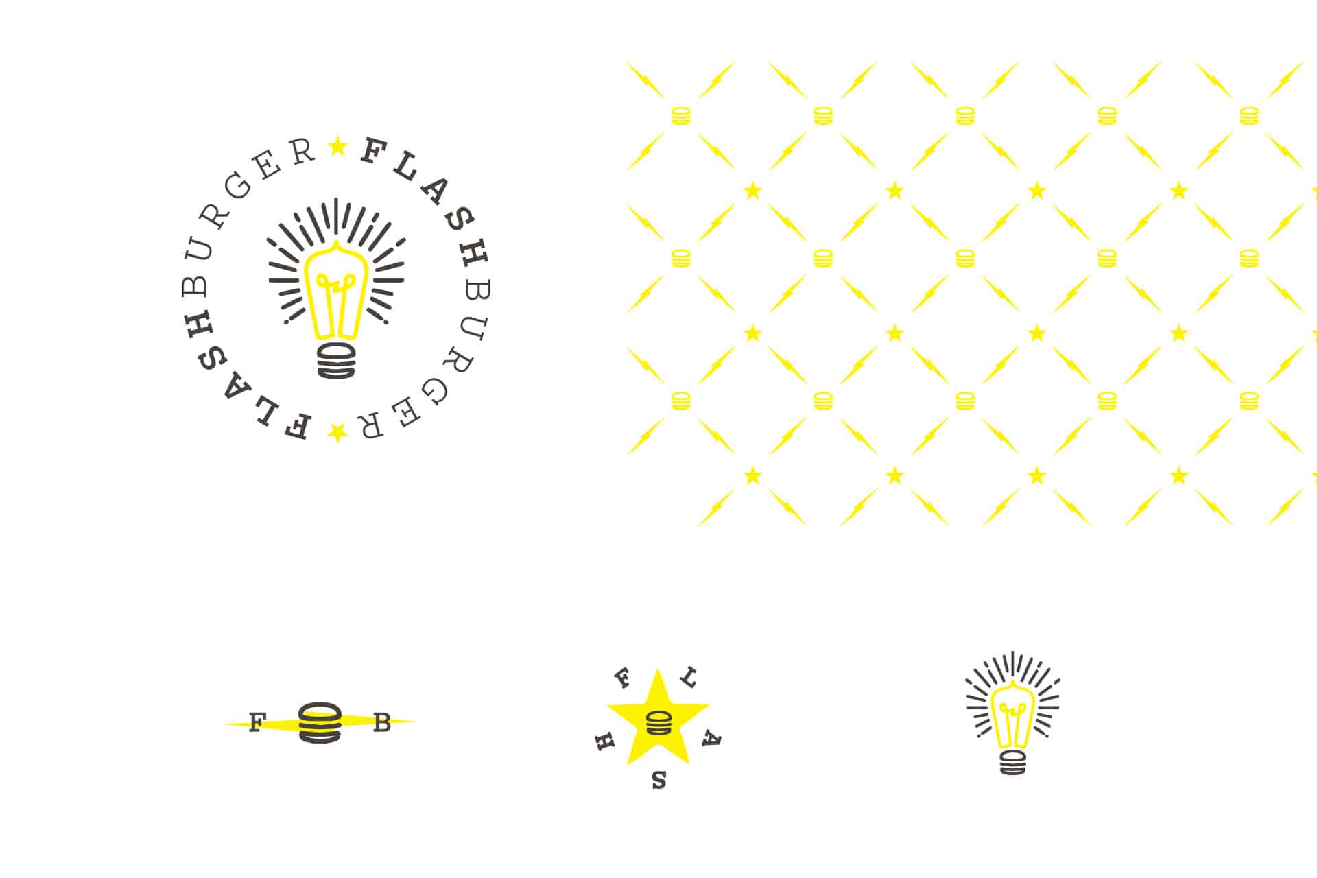
These questions led the team down paths that established new ideas of “flash” and how to represent the word and the brand. Ideas flashed in our minds which resulted in the brand’s mark: a lightbulb with a subtle hamburger mnemonic device.
From there a gritty, raw identity was crafted. Vandalized images of pop culture helped tear down the buttoned-up vibe a lot of better burger brands portray. This style worked with a tone of voice that leveraged more pop culture movie names to represent the burger lineup. Furthering the rebellious attitude, we took inspiration from historic Texas flags to create a set of secondary graphic elements used throughout multiple brand touchpoints.
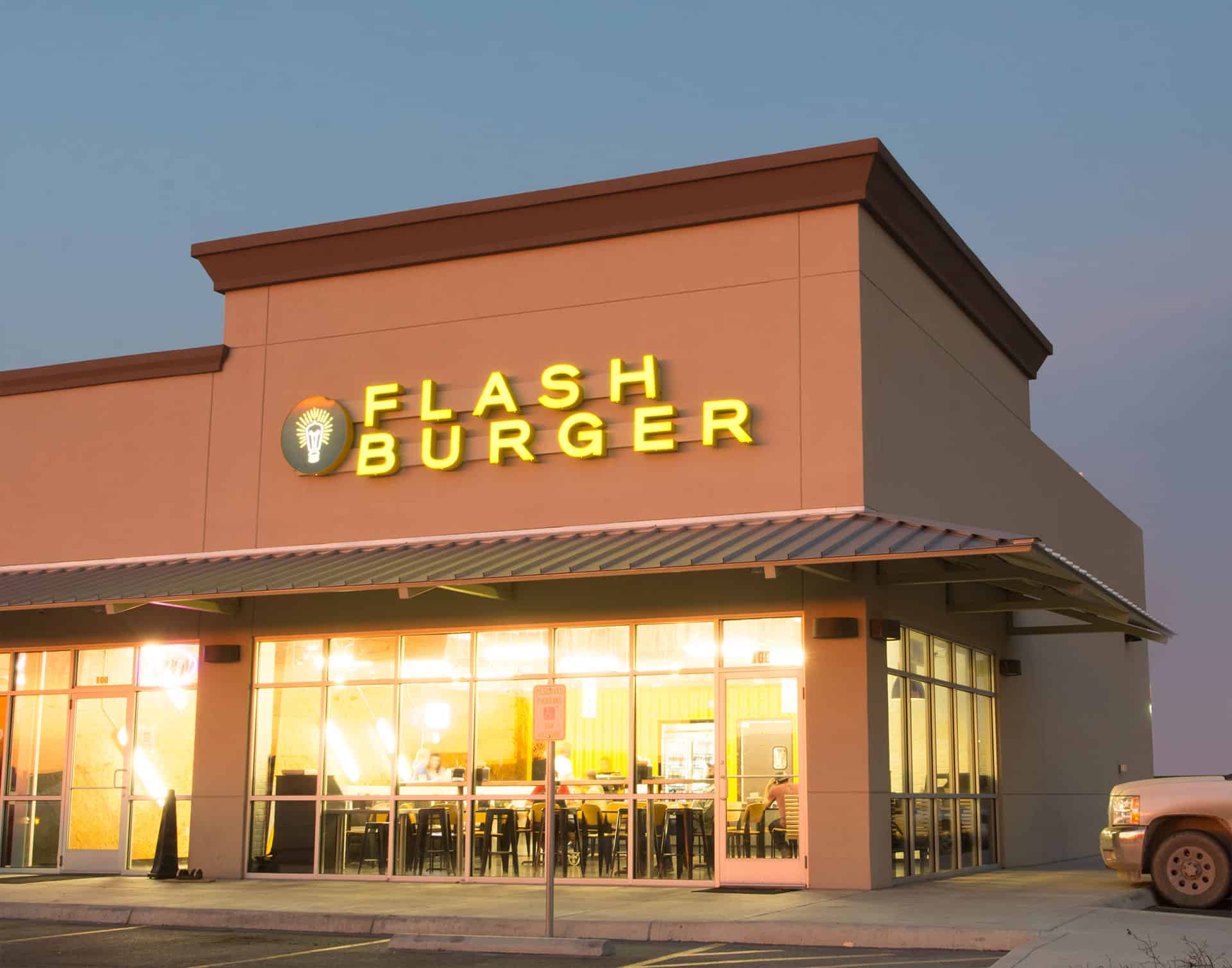
The graphic elements all helped inform the interior space which used common textures in new ways. Bright lighting was presented in off-kilter ways. The point of sale was giving just glory with a bright yellow reclaimed shipping container. Other nuances throughout the space elevated the brand experience to be completely unique, memorable, and worth talking about.
