Positioned close to the Mason-Dixon line, but far away from any true Southern food experience is what prompted this brand’s vision: A Southern-fried, rebel-smoked, bourbon-infused bar and kitchen in the heart of Baltimore’s most lively neighborhood. Vigor conspired to inject a taste of Southern hospitality into Federal Hill.
Location
Year Completed
Team Size
Services
Challenges
- Elevate the restaurant and bar from a country-focused party spot, to a culinary forward, Southern-inspired experience
- Develop a name and identity that would communicate the free spirited, rebelliousness held by the owners
- Establish the brand as a lifestyle and the new hotspot in Federal Hill, Baltimore
Key Insights
Cowboys & Rednecks, the original bar, had developed a name for being the country spot in Federal Hill, moving away from this would take a complete overhaul. The Baltimore market was primed for a true Southern experience and with a smoker already on site it made sense to push in this direction. Going deeper than bourbon and barbecue would be important to get people to buy-in to the authenticity of the brand. For the founders, their never-back-down attitude, and go-against-the-grain spirit was the human truth with which everyone could identify. Using that as the focus, the team jumped into the drive towards going Wayward.
Here's to the crazy ones
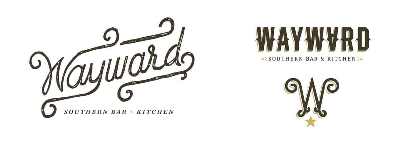
Communicating “waywardness” was quite the challenge. After exhaustive naming exercises we found inspiration in the classic rock anthem by Kansas, “Carry On Wayward Son.” It may seem a bit cheesy, but it worked perfectly. Wayward sparked the spirit in the team necessary to create fresh visuals that would grab the market’s attention.
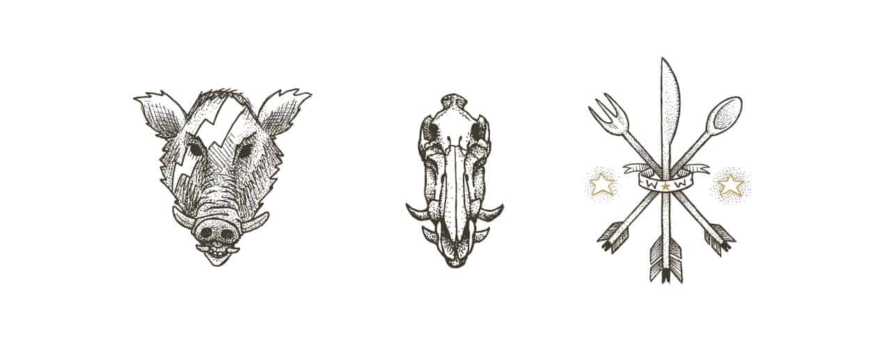
Wild hog skulls served as the center point for the new brand identity. Georgia and other Southern states are teeming with hogs, and hunting them is engrained in the culture. Building that culture required getting more down-to-earth with illustrations that were both technically intricate, but fresh, and intriguing. The barrel boar captured this perfectly and from there a new set of Maryland-inspired southern compositions.
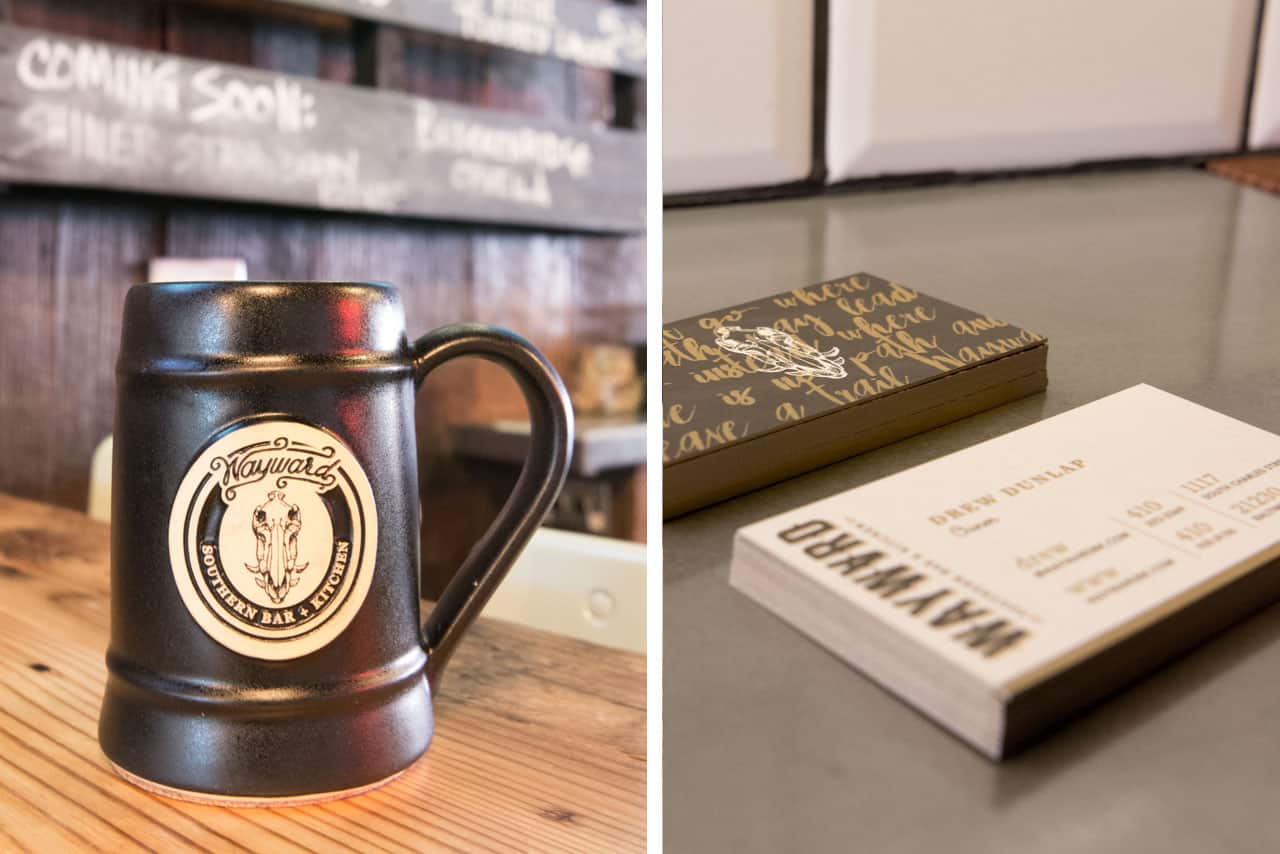
Wayward’s typography was hand rendered to match the illustrations. The curling letterforms were intended to convey the free spirited nature of a wayward soul. The insignia continued this look with the addition of a star that represents the desire we have for something more.
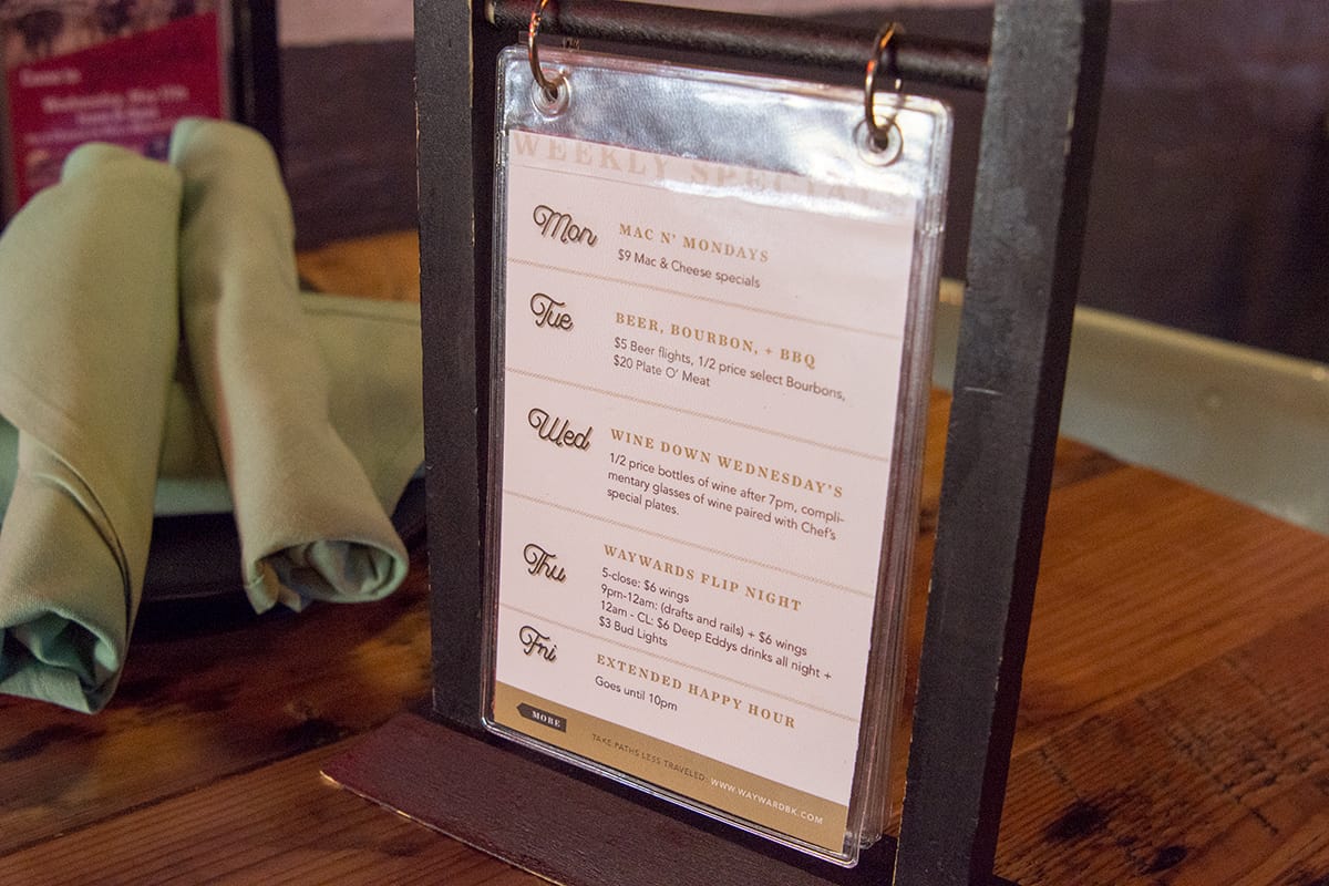
These elements came to life across the interiors, menus, and various other touch points where they mixed with new textures and materials. From black, raw leather to unrefined wood, the rustic feel was left to shine. This was offset with notes of gold as seen in the tusks of the boar’s skulls, rivets in the crossbeams and elsewhere throughout the interior. The same dichotomy in style was brought into the print pieces with metallic gold elements across the materials.
This created a unique look unrivaled in the market and shouted the Wayward anthem completely and concisely.