
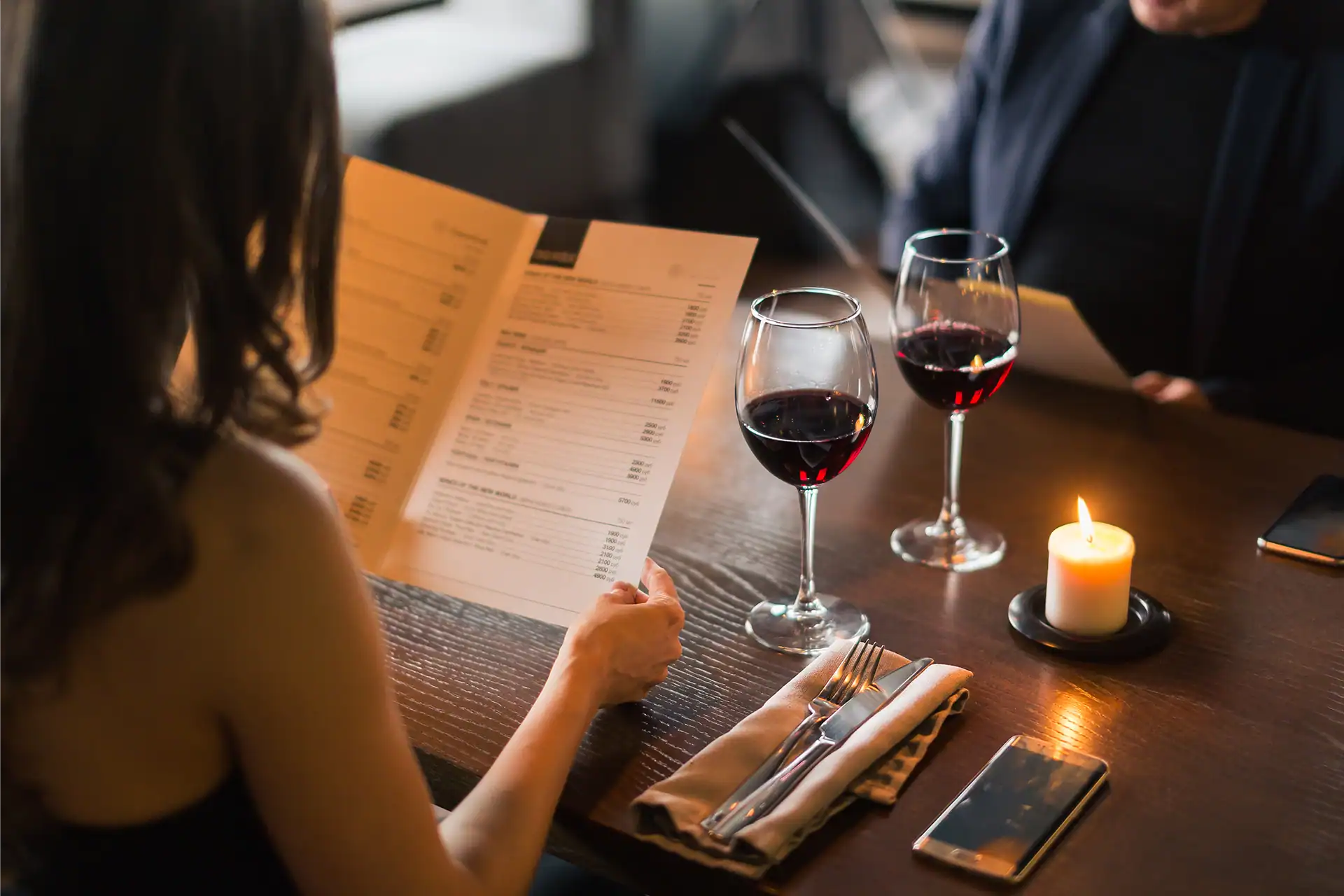
Before a guest reads a single word on your menu, they’re already forming opinions—about your food, your price point, even your hospitality. That first impression often starts with something most diners never consciously notice: typography.
The fonts on your menu quietly communicate your restaurant’s personality. A sleek sans-serif font suggests modern, efficient, and approachable. A refined serif typeface can feel elevated, traditional, or indulgent. A hand-drawn script brings warmth and intimacy. Every curve, line, and weight of a letter shapes how guests perceive what’s behind it.
Typography also affects readability, which directly influences sales. Studies show that when text is hard to read—too small, too ornate, or lacking contrast—diners order fewer items and default to familiar choices. Clear hierarchy and easy legibility invite exploration, encouraging guests to linger on descriptions or discover new favorites.
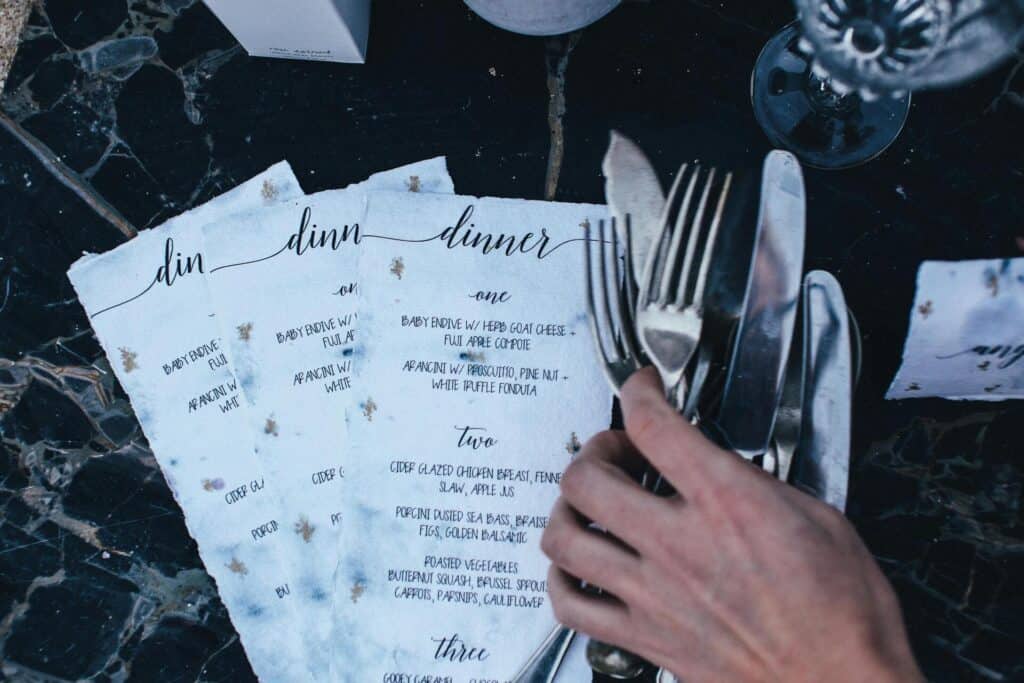
Font size and weight matter too. Bold type draws the eye, guiding diners toward profitable items or chef’s specials. Subtle variations in type size can create rhythm and flow, leading guests naturally through the story of the menu without feeling “sold to.”
And then there’s tone. The same dish—say, Seared Scallops with Lemon Beurre Blanc—feels completely different in a blocky industrial typeface versus an elegant serif. The typography sets expectations for price, experience, and even taste before the first bite.
VIGOR’S VIEW
Typography isn’t decoration—it’s strategy. The right type choices create an unspoken dialogue between your brand and your guest. At Vigor, we see menu design as an extension of the brand identity, not an afterthought.
Our advice: audit your menu typography the same way you’d evaluate your food presentation or service tone. Make sure your fonts aren’t just readable—they’re relatable. Because when typography aligns with brand personality, it does more than look good. It sells.
