Location
Year Completed
Team Size
Services
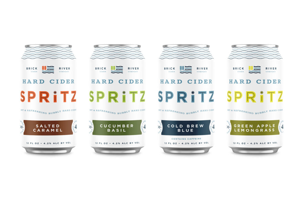
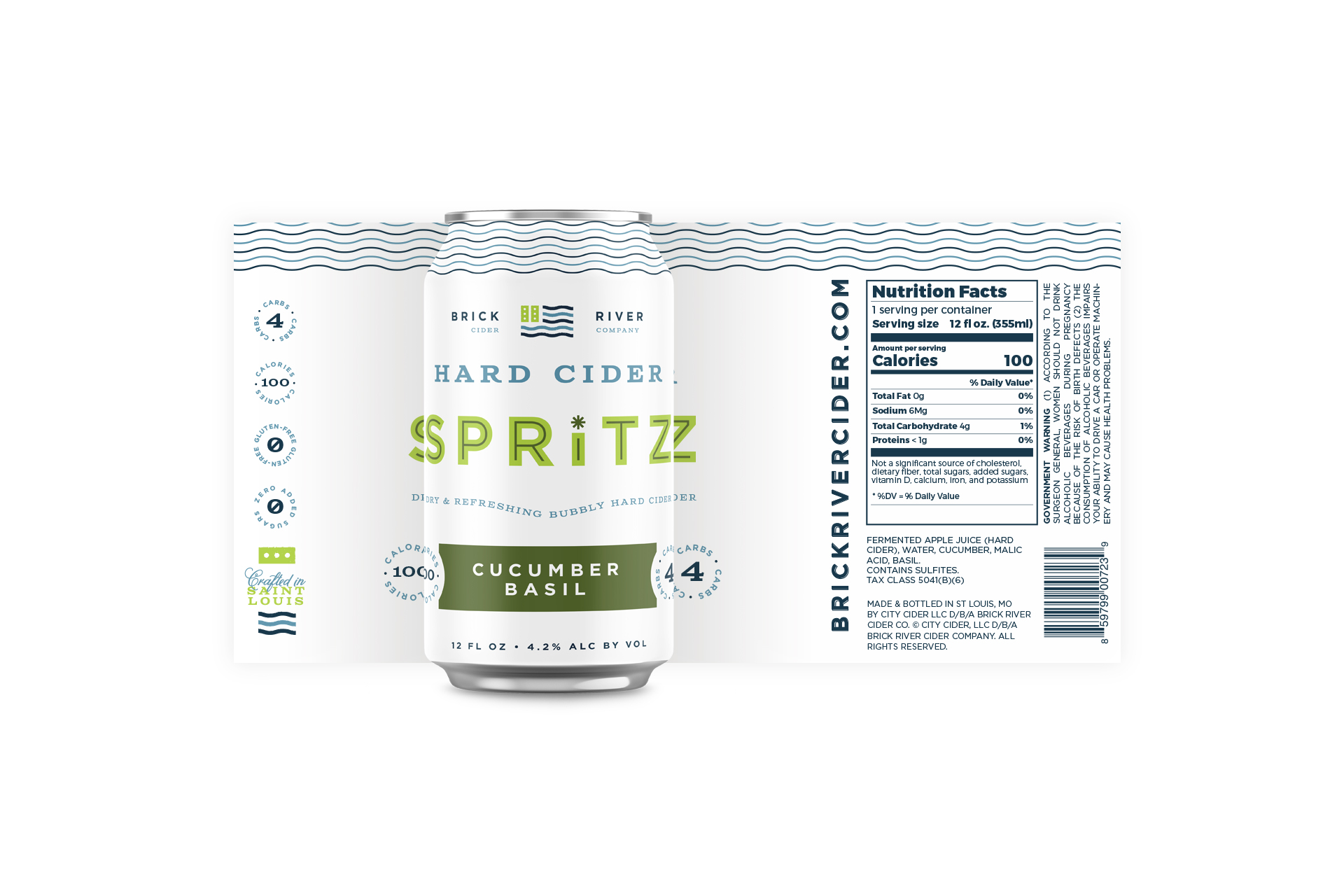
Creating an effervescent sub-brand
The Brick River Cider Co brand had been well established in St. Louis for years with great brand recognition. Creating a new product without confusing the public was the biggest challenge. Secondly we had to answer the question of how do you explain what this lighter hard cider is in a way that people can quickly grasp.
Finally, we knew we had to rapidly communicate the features that were on par with competing products like hard seltzers while positioning the product as something more flavorful and worth trying out.
These three challenges combined created a unique path forward for what would be Brick River Cider Co’s newest product offering: Hard Cider Spritz.
A refreshing, crisp design solution
Vigor’s solution to the challenges was to create a name that would evoke the experience of the product. However, the word “Spritz” wouldn’t be enough to drive it home. We had to quantify it with “hard cider” to ensure people quickly got the idea.
The word “spritz” has a light, airy feeling and it implies a less intense flavor. As a result, it lends itself well to being associated with a low calorie and low sugar product.
We created an identity that pulled elements from Brick River Cider Co’s core visual language, and built upon it with new colors and a hero typographical treatment for the main brand name.
Results
The product launched in June 2021 to a lot of positive chatter on social media. While sales numbers aren’t in just yet, we do know that the client is already considering a second, larger run to accommodate the demand.
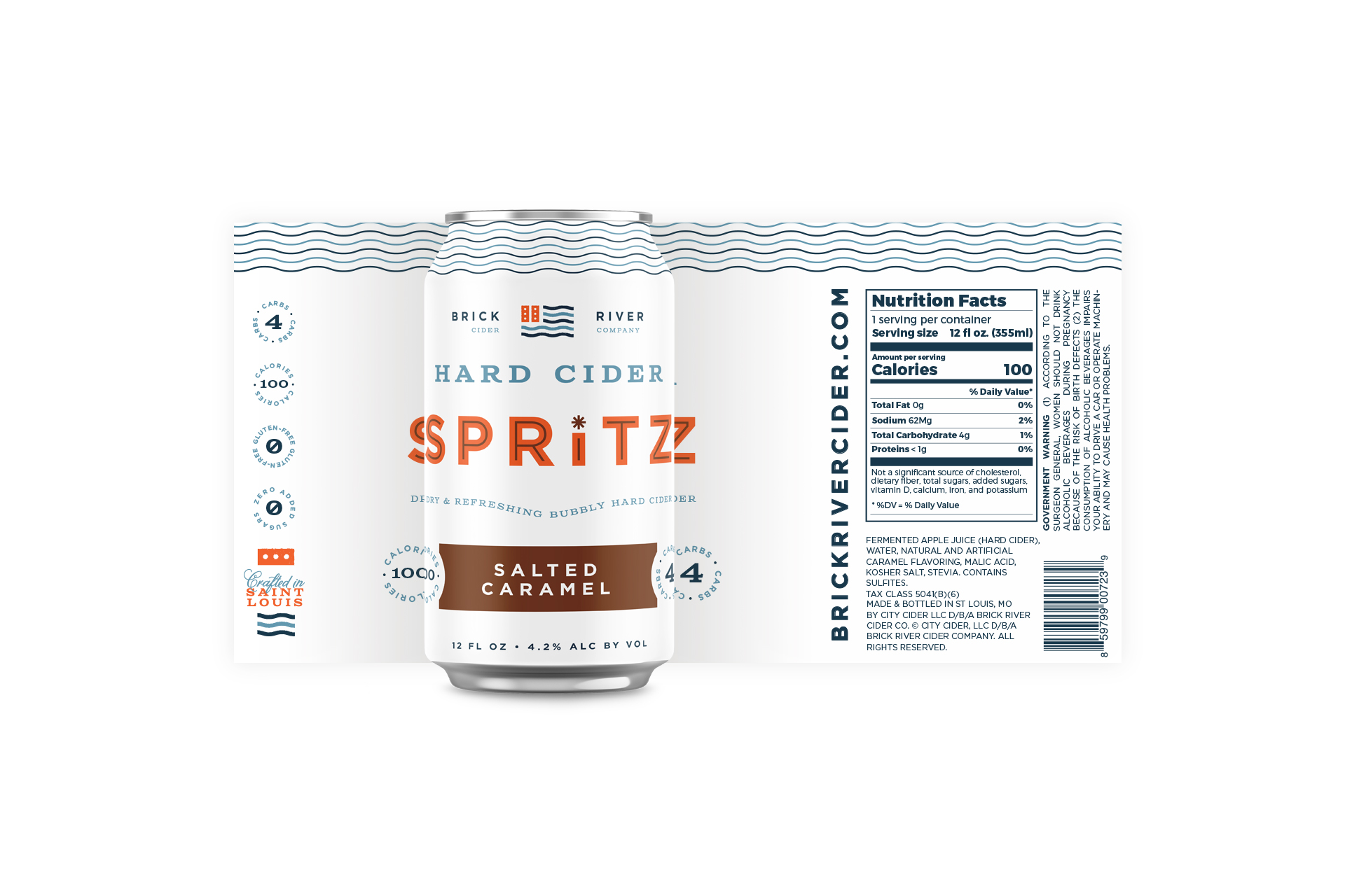
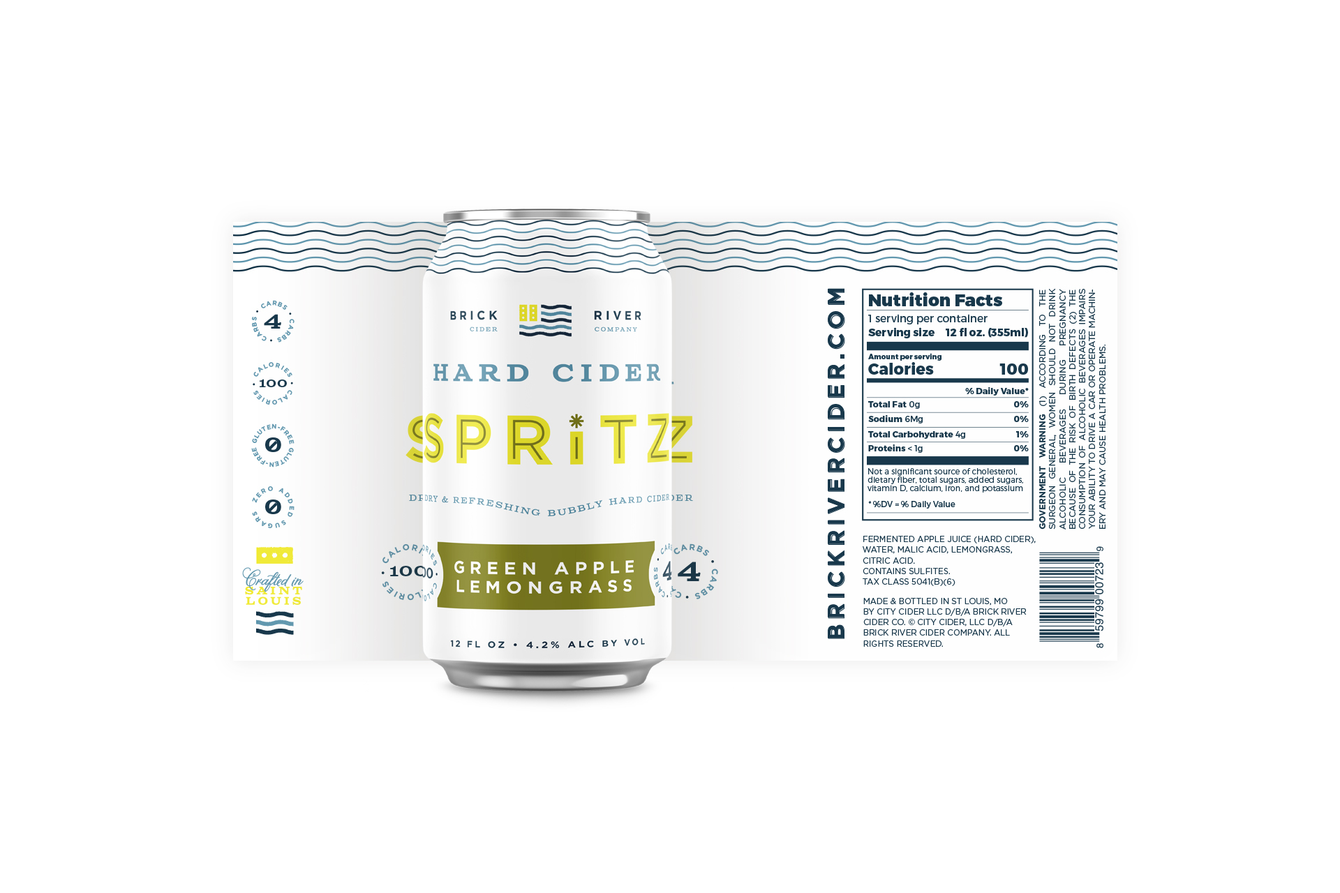
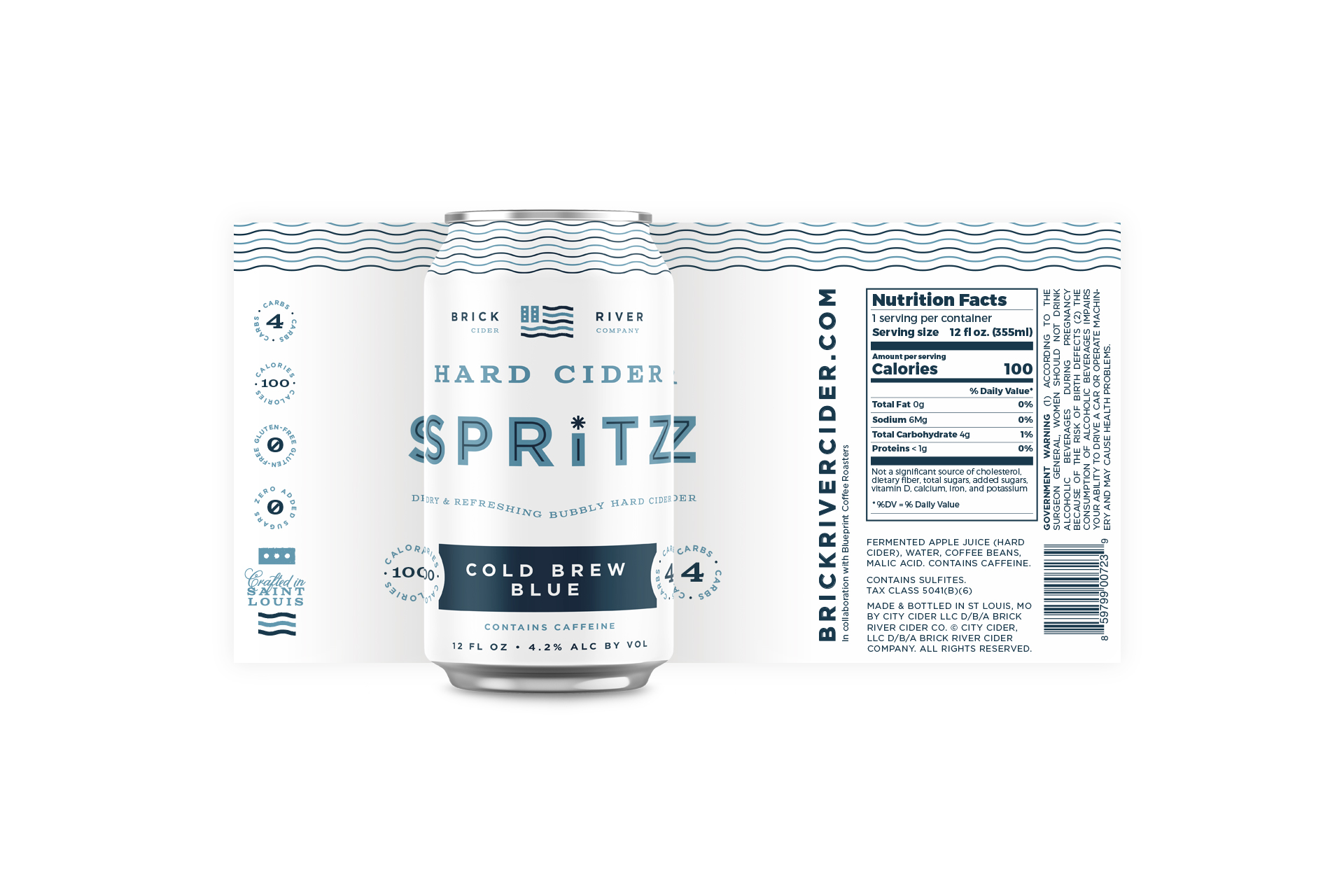
To alleviate the cost of printing multiple shrink sleeves, Vigor worked with Brick River Cider Co to make this packaging more modular. The wavy lines can be printed direct to can in large quantities and the rest of the design can be printed on pressure-sensitive labels to make expanding or shifting the flavors less costly.