
Joseph chimes in on the new holiday packaging for Dunkin. How does it stack up against Starbuck’s classic look? Is it a hit or a miss? Read the full article on Nation’s Restaurant News, here.
Diving deeper into the subject, Dunkin isn’t the only restaurant brand that capitalizes on “the most wonderful time of the year.” Many brands adjust their looks to create memorable moments with their guests through remarkable packaging design. What’s striking about Dunkin’s approach is their use of their own brand colors and identity in a fresh way. Most other brands, Starbucks included, jump right into the green and red look to drive home the Christmas angle. However, this does alienate non-Christmas celebrators. Dunkin, on the other hand, creates a pan-religious look that pushes their own brand’s personality further. It’s smart and effective.
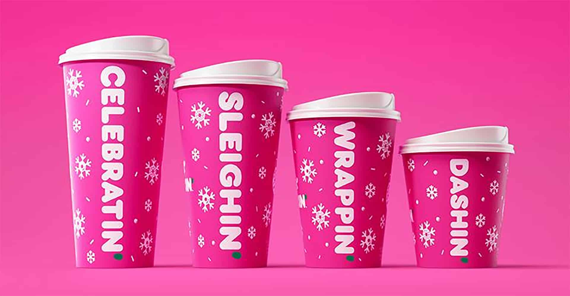
What components accomplish the “win” here?
- Colors. Pink isn’t traditionally associated with the holidays, but in this case, it’s working. It has that candy cane kind of feel. Mixed with the slight apostrophe in green, the effect is complete.
- Illustrations. The snowflakes bring in doughnut shapes and have rounded corners to tie to the brand’s typography.
- Typography. It’s bold, thick and inherently Dunkin. Enough said.
- Words. Simple, but effective. They play up pun-driven one-word statements that are abbreviated in Dunkin’ style.
Collectively, these components create a fantastic holiday packaging suite that doesn’t reek of pandering to the masses. Well done, Dunkin’

