Location
Year Completed
Team Size
Services


Designed with Determination
The beerscape is crowded with tons of options, but none have seemed to truly capture the grit of American culture. Sure, there are the old guard standards, but they’ve been mainstays for so long that they seem like your grandpa’s beer. Gilly’s came to the scene with a dream of pushing the boundaries not of the beer itself, but of the people who like the no-nonsense lifestyle. Folks who are too busy pursuing their hustle or leisure to waste time making a decision between 100s of options.
With that group of people in mind, we began developing the Gilly’s brand identity from visual through verbal.
From dream to reality
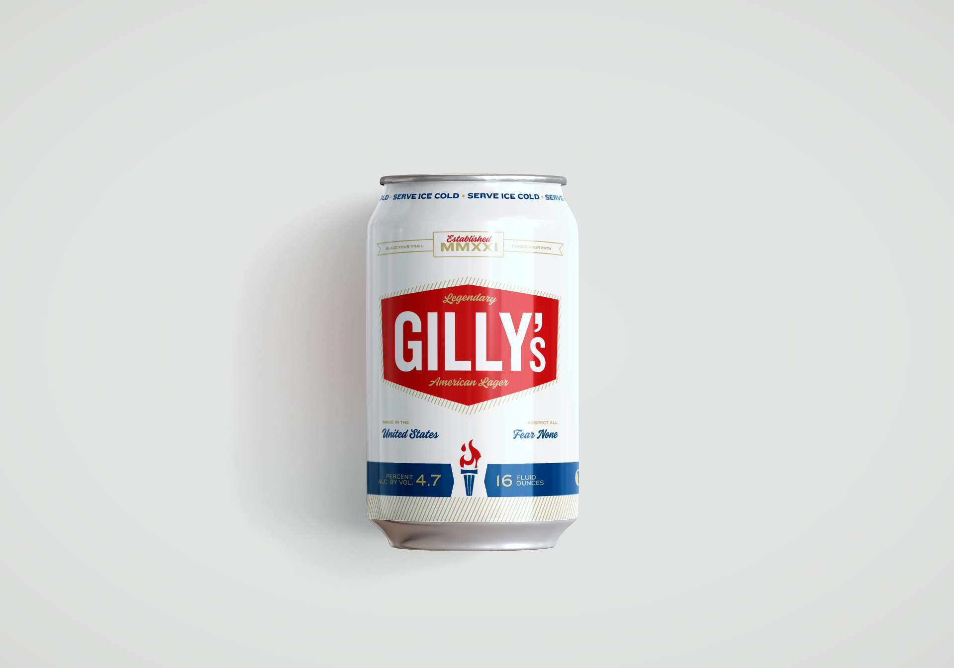
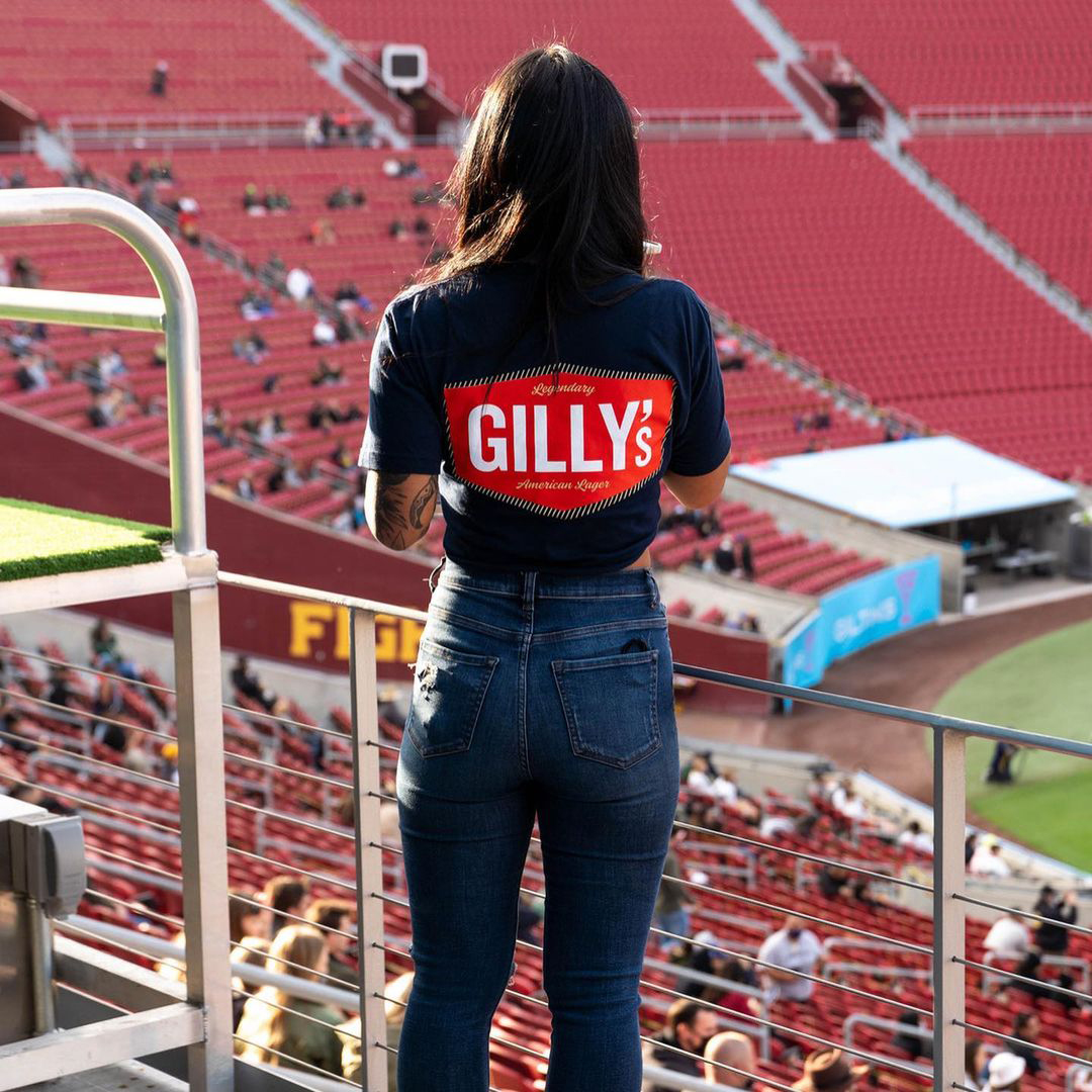
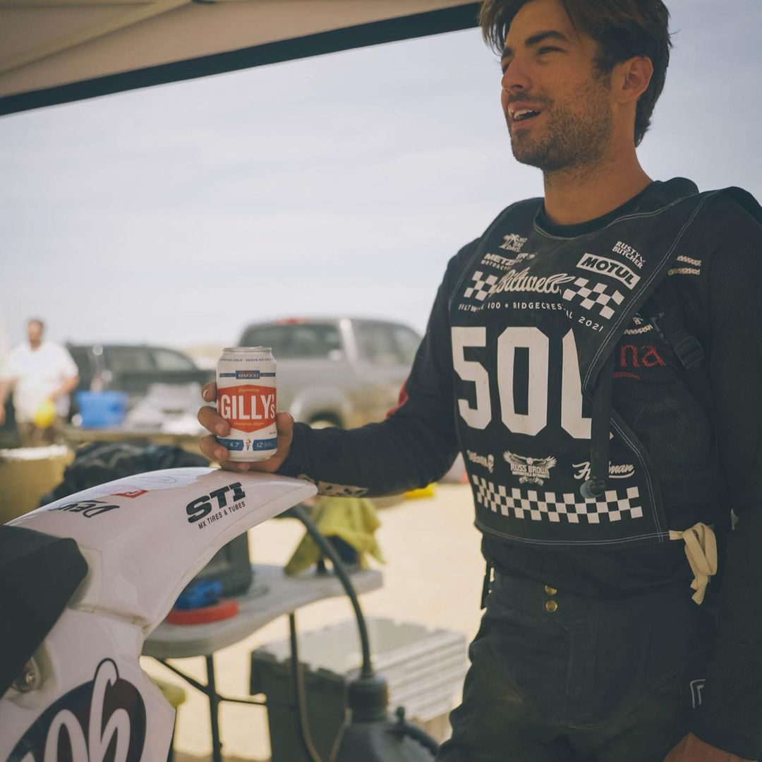
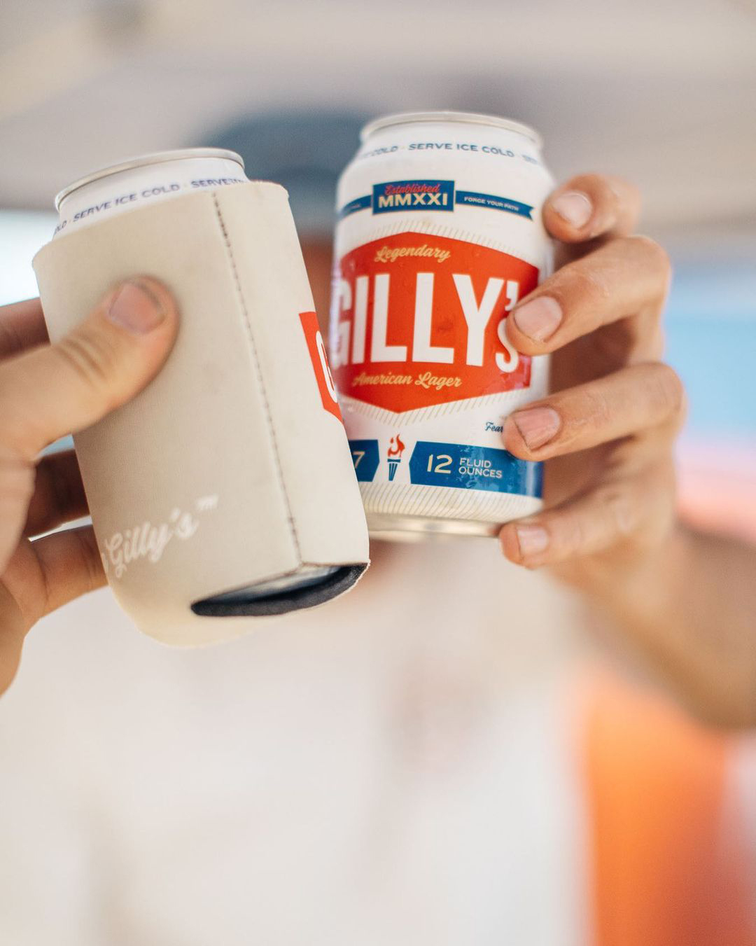
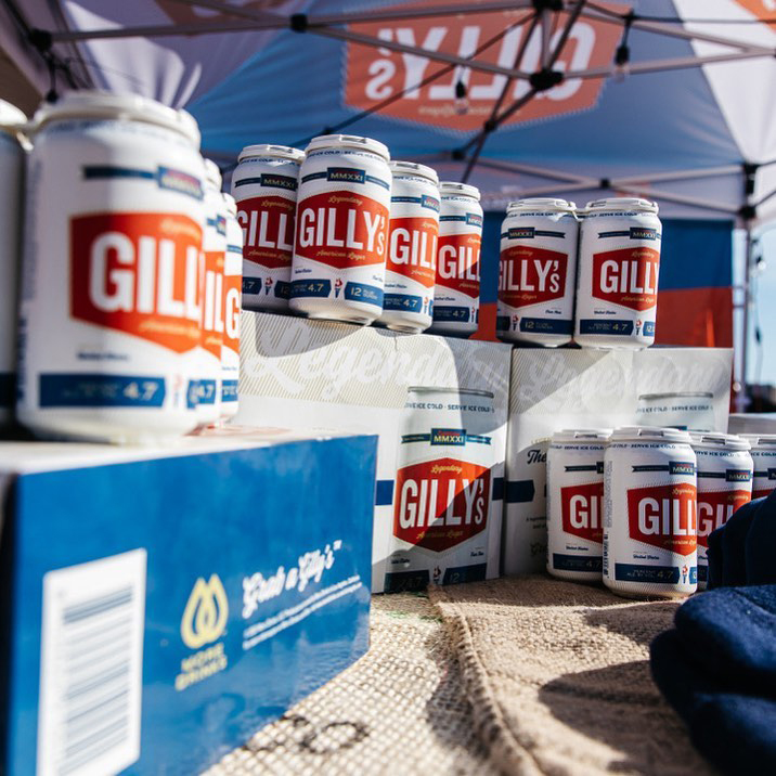
Through Vigor’s collaborative approach, we developed an iconic, Americana-driven design aesthetic to communicate the brand’s roots. The big red shield element was created to draw the attention of a passerby with energy and steadfast strength. Combined with sturdy typography mixed with flourishing golds, the Gilly’s visual identity formed up quickly.
Voice is everything and for Gilly’s that voice is one of heroic, unapologetic go-getterness. The brand’s verbal identity came to life on the primary packaging and proliferated throughout every touchpoints. One-liners like Grab a Gilly’s™ became battlecries for the adventurous spirit found in every American.
Scoring big with a new beer brand
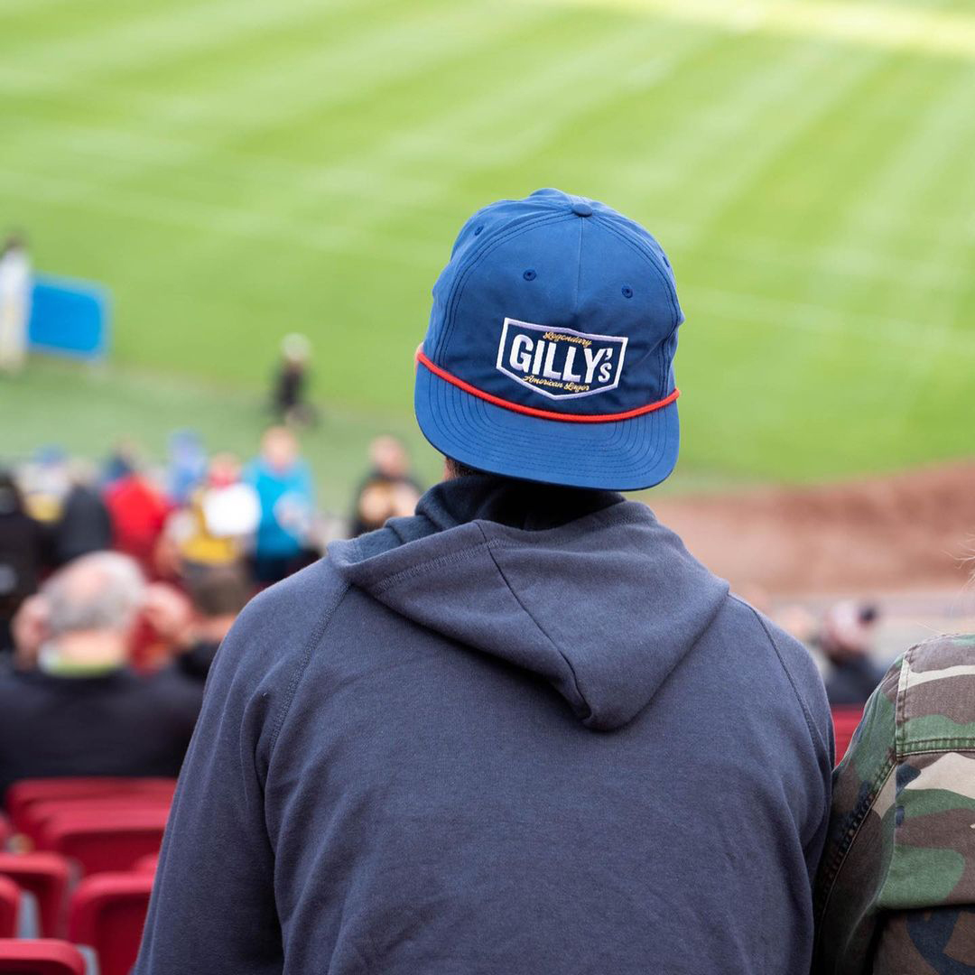
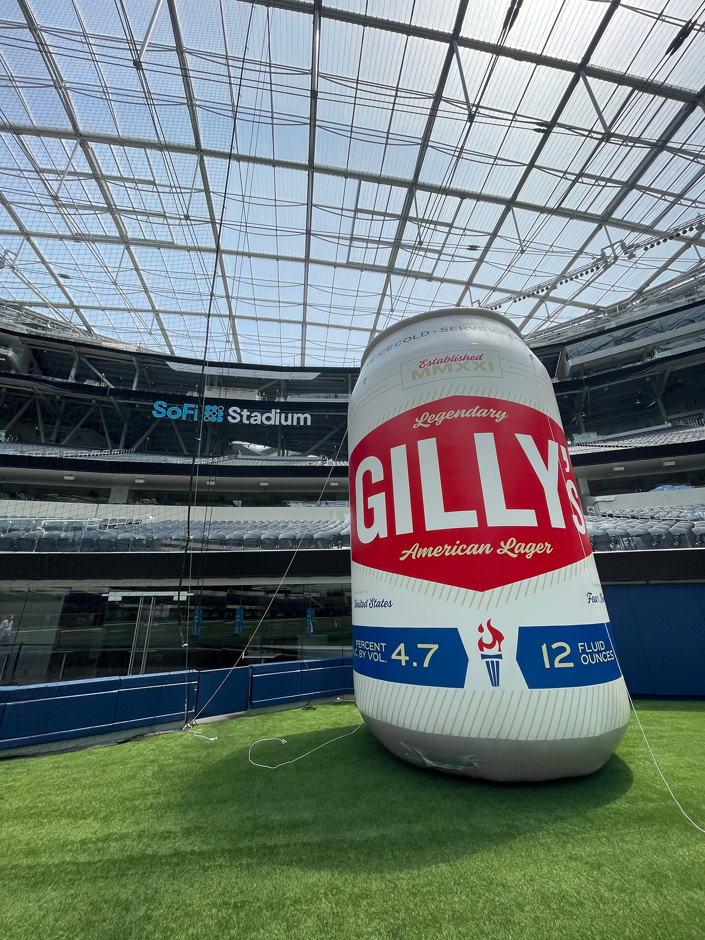
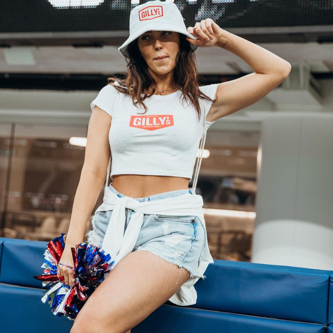
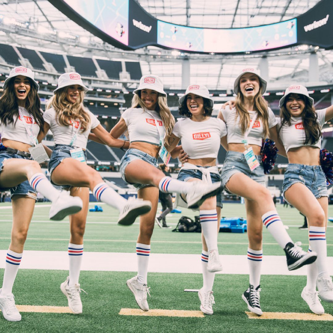
More Drinks’ founders were well connected in the Major League Rugby world and that platform served as the perfect pitch to kickoff the new brand. The Gilly’s team decked out their crew in custom-designed merchandise and swag to showoff the brand and its lifestyle. And when the Los Angeles Giltinis took the field, the fans were presented with the Gilly’s brand in full effect including a giant inflated Gilly’s can. Good luck grabbing that one!
