
Location
Year Completed
Team Size
Services
Identifying the Patron: Ava Wellington
Sankranti was slated to open its first quick serve restaurant format (QSR) in the Dunwoody area of Atlanta’s metro footprint. Shortly after, they planned for expansion into a number of other Atlanta neighborhoods. But a critical question remained unanswered, who would be our early adopters and why should they love the new Sankranti brand?
Using a number of data-driven research tools, we were able to uncover a group of people who were prevalent in the planned footprint. The group was also primed to love Sankranti’s offering and had the power to promote and influence their social spheres. We collected and merged the key demographic and behavioral characteristics to result in a singular profile that we named Ava Wellington.
Ava loves the outdoors, cooking, yoga, travel, photography, decorating, and play dates with her kid. Brands she enjoys include Aveda, Lululemon, and Chacos. She’s a “good vibes only” personality and friends describe her as positive, thoughtful, and open-minded. She wants the world to know she’s adventurous, health-conscious, and creative.


Brand Personality
To effectively tap Ava Wellington’s desired projection characteristics, we had to identify a personality that was believably ownable by the brand. Simultaneously, those traits had to convey the roots of Indian culture on a deep level .In order to hit such a deep, visceral level of meaning, we worked with a spiritual advisor who was ingrained in the culture and the various meanings and symbolism of colors, shape, and subject matter.
With the aforementioned parameters in mind and the guidance of the spiritual advisor, we homed in on three traits the brand could own: Inclusive, Festive, and Mindful. These traits represented the innate beliefs of ownership while simultaneously representing the core aspects of Indian culture. They guided the development of both visual and verbal identities for the brand. A brand that would exalt the vibrant, colorful culture while portraying a mindful approach to all aspects of life. A brand inherently tied to Indian culture at its roots, not solely its cuisine.

Brand Visual Identity
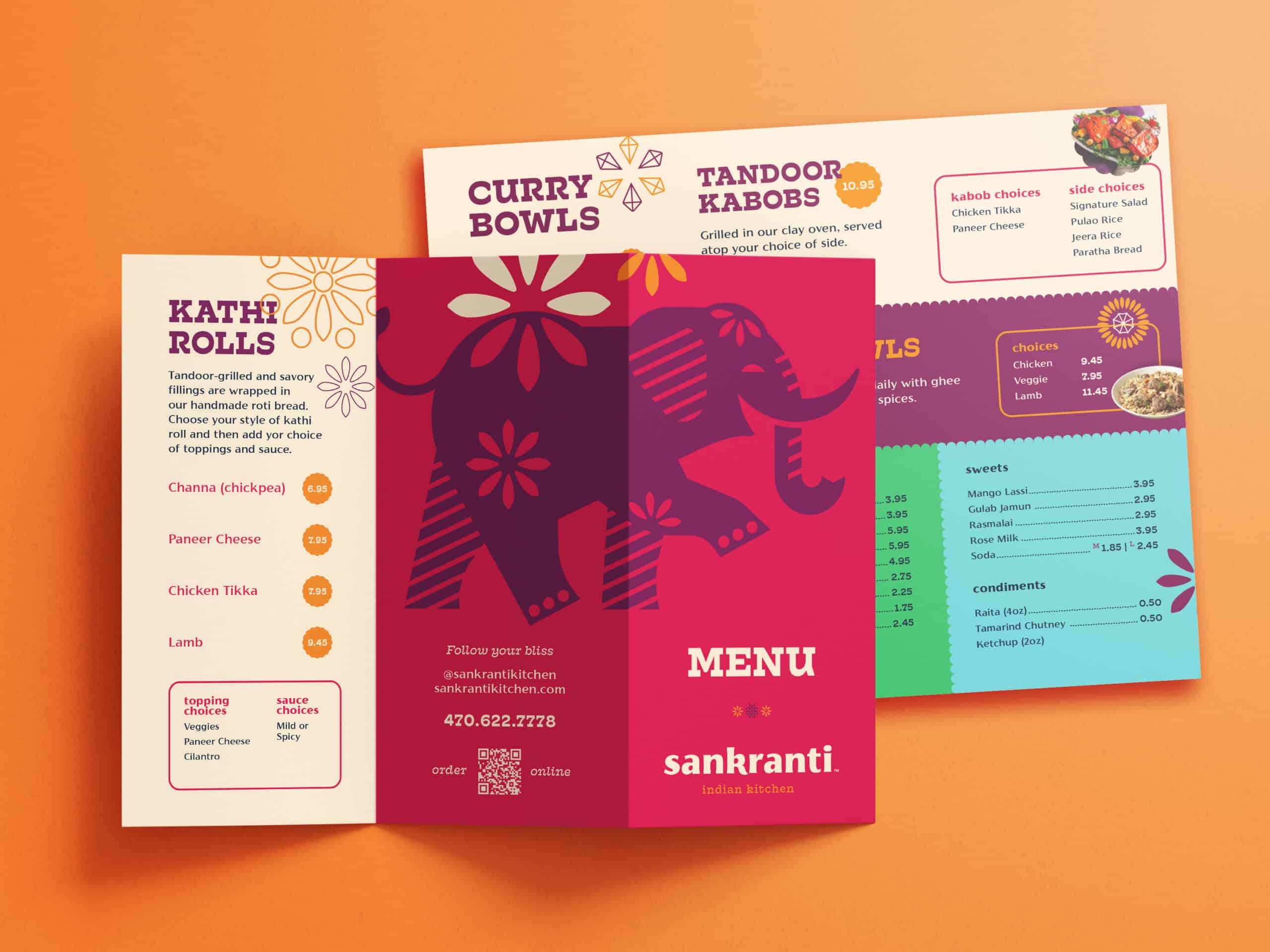
Indian culture celebrates vibrant colors and patterns on levels unlike any other in our world. The beauty of this expression afforded the team seemingly endless options for exploring how the brand would visually present itself. We had to find connectivity deeper than the general visual aspects of the culture. We had to zero in on something inherently ownable by this brand. We found our inspiration in the humble elephant.
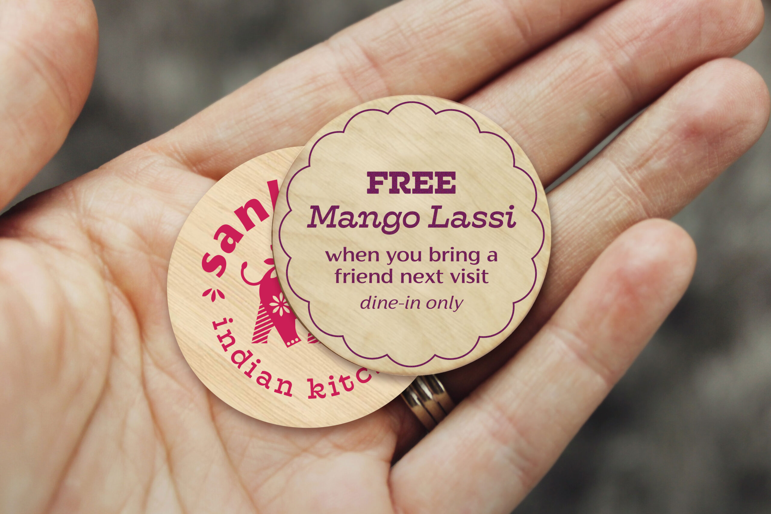
Elephants represent many things in Indian culture, and the nuances of how they’re positioned can have very different meanings. The spiritual advisor helped us understand those nuances to create a brand mark that would become the epicenter of the Sankranti brand. We named her “ella” and she’s the embodiment of Sankranti’s spirit and personality.
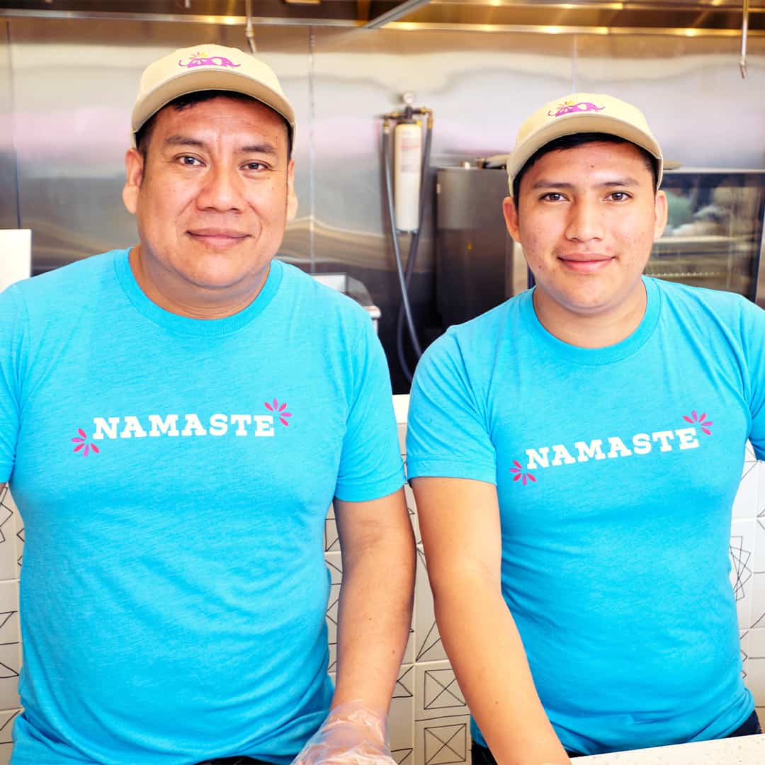
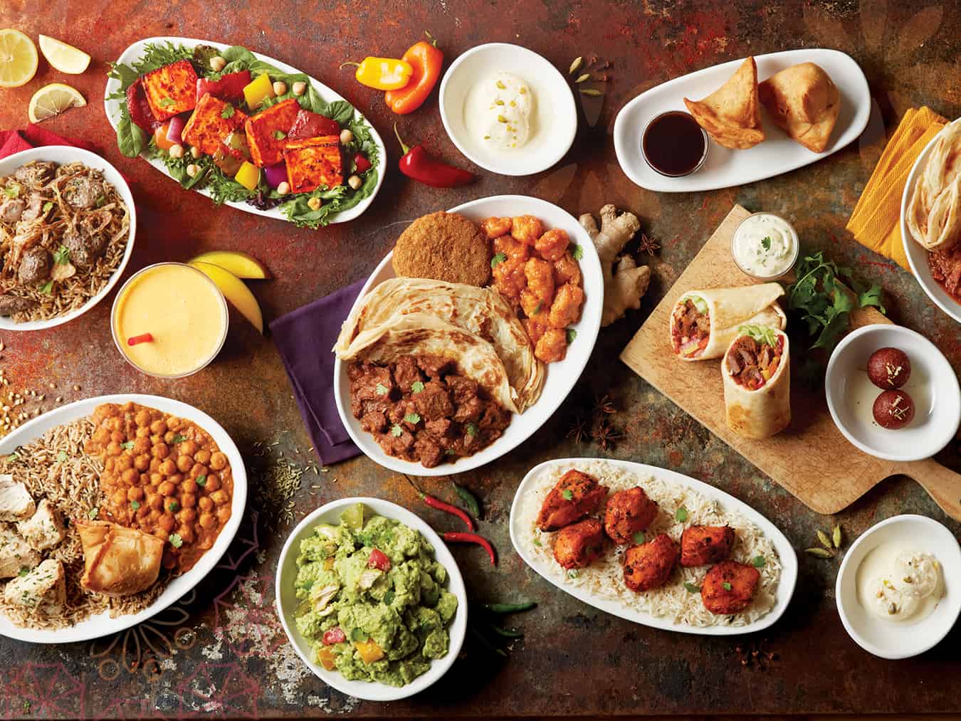
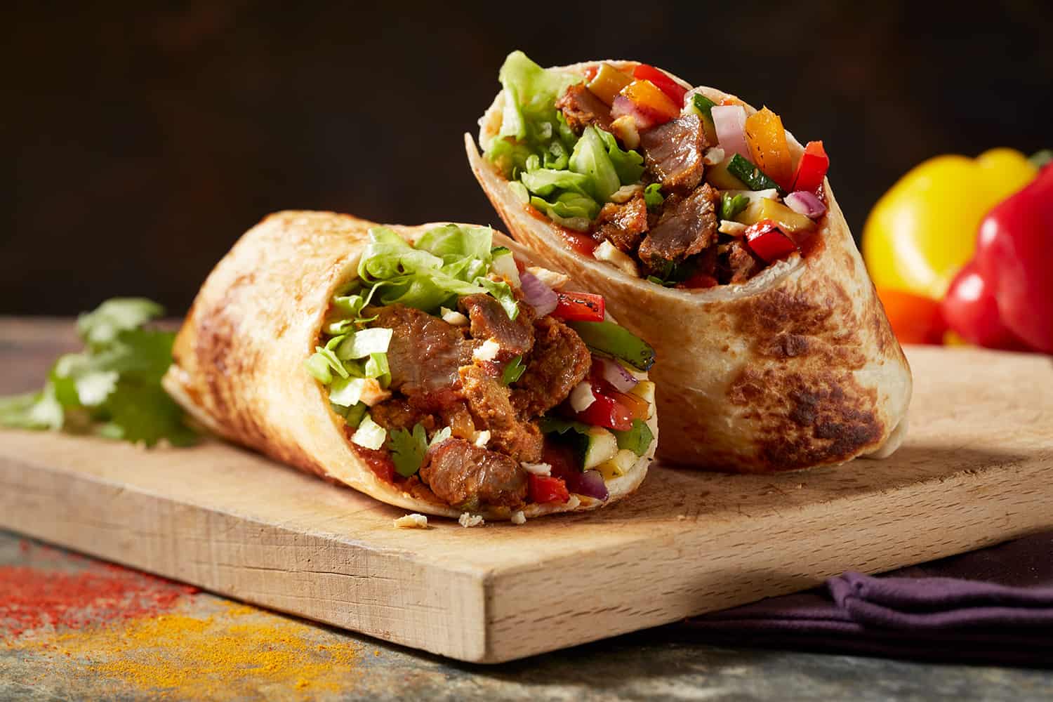
With Ella as the core, we explored jovial typography that would evoke the brand’s celebratory vibes. A slab-serif typeface was coupled with a more modern typography family to create a bridge between the traditional and the new. Coupled with a vibrant color palette and custom-designed patterns modeled after Indian iconography and the ingredients in the cuisine, the typography comes to life with vivacity.
Interior Design
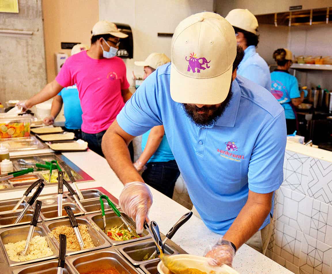
A restaurant’s interior is where a brand’s promises coalesce into an immersive, full sensory experience. Understanding this, our team set forth with the goal of guiding the customer experience so they would absorb the brand’s tenets without impeding the core needstate of having to place and/or pickup an order.
With a small footprint, such as the case in a QSR format, optimization is imperative. Every moment within the sapce is an opportunity to make something memorable, so starting with the approach we ensured the brand was clearly positioned, highly visible, and communicated the unique attitude even for passersby. By activating the windows beyond the basics of logo and hours of operation, we started the Sankranti story from the first impression.
Inside the “four wall” experience, we identified key areas for the brand’s story to play out. Whether it be the queue wall where nooks for spices and trinkets to exist and subliminally deliver the message of authenticity.
Conclusion
Sankranti’s first location opened in Dunwoody Georgia in early 2022 with a second location scheduled for Fall. The brand has its sights set on growth throughout the Atlanta metro area and beyond. With a strong strategic foundation, the sky is the limit.