
Craft beer is burgeoning across the nation and Denver, Colorado is one of the epicenters of this resurgence. That means competition is fierce. Leveraging expected imagery wouldn’t work because the Rocky Mountains have been used to the point of being forgettable. We knew that one thing about Denverians has remained true throughout the decades: Adventurous spirit runs deep. Tapping this spirit in a way that was tangible and malleable to various groups of people would be key in crafting this new craft beer brand.
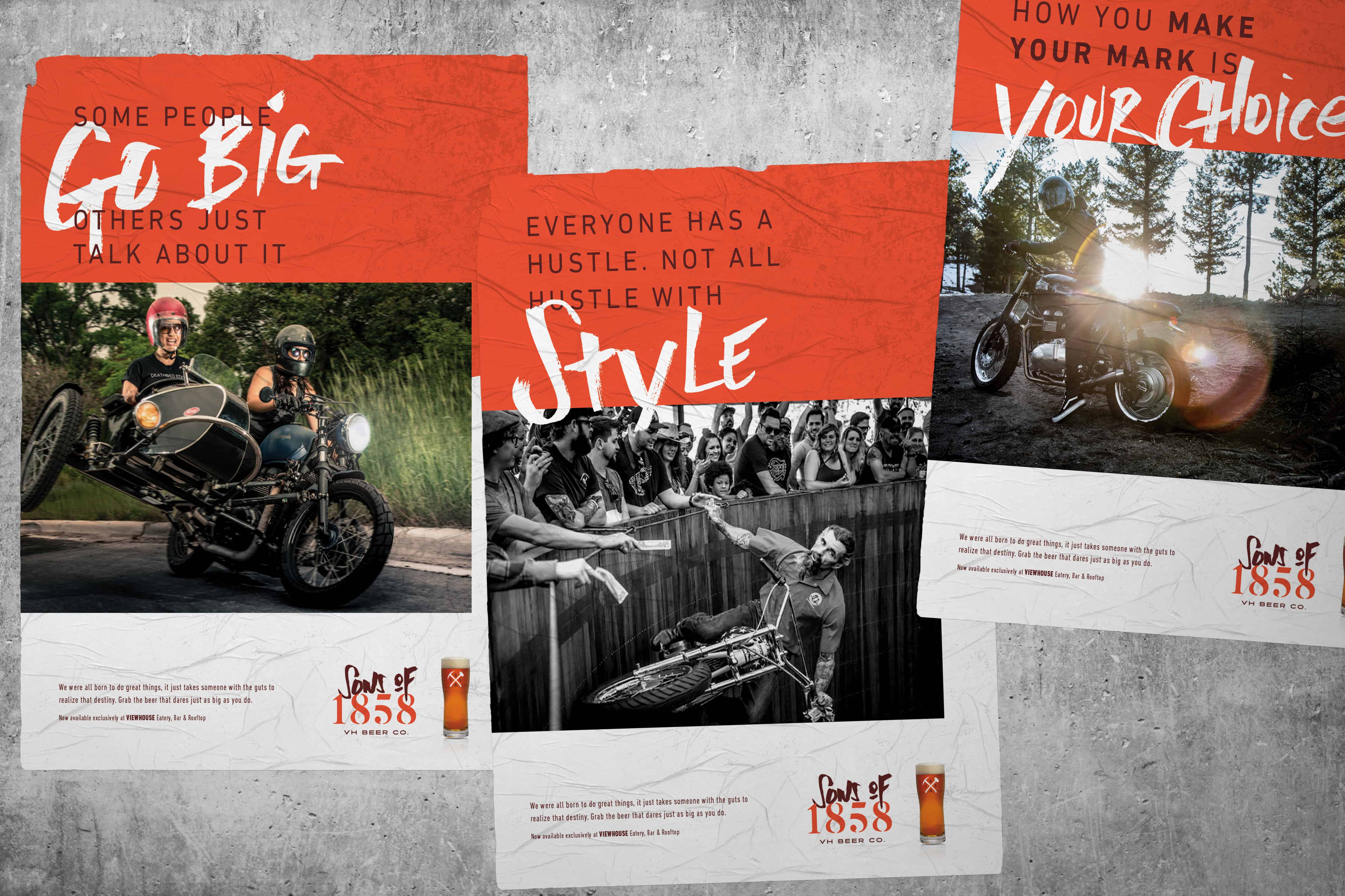
We focused our efforts on the human truth of: No matter who you are, or what you do for a living, there is an adventurous spirit in all of us. That fact set the team up for positioning this brand-to-be as a craft beer much different than others. Sure, exploring flavors, tastes, and ingredients is a great thing to talk about, but it’s not a new conversation. In fact, most craft beers talk about only that. This brand would be different.
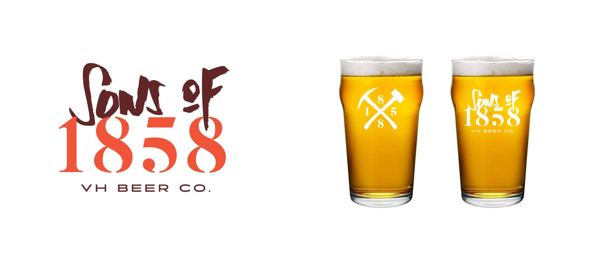
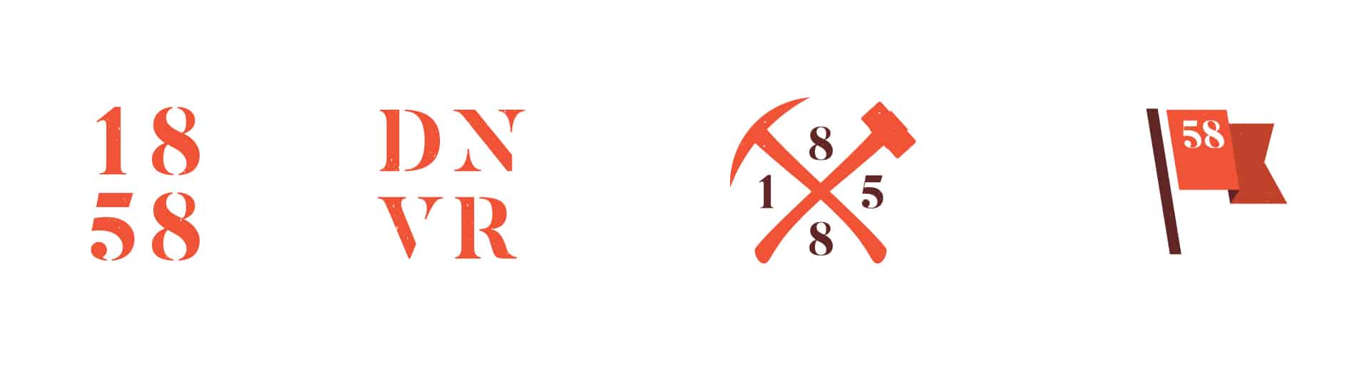
Through rigorous naming exercises we created a name that captured the brand’s essence: Sons of 1858. A classic sounding name that nodded to the root of Denver, and those who make Denver their home. This name prompted a tone of voice to be threaded throughout the brand’s touch points. Pioneering, bold, edgy, and, at times, risque. The tone of voice informed the visual tone as well. Photography was carefully set up and shot to encapsulate the adventurer in all of us. This can be seen in the on-premise marketing touch points. (Special thanks to Ladd Forde for the photography.)
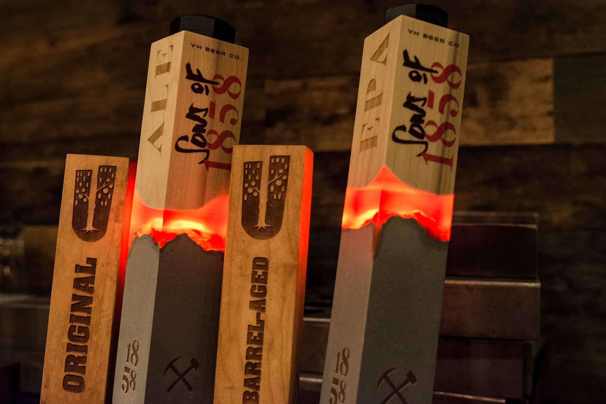
Sons of 1858 would launch in two restaurant locations in Denver, but would not have the benefit of packaging at first. This made the tap handle design even more crucial. Our solution was to tell the story of Sons of 1858 in way that would subliminally take hold, while demanding attention immediately. The tap handles are a representation of rock meets wood, the sun rising and setting on mountain tops, and a boldness that dares you to ignore it.
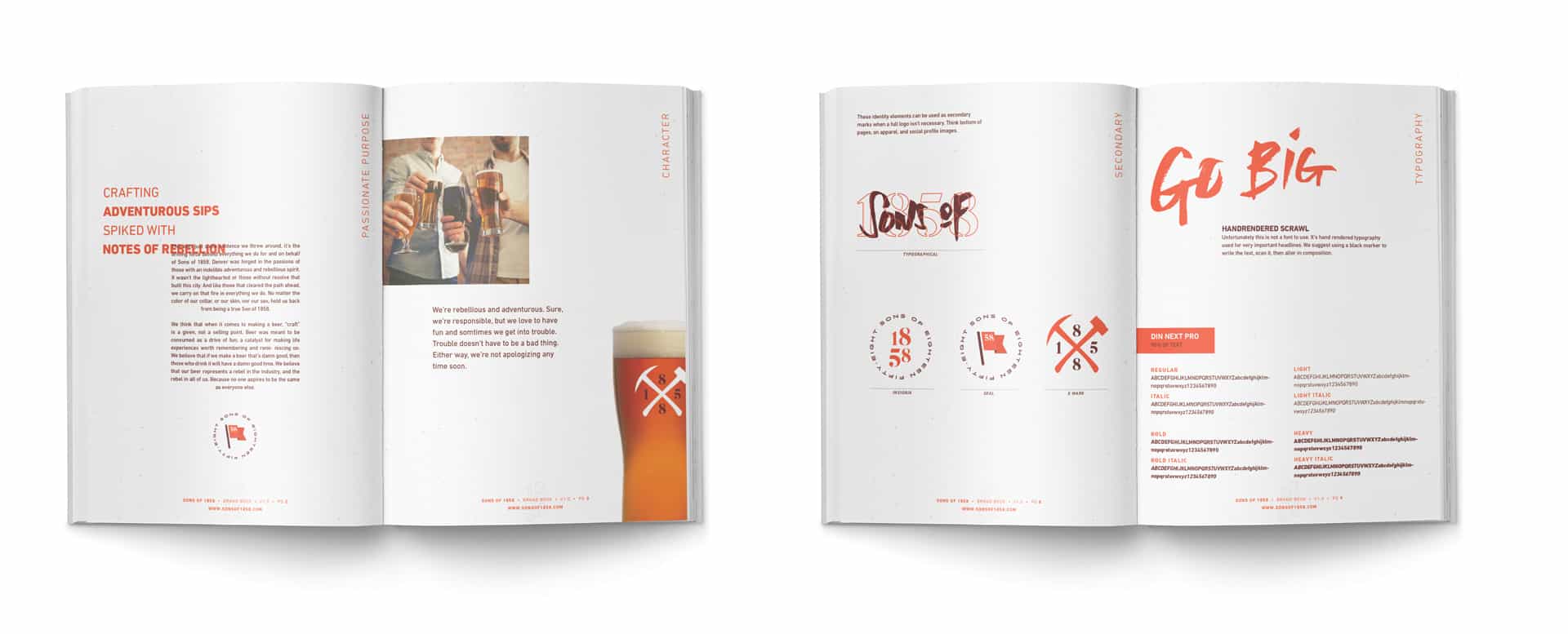
Finally, we furnished the team with a complete brand guidebook so they can build and grow the brand moving forward.
Sign up for branding and marketing insights and get our expertise delivered to your inbox.
"*" indicates required fields