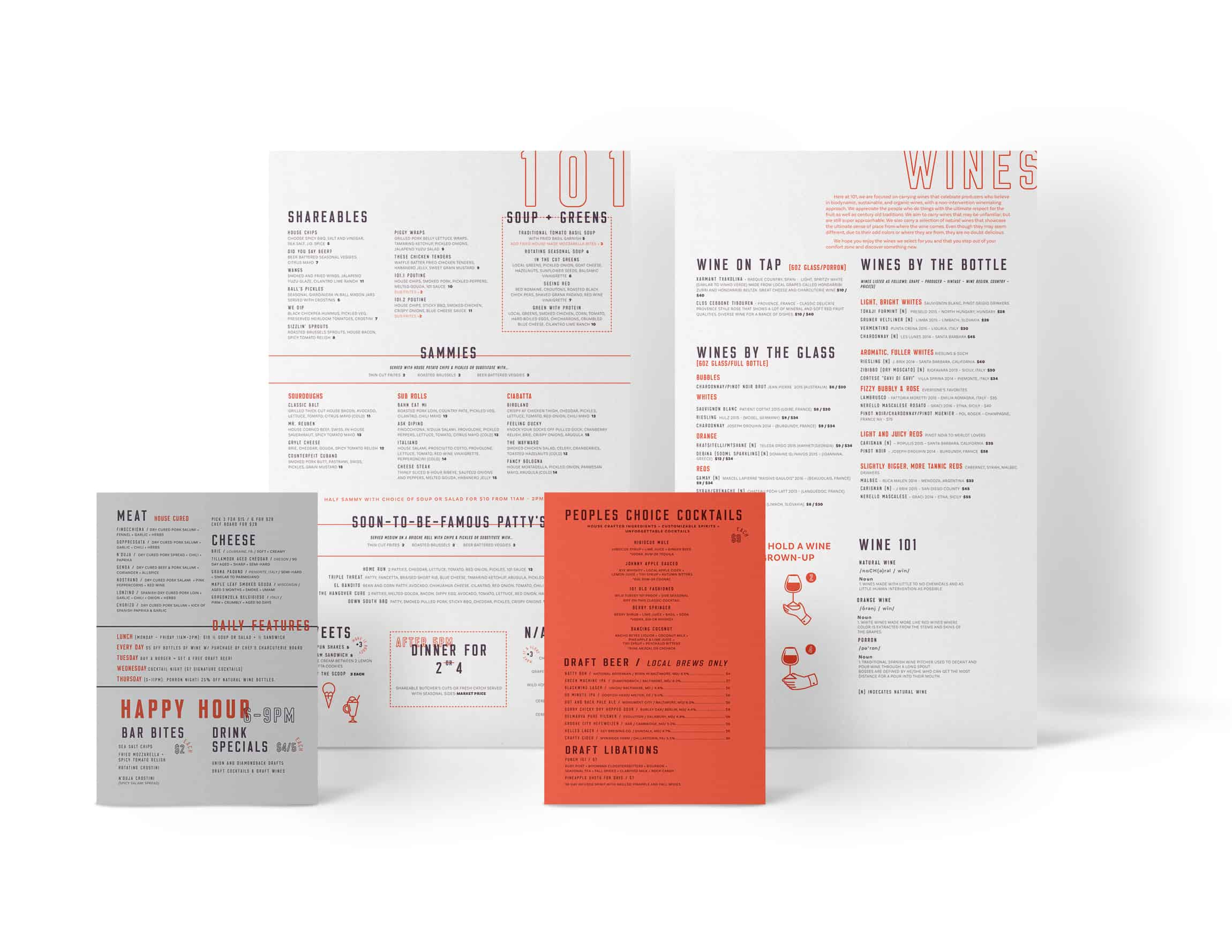
We’re in a time where over-craft and uber-culinary have become the status quo for restaurant brands. While others look to one-up one another in these words, our friends in Baltimore chose another path.
Location
Year Completed
Team Size
Services
Brand Truth: People are fatigued with the over-crafted culture found in today’s restaurants. They want simple, damn good food without all the fluffy stuff.
Going back to beautiful basics
There’s no need to go overboard and try to gussy up damn good food. If you do it right, add in a bit of love, you’ll get a fantastic dish that’s perfect in its simplicity. All this extra stuff seems like overcompensating.
We approached the brand identity design and strategy with this mentality. It fueled the idea of the restaurant’s name, 101. Jumping off of that base we created a multi-faceted visual system and brand tone of voice that mixed in attitude without losing respect for the craft.
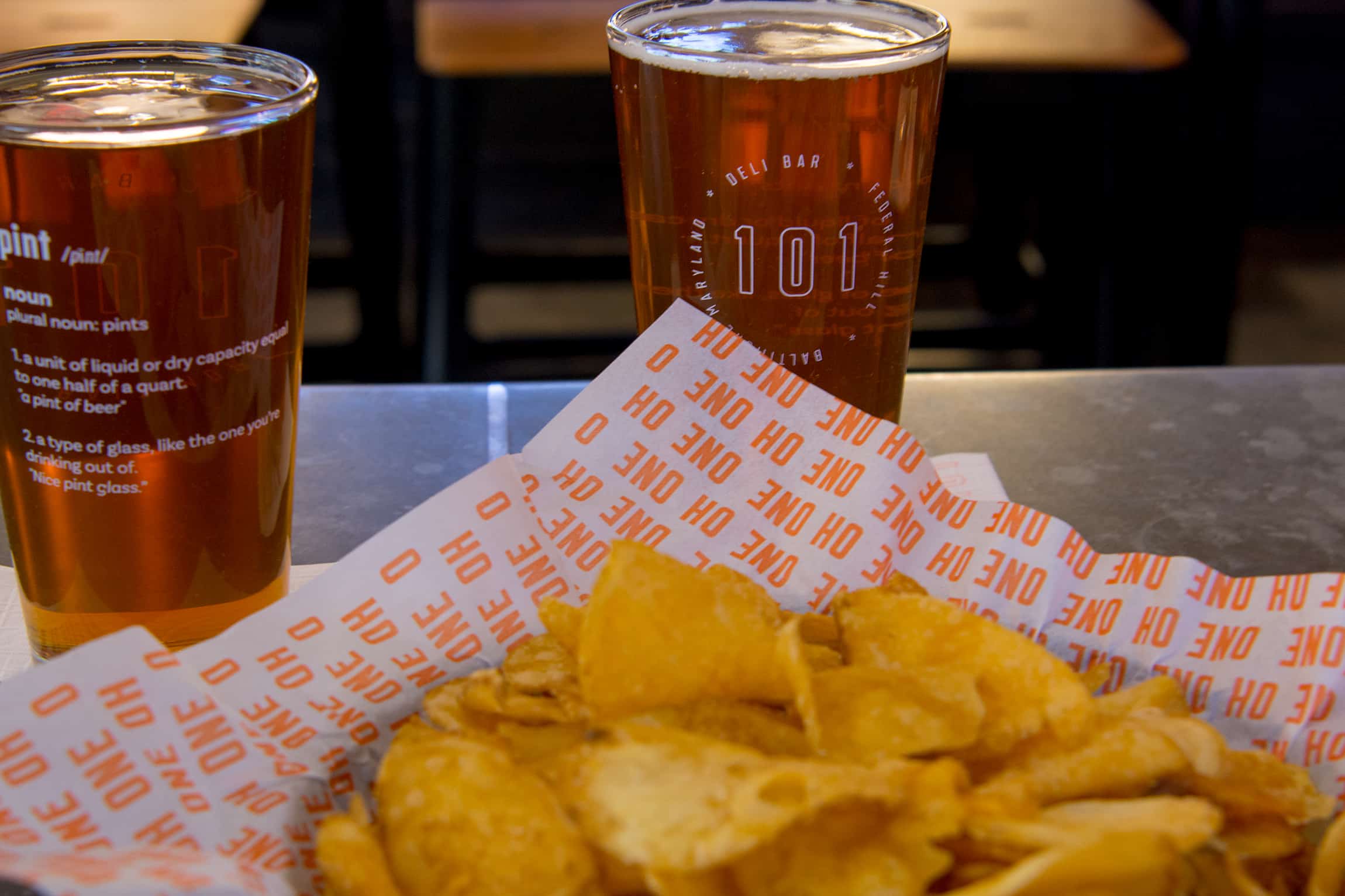
Brand touch points carried a direct voice while pulling in elements of vandalism and some academia. Text book definition with a touch of attitude kept things simple, yet interesting. Boring found “artwork” was vandalized and flavored with the brand’s unique attitude.
