Home » Projects » Olga’s Kitchen Rebranding & Advertising
Detroit has a number of icons in its culture. When it comes to restaurants, one of those icons is Olga’s Kitchen. Olga’s was founded in the 1960’s by Ms. Olga Loizon, an area go-getter who built the brand by brains and brawn. Throughout the years the brand had ups and downs until recently when new ownership took the helm and sought to change that rollercoaster for the better.
Olga’s Kitchen is in a transition. Some locations are full service restaurants much like a family diner experience. Others are more of-the-times and operate in a quick service restaurant format. Adding another layer is the advent of virtual restaurants which posed a new opportunity for the brand.
Location
Detroit, MI
Year Completed
2022
Team Size
Vigor 12 / Client 4
Services
Brand Strategy, Identity Design, Marketing Strategy, Campaign Creative, Art Direction, Marketing Management, Social Media
Introduction
Internally, the messaging was stuck on basic approaches like “best bread on the planet” and “it’s not a sandwich, it’s an Olga.” A confusing line considering Olga’s flagship product is not a sandwich at all. It’s a Greek gyro, and its name created a hurdle for communications in that not many folks referred to it as the preferred name of an Olga.
Vigor was brought in to help detangle the confused messaging while steering the brand into the future with a sound strategy, advertising acumen and a social media-first approach.
Restaurant Advertising & Messaging Strategy
Homing in on the Patron was the first step in excavating messaging that would spark connection for the brand. To date, the brand hadn’t zeroed in on a core group of people and their behaviors. That resulted in general messaging that fell flat and didn’t connect.
Through extensive research using multiple research tools, we were able to pinpoint a group of Michiganders who already frequently Olga’s, frequented affinity brands like Olga’s, and who had the right mix of market prevalence. We called them Homerunners.
With a fuller understanding of the brand’s Patron and her motivators, we collaborated with leadership to establish the brand’s platforms starting with Purpose. Olga’s has such a rich history derived from the benevolence of Ms. Loizon herself. And while the brand had evolved over the years, that sentiment was still deeply rooted within the organization. What’s more, this benevolence and good will had the potential connect with Homerunners.
The personality of Olga’s was in dire need of a shift. It would serve as a guide for adjusting messaging, both visual and verbal. Leveraging an intensive competitive analysis, we identified a white space where Olga’s was primed to establish an ownable, unique position in the Patron’s mind. It was a mix of Regional Roots and a Contemporary Experience. This position would be reinforced with a personality mix of vibrant, self-assured, and resilient traits.
Restaurant Visual identity evolution
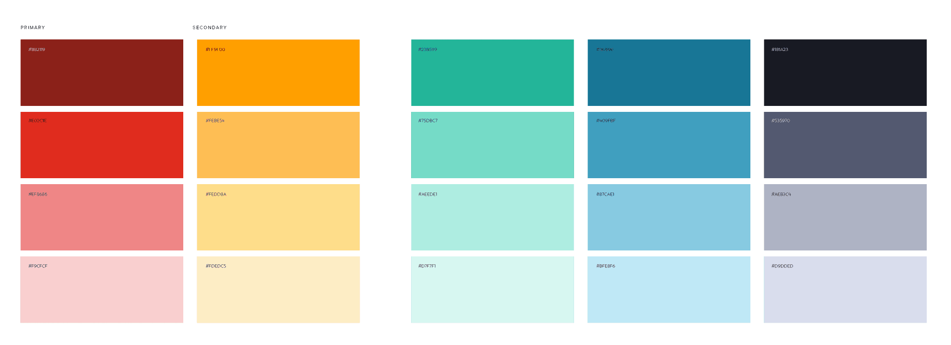
In order to communicate the adjusted strategy, the Olga’s visual identity needed to evolve. When we first engaged, the brand’s color palette was a drab combination of rich burgundy and beige tones. It certainly did not communicate the vibrant personality trait the brand sought to own.
Typography plays a big role in communicating personality. Olga’s typography had been basic and unremarkable. A versatile, friendlier family was identified and acquired to lead the charge for the brand’s typographic needs. Rebrand, the selected family, came with alternate letterforms baked in. “A”, “E”, “R”, and “Y” letterforms opted for the alternates. The forms had rounded bowls and subtle upbeat features like lowercase “e” forms that seem to smile, and the legs of the capital “R” that flipped upward.
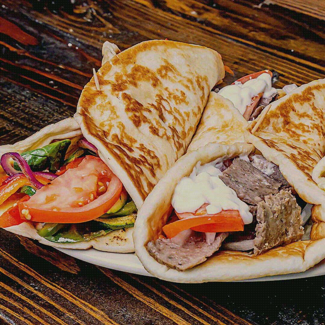
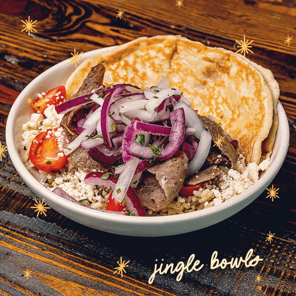
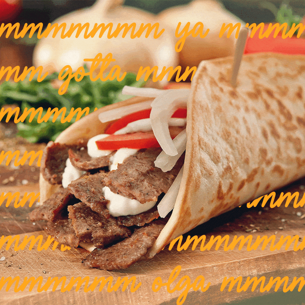
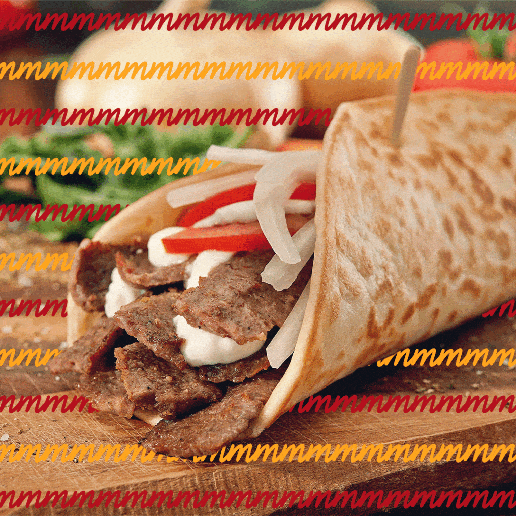
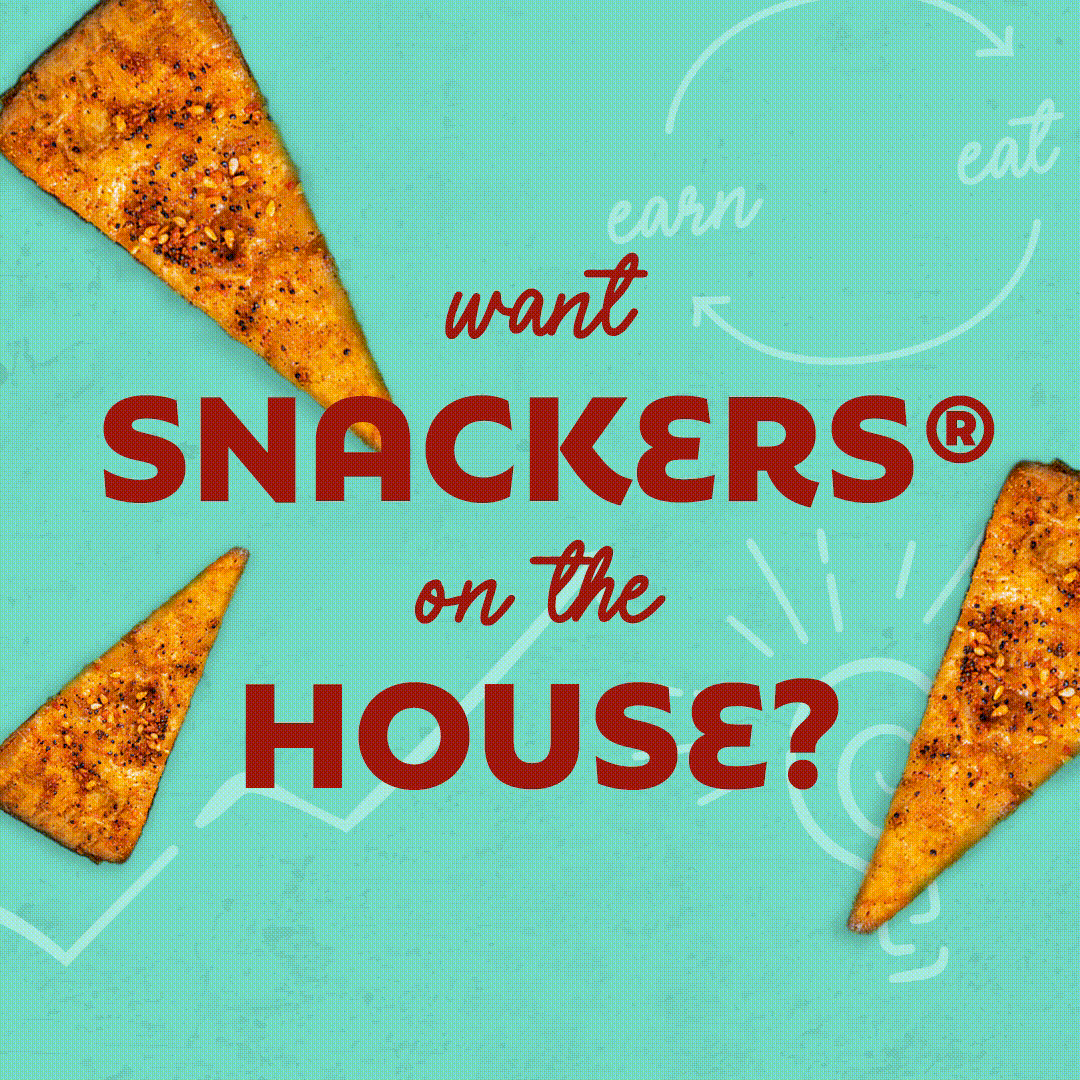
The Vigor team found inspiration in the brand’s staple ingredient: fresh-baked pita bread. The bread offered shape and texture that, when combined with the rejuvenated color palette, created a unique graphic element that would permeate throughout all marketing communications.
Pulling these visual identity elements together resulted in unique brand elements like the “Ya Gotta Olga” lockup, interactive button styles, and background textures. Combined the created a refreshing visual language and identity that all teams, internal and external, could leverage and grow.
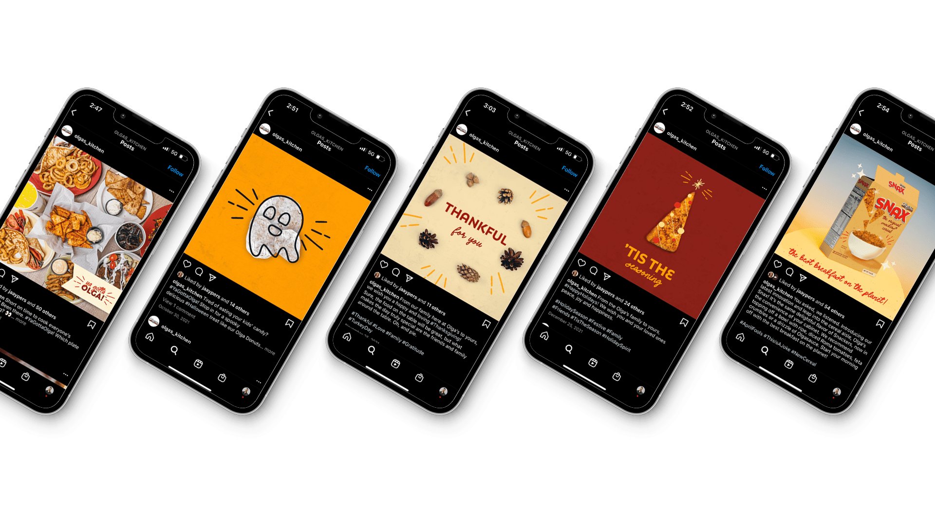
Evergreen Marketing: Social Media Marketing
Uplifting the messaging and consistency in the Olga’s Kitchen social effort was a top priority. Fans of the brand demanded more than food photos. They craved the personality the brand had built over its lifespan and had recently reinforced with a new strategy.
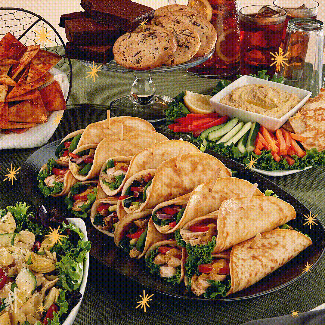
The Vigor team quickly took the helm with the goal of infusing the evolved personality and identity throughout the main social channel: Instagram. We identified a data-driven balance of food, lifestyle, and marketing content that, when combined, would tell an ongoing story that reinforced believabilty in the brand from Homerunners. We upped the ante on the quality of content by introducing stronger photography and animations to grab attention.
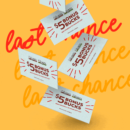
Limited Time Offer Advertising Campaigns: Gift Cards
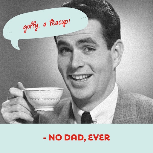
Overtop of the Evergreen marketing and advertising efforts were a series of limited time offer campaigns. In the fourth quarter of 2021, the brand zeroed in on promoting gift cards as a holiday gifting option. With limited media and production budget, the Vigor team developed a series of activations to position the Olga’s Kitchen gift cards as a holiday win for everyone. The holidays are rife with gifts you simply didn’t want: another mug with a picture on it, an ugly sweater, and so on. Homerunners are all too familiar with this reality. It was exactly that insight that lead to the “Said No One Ever” campaign direction.
In the advertising campaigns creative, we took the words right out of the Homerunners’ mouths with a little sarcastic seasoning to create a relatable moment. Playing off of a common meme, we crafted headlines like “I love hearing ‘hey, it’s the thought that counts’ – No One Ever.” Each headline reinforced the sentiment we have all experienced with when receiving or giving gifts. The familiarity of the meme helped reinforce the humorous angle helping the campaign’s memorability.
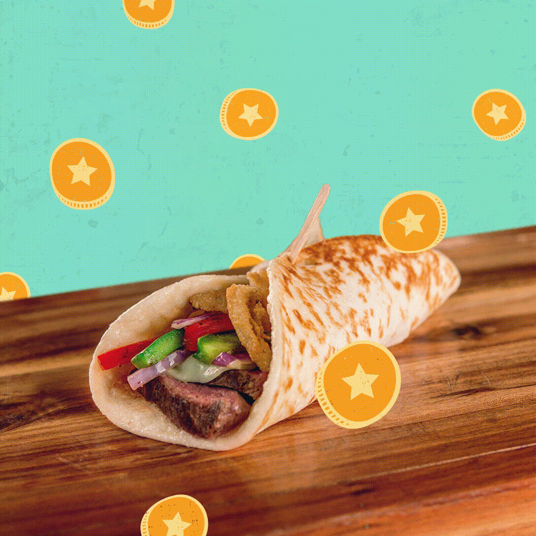
Limited Time Offer Advertising Campaigns: Rewards
Pushing into 2022, the brand wanted to focus the attention to a new loyalty rewards app to foster downloads and participation. Coinciding with the launch of a new app platform, we developed a limited time advertising campaign to build awareness and fuel growth.
The “Earn while you eat” tagline was developed to shoot straight with Homerunners to increase the chances of adoption. Buiding upon the visual identity language from previous campaigns and other touchpoints, we crafted illustrations and iconography to reinforce the savings messaging. Coins, sparks, and lightbulbs were introduced in a handdrawn illustration style to help the creative grab attention while instantaneously communicating benefits.
The campaign rolled out across a suite of media touchpoints spaning social, digital display, and the brand’s owned channels. With a focus on being channel specific, we develop new headlines and design treatments to grab attention, communicate the benefit, and push adoption.
Conclusion
Over the course of the partnership, Vigor uplifted the brand’s visual and verbal identity to position Olga’s Kitchen for future growth and reclamation of relevance in market. By employing multiple new media in the suite. Over the year long engagement we produced month-over-month positive movement in metrics successfully creating momentum for the brand overall.
This website uses cookies to improve your experience. We'll assume you're ok with this, but you can opt-out if you wish. Cookie settingsACCEPT
Privacy & Cookies Policy
Privacy Overview
This website uses cookies to improve your experience while you navigate through the website. Out of these cookies, the cookies that are categorized as necessary are stored on your browser as they are as essential for the working of basic functionalities of the website. We also use third-party cookies that help us analyze and understand how you use this website. These cookies will be stored in your browser only with your consent. You also have the option to opt-out of these cookies. But opting out of some of these cookies may have an effect on your browsing experience.
Necessary cookies are absolutely essential for the website to function properly. This category only includes cookies that ensures basic functionalities and security features of the website. These cookies do not store any personal information.
Any cookies that may not be particularly necessary for the website to function and is used specifically to collect user personal data via analytics, ads, other embedded contents are termed as non-necessary cookies. It is mandatory to procure user consent prior to running these cookies on your website.