Hoyle’s Kitchen & Bar full service restaurant branding
Home » Projects » Hoyle’s Kitchen & Bar full service restaurant branding
A tavern turned music hall experience had run its course in relevance, and the ownership sought to reinvigorate the space. With a focus on the historic roots of the family, and a vision of creating a family-meets-fun experience, the Vigor team realized a new life and brand for the team.
Location
Marietta, Georgia
Year Completed
2017
Team Size
Vigor 4 / Client 4
Services
Brand Strategy, Narrative, Naming, Brand Architecture, Identity Design, Menu Systems, Web Development
Challenges
Establish a brand strategy and focus for the team that moved the company away from pre-existing associations
Create a name that tied to the owner’s local history and family name
Design a look that would attract the local market, and establish the restaurant as approachable, but elevated
Key Insights
Despite being a non-affluent area, the desire for an elevated experience still existed. The neighborhood didn’t have a place that served families and friends alike. They didn’t have a sports bar that wasn’t dingy, smoky, and rundown. Furthermore, Marietta is on the rise and the folks in that area wanted something better that was rooted in the community, not just a place for food and drink.
A history-influenced happy home
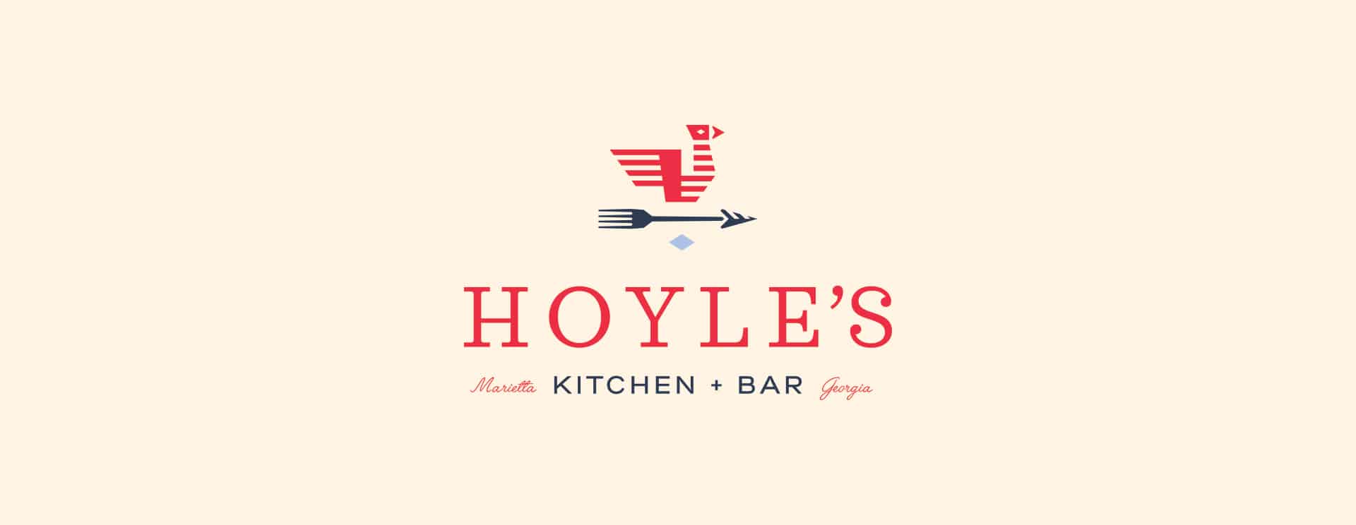
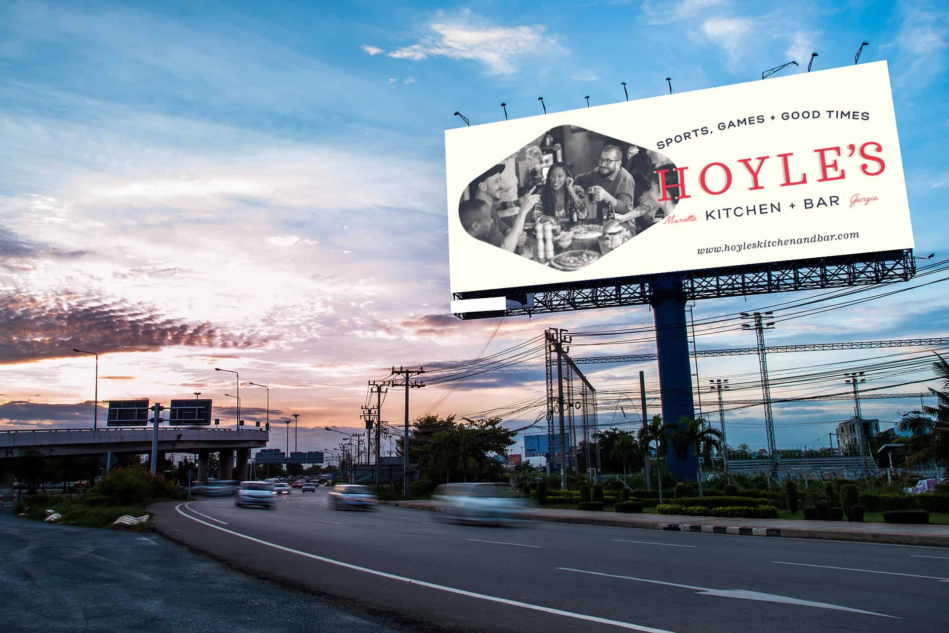
After interviews with the ownership we found a historic tie to Marietta, and Atlanta. The family’s ancestors were one of the first settlers and played major roles in the development of Atlanta proper. From entrepreneurship through politics, the Ivey family was renowned and no other Ivey was renowned as much as Hoyle. So, Hoyle’s was set as the name of the new restaurant.
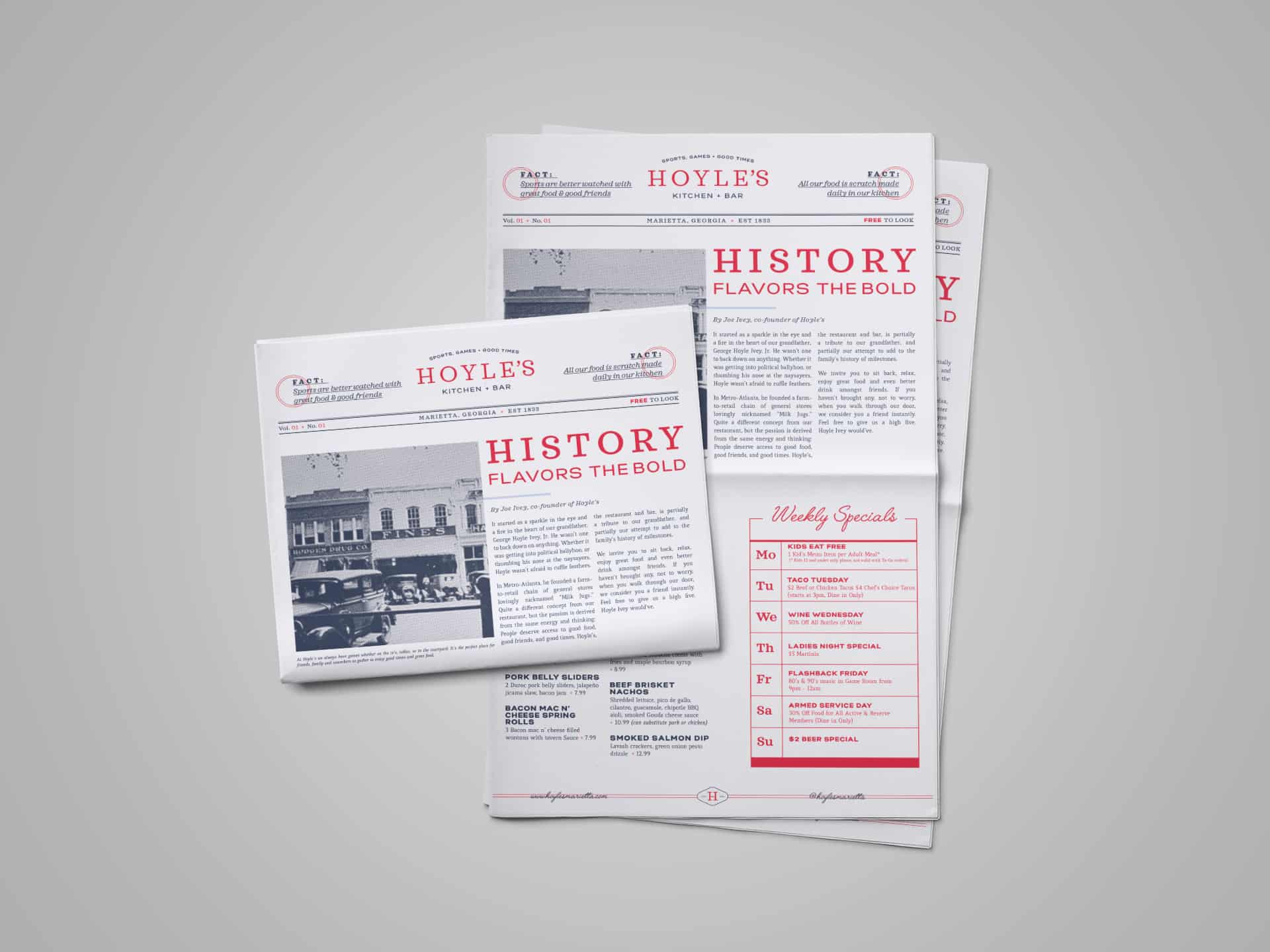
Mr. Ivey created one of the first farm-to-community stores. Lovingly nicknamed “Milk Jugs” the stores brought agriculture to the city’s doorstep. The restaurant’s culinary focus was inspired by this story that helped solidify the ties to why the restaurant exists, and how it serves up its food.
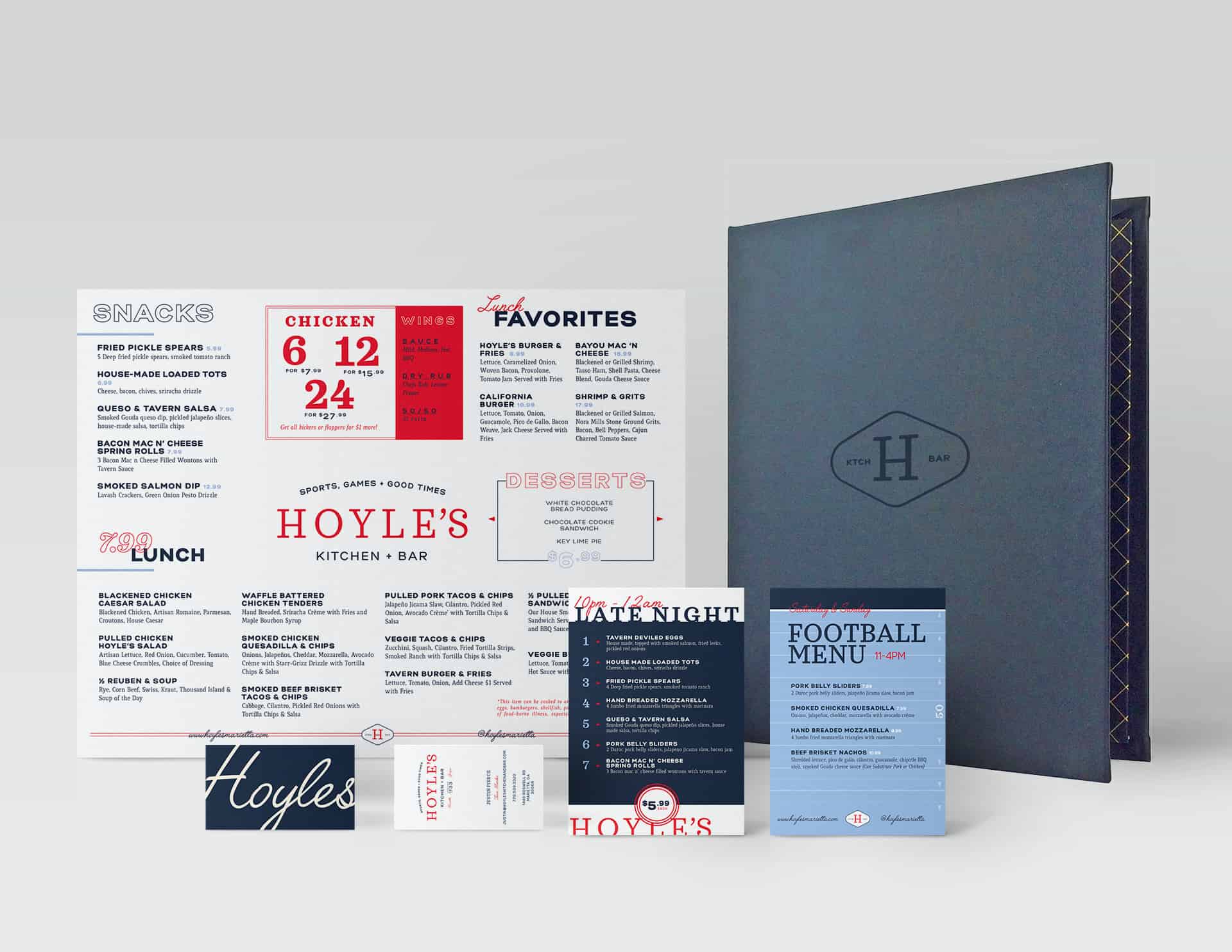
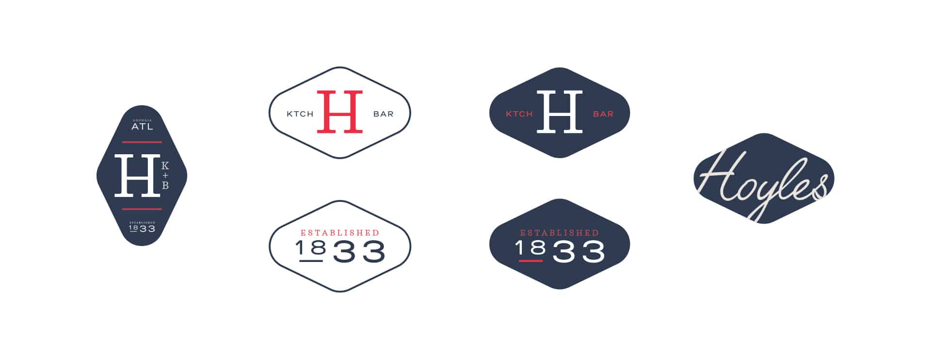
All of this insight culminated into a classic look that pulled on beautiful typography rooted in history. The core logo design pulled influence from classic typographic layouts found on packaging from the turn of the 20th century. The branding elements from menu designs through ephemera continued the vintage-inspired focus with newspapers, hotel key chains, and photographic styles.
Overall, the brand evokes a feeling of historic, wholesome, and approachable vibes. It delivers on the message of good food and good times.
This website uses cookies to improve your experience. We'll assume you're ok with this, but you can opt-out if you wish. Cookie settingsACCEPT
Privacy & Cookies Policy
Privacy Overview
This website uses cookies to improve your experience while you navigate through the website. Out of these cookies, the cookies that are categorized as necessary are stored on your browser as they are as essential for the working of basic functionalities of the website. We also use third-party cookies that help us analyze and understand how you use this website. These cookies will be stored in your browser only with your consent. You also have the option to opt-out of these cookies. But opting out of some of these cookies may have an effect on your browsing experience.
Necessary cookies are absolutely essential for the website to function properly. This category only includes cookies that ensures basic functionalities and security features of the website. These cookies do not store any personal information.
Any cookies that may not be particularly necessary for the website to function and is used specifically to collect user personal data via analytics, ads, other embedded contents are termed as non-necessary cookies. It is mandatory to procure user consent prior to running these cookies on your website.