
Sparked by an opportunity of international expansion, the Great Wraps team sought to rethink their offering and brand positioning. The brand had lost its position in food courts with a cluttered product mix, and a name that miscommunicated the brand. Vigor was charged with developing a healthy expression of Great Wraps to enter into Canadian markets and airports across the United States.
Originally, Great Wraps was a restaurant concept focused on healthy-style wraps. In the 90s it was a trending item, but that time had passed. Health didn’t sell in foodcourts so the brand was left adding new product categories to better compete. The result was a confusing, misaligned brand experience and a sinking business.
The solution was two-fold. The first path was to springboard off the Canadian expansion opportunity to create a health-first brand experience in a cafe model environment. The second path involved trying to realign the mall foodcourt brand through an extensive rebrand and concept adjustment. Full case study on rebranding Great Wraps into Gyro Wrap coming soon.
We couldn’t disrupt the entire multi-unit network with a brand refresh yet again. They had already been through nearly 8 iterations of the identity over the course of 20 years. However, with the Canada move, and airport terminal opportunities available, the strategy for developing an international and café model expression was the obvious right move. The remaining mall foodcourt locations would require a separate approach as healthy eating was not the DNA of the mall foodcourt consumer.
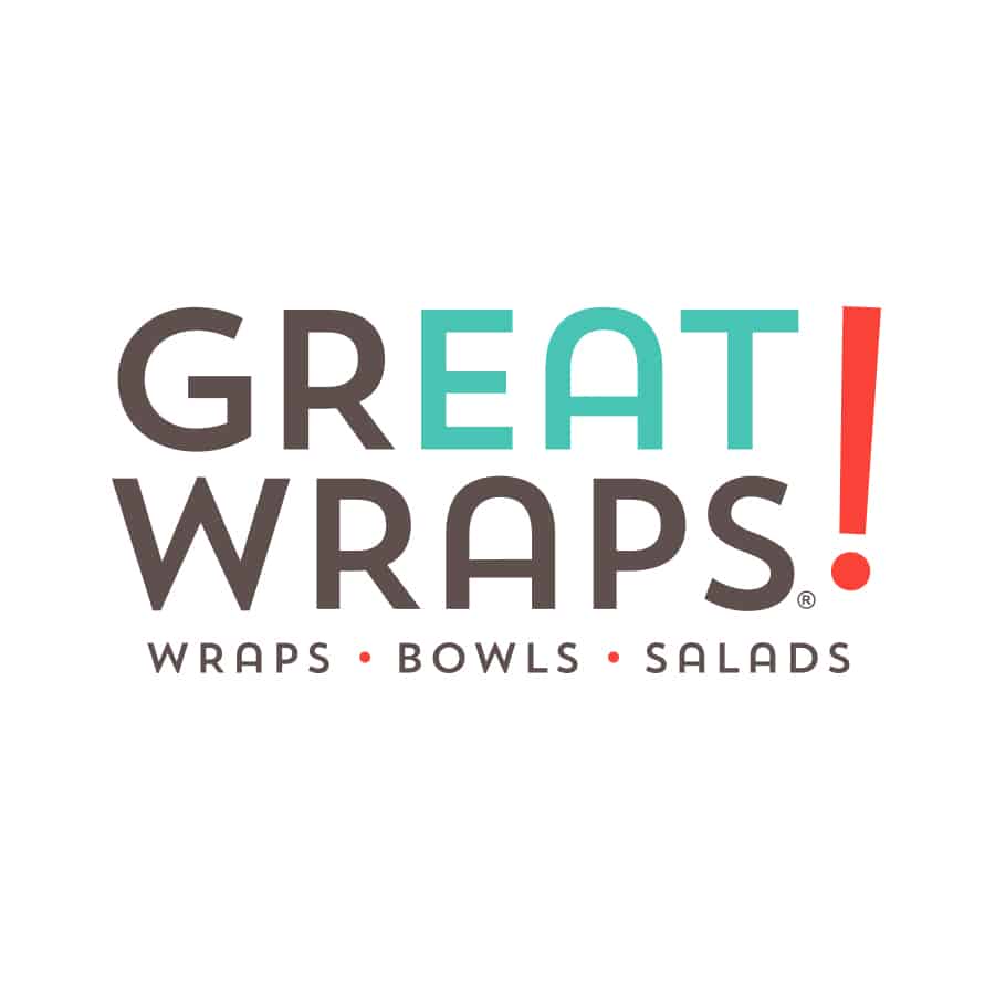
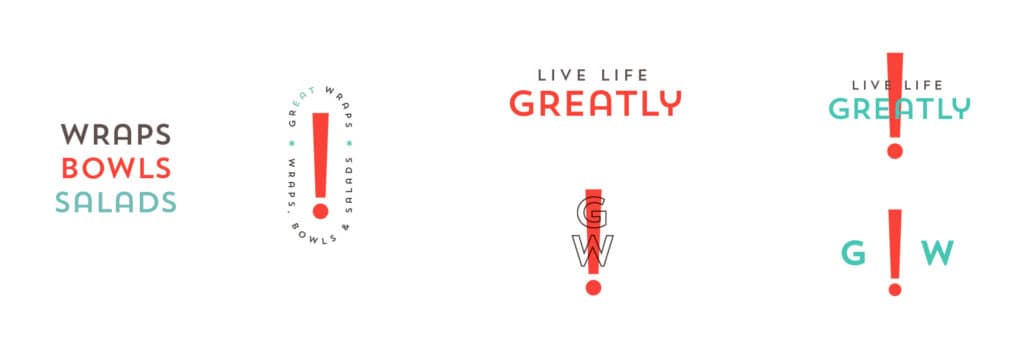
Great Wraps served as a catalyst for a greater, bolder lifestyle. Healthier eating meant more energy to do the things one wished to do. Stuck with the name, Great Wraps, we hitched this passionate purpose to drive the rebranding and rejuvenation of the tired, dated identity employed to date.
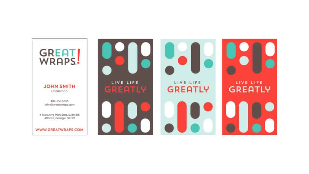
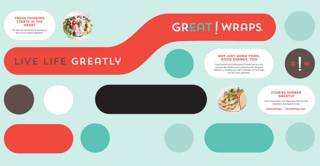
The passionate purpose, Live Life Greatly, drove the brand identity design forward with aspirational and mindful health imagery. It informed the refreshed brand color palette to be one that’s modern, and light hearted. In today’s world, people are rediscovering old forms of connecting which brought forth the idea of morse code. Seen as one of the original forms of messaging, this sparked a visual representation of Great Wraps’ passionate purpose. The new pattern is Live Life Greatly spelled out in morse code.
Great Wraps’ new identity built from the pattern and colors to create an interior experience that conveyed clean, healthy eating for a greater lifestyle.
Sign up for branding and marketing insights and get our expertise delivered to your inbox.
"*" indicates required fields