
Location
Year Completed
Team Size
Services
Restaurant Brand Workshops
Chasin’ Tails was the flagship restaurant brand under the hospitality group known at that time as Happy Endings Hospitality. Understanding the relationship between the parent company, its restaurant brands, and Chasin Tails was critical to defining how this restaurant concept would continue to thrive and grow. That became the first step in establishing Chasin’ Tails’ brand strategy
Eight total people were involved in the strategy development workstream. Each had their own perspectives, priorities, and personalities that they brought to the table. Overcoming these various forces served as a foundational challenge to realizing brand alignment. Through a series of workshops, presentations, and engaging activities, we guided the team while removing the barriers to unity.
With the barriers down, and unity strengthened, we began to design the workshop’s outputs and our extensive research into the market, the people in it, and the competitive landscape as a whole. What emerged was a clear identification of the brand’s primary and secondary patrons., and the behavioral driver primed to connect with them.
Research, Workshops, and Insights
Our research, workshops, and insights led to identifying a core Patron group we named Good Getters. Good Getters sought out new, instagram-worthy food experiences in groups where they can enjoy their company and share the times with their followers. Social media is where they play and share, which leds to drawing in secondary Patron groups critical for sustaining and growing the brand’s two locations in Northern Virginia.
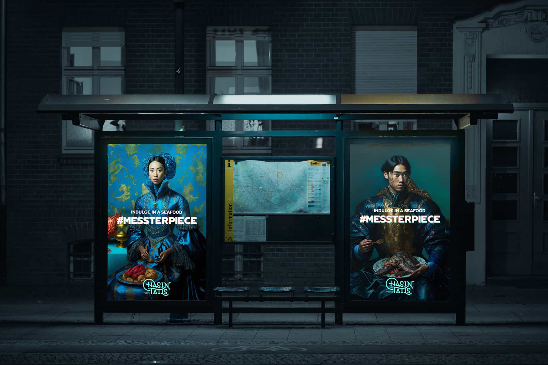
Having a deep understanding of the brand’s Good Getters Patron group guided the team towards a Purpose derivative the parent company. That Purpose was driven by the Hedonist archetype. Niched under the Lover archetypal driver, The Hedonist is marked by an indulgence in the richness of life, food, drink, and experience. Hedonist brands revel in excess and enjoy every moment. Owning this archetype fully informed the identification of Chasin’ Tails core Purpose: Revel in a seafood messterpiece fit for royalty.
From this Purpose, a core suite of Personality traits were identified. These traits influenced and informed the development of an overhauled visual identity for the restaurant that would position it as higher end and indulgent when compared with the seafood shacks in the region. In short, Chasin Tails would be an elevated seafood experience with an emphasis on social gatherings fueled by fantastic food and drink with zero limits.
Verbal Identity
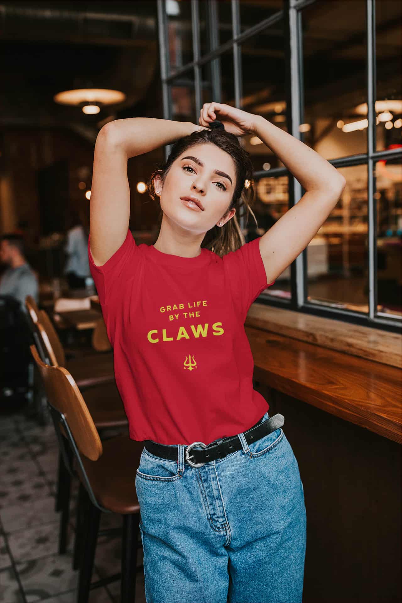
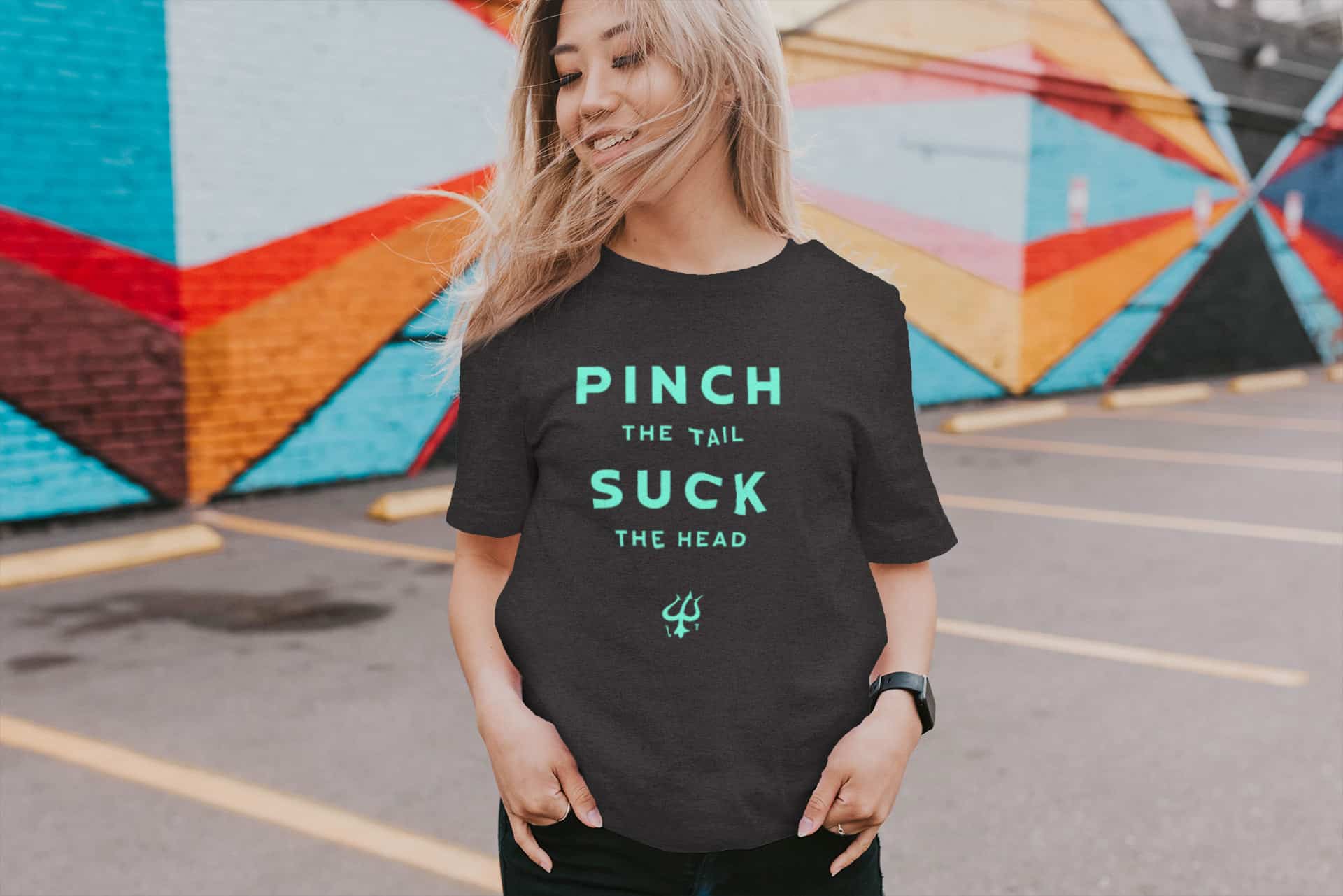
To live the Personality traits of energetic, alluring, and awesome, we had to shift the team’s thinking and vocabulary. The first step was to shift the restaurant’s descriptor from “Cajun Seafood” to “Seafood Social.” This put necessary emphasis on the socialization of the experience as a primary driver enabling Patrons to easily categorize the time and place for Chasin Tails in their lives.
Changing the descriptor wasn’t enough, however; we needed to tone down the heavy-handed sexual innuendos and replace them with an appropriate mix of cheek and elevation. These replacements were found in touchpoints like the loyalty club which was renamed to The Mile High Club, and categories on the menu. We replaced “Sides” with “Side Pieces” and “Beverages” with “Thirst Traps” to bring the brand up to date with trending terminology that our Instagram-obsessed Good Getters would connect with.
These shifts help set a path for a verbal identity that was robust and inspiring to continue to grow with the brand while setting benchmarks for what will reinforce and what is too far.
Positioning The Brand
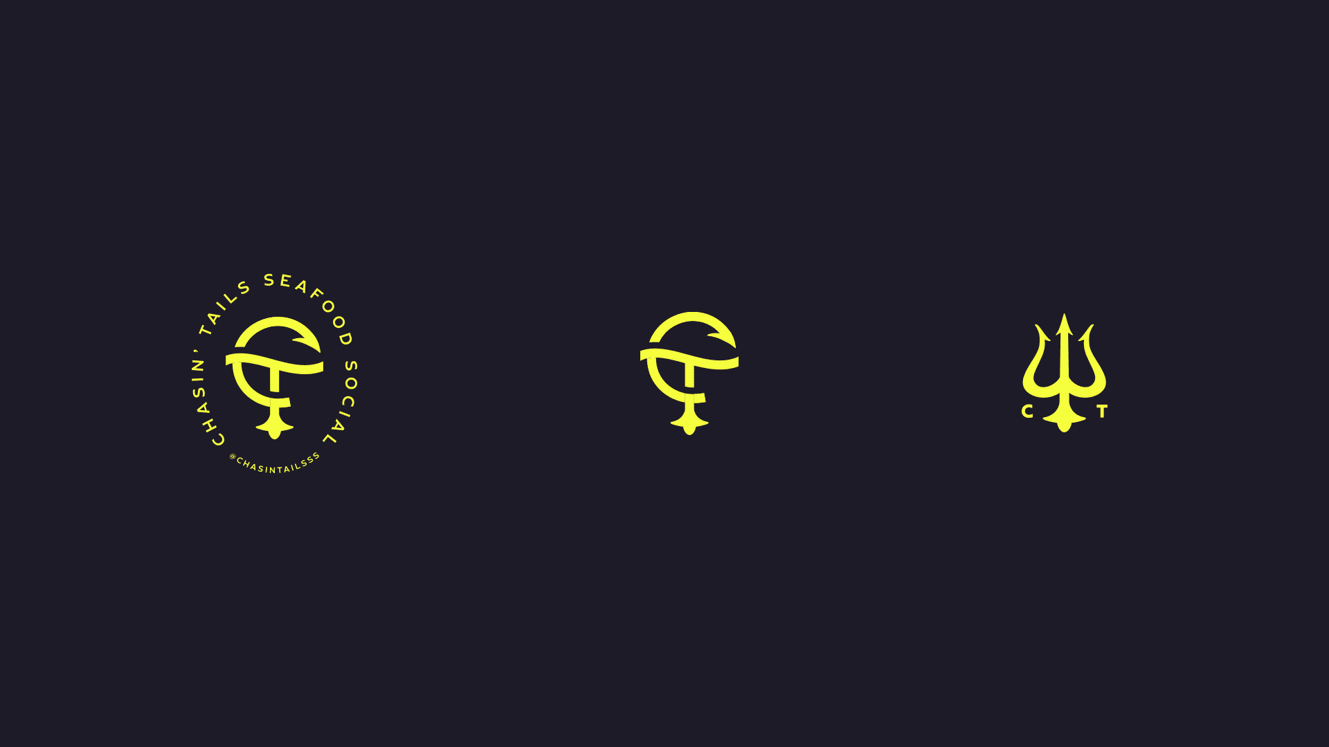
Up to this point, Chasin’ Tails had two identity iterations in market. The first was a highly campy and cartoonish look fronted by a cartoon crawfish. That was minimally replaced by a more nautical, poker-chip-inspired seal logo design and identity suite that sought to make the brand more serious. However, neither nailed the alluring, awesome, and energetic traints necessary to fully own the brand’s strategy.
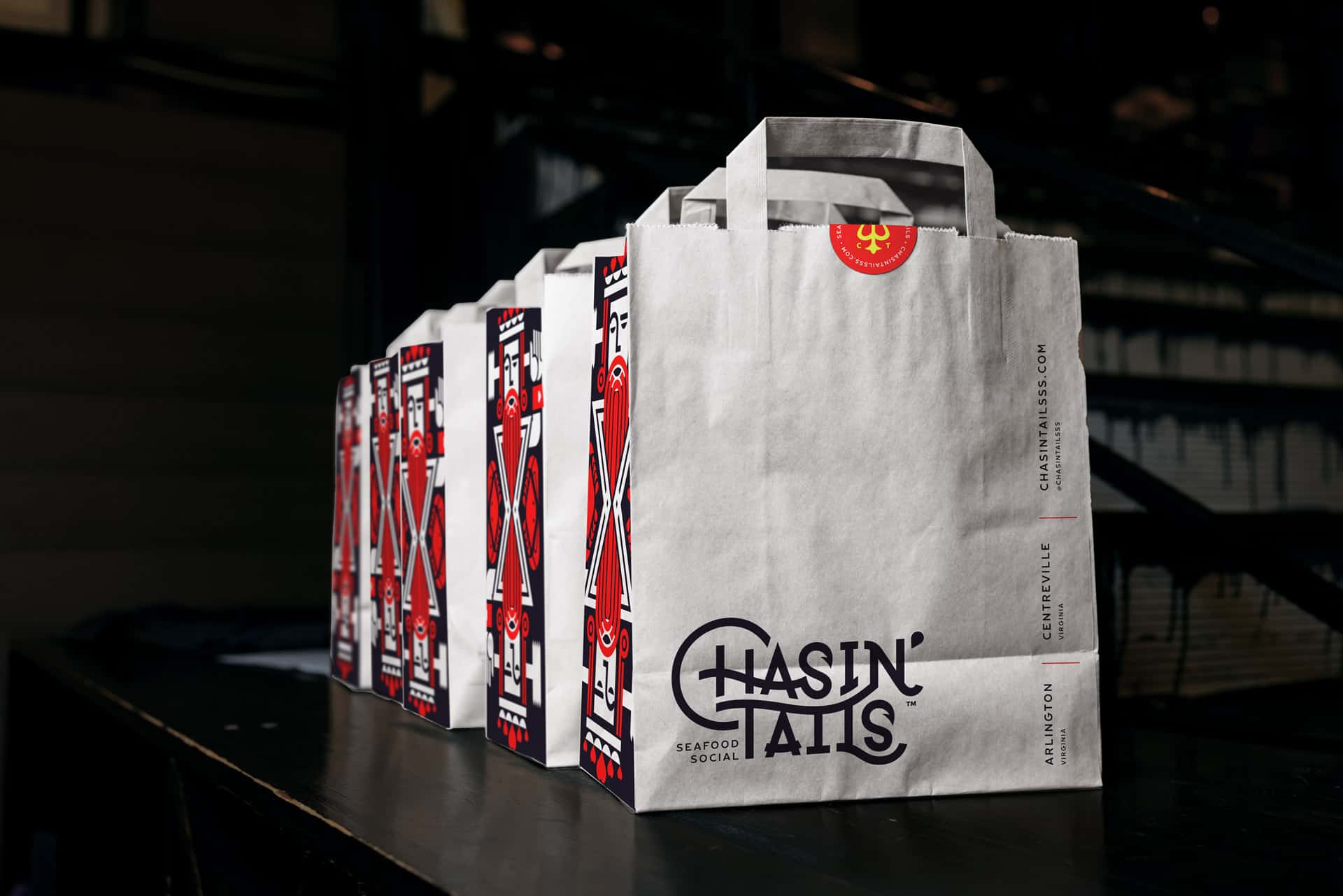
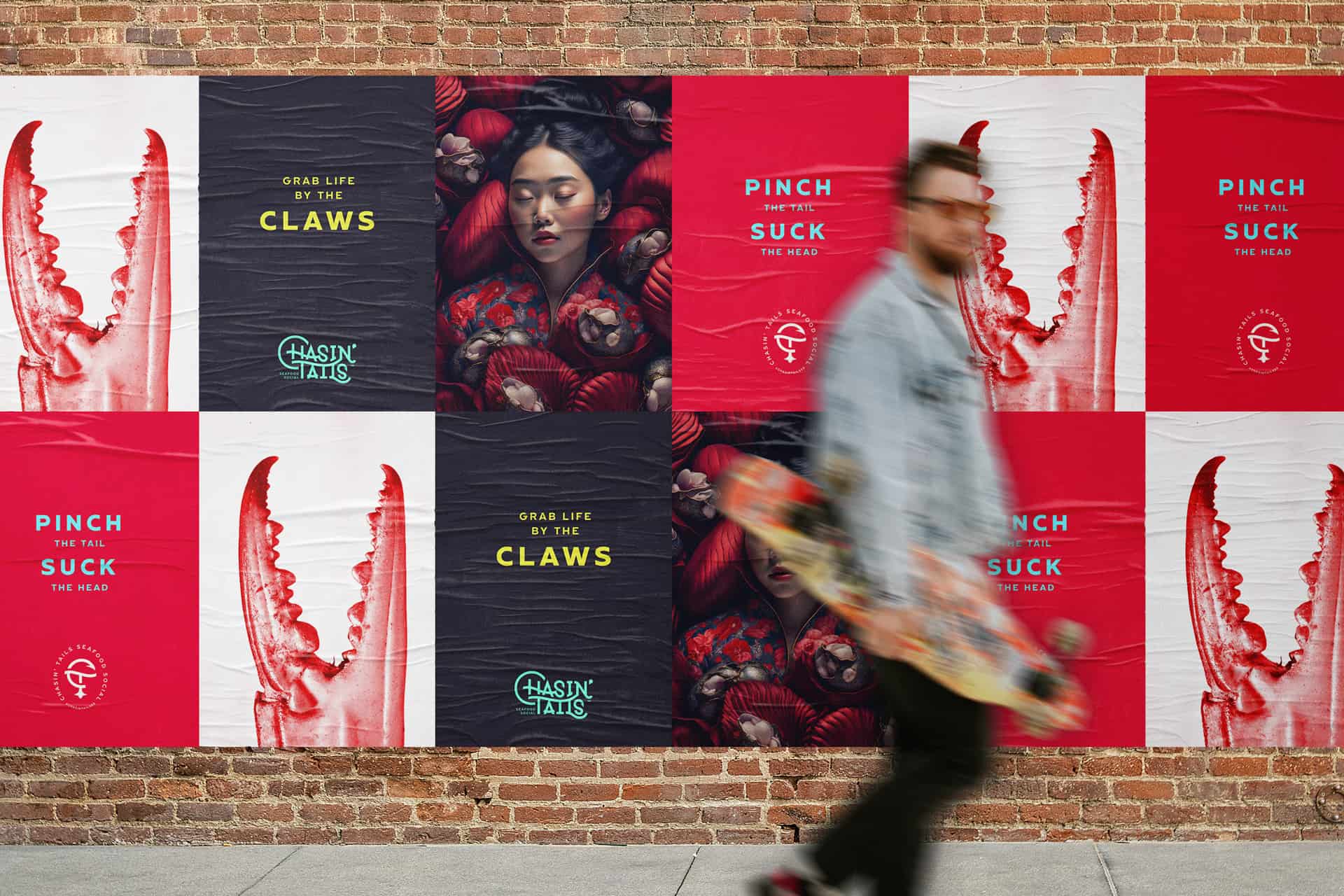
Multiple paths were explored using the Personality traits and moodboards as driver. The selected direction was a customized typeface that integrated subtle seafood iconography. Letterforms comingled and merged with others to create a cephalopodic, noodlelike innuendo while reinforcing a sense of upscale luxury.
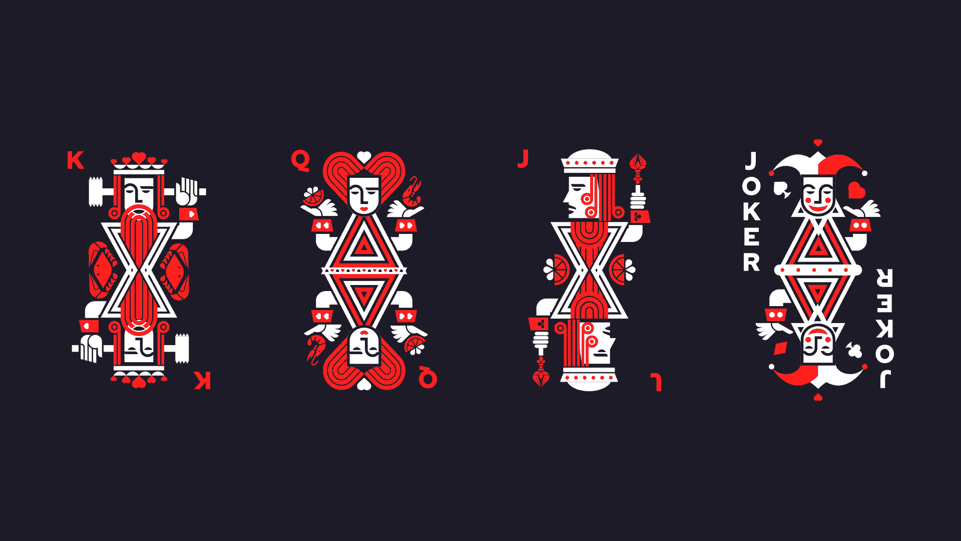
The new logo design was accompanied by a suite of iconography and custom illustrations depiciting the royal family found in playing cards. The poker-inspired iconography led to the creation of highly geometric and intricate pattern design that established a classic wallpaper effect to be used in the interior design.
A strong, confident sans-serif typeface with an array of weights was selected to serve as the core brand typography. Coupled with awesome imagery that pushed the photography into the surreal and moody, the typography, iconography and imagery alike created the foundations for a totally unique brand identity. One that effectively positioned the brand away from all competition.
Menu Design
Chasin’ Tails’ menu design was highly photographic and did not stand up to the level of quality and sophistication necessary to communicate the brand’s updated strategy. We introduces menu holders that were easily cleaned and durable, while injecting a level of awesome unexpected by guests. The holders were crafted from fluorescent acrylic and engraved to achieve a glowing effect because of the light refracting properties of the material.
The menu inserts were laid out using the new typography and graphic elements in a way that optimized effective placement of popular and profitable menu items. The menu layout was a simple bi-fold layout that was efficient and effective.
Restaurant Website Design
Ancillary to the four walls experience is the website experience. Oftentimes the website is the first stop when evaluating a restaurant experience, and with a newly evolved brand and experience, we knew the Chasin Tails website had a big story to tell.
Conversion points were identified and the site was optimized to maximize those metrics. The new website focused on guiding visitors through the Chasin Tails experience, first and foremost. Booking parties was the secondary focus, and ordering online the third. Telling the deeper story meant more pages with rich content that would help the site realize stronger search engine results as a byproduct. Therefore, the site’s structure was built around the content to ensure visitors would quickly understand and categorize Chasin Tails in their minds.
With a moody color palette as the base, pops of fluorescent colors from the brand’s newly rejuvenated palette became even more powerful and impactful. Large, gorgeous photography of the products were integrated and styled in a high-contrast, vibrant look to add an artful touch.