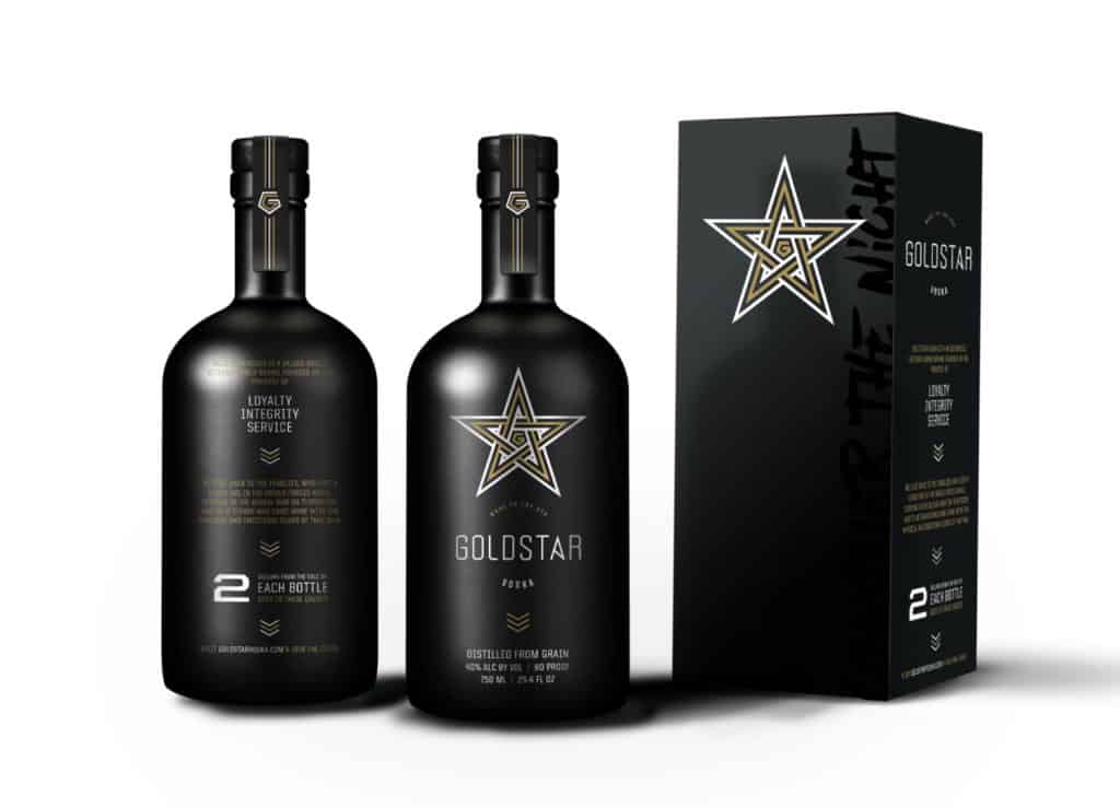
An Army Ranger was on a mission to elevate the positioning and style of his startup vodka brand. With a focus on giving back, and doing good for Gold Star families, this brand was already getting the attention of national publications. Vigor was tasked with crafting the positioning and brand identity for their first national advertisement.
Location
Year Completed
Team Size
Services
Challenges
- Create a look that told the brand’s story of military tradition, without breaching the subject of mental illness
- Refine existing brand into a unique, professional look that would compete on the same level as larger brands
Insights
The vodka market is rampant with all sorts of brands, but none so dedicated to the well being of armed forces as Gold Star Vodka. Most brands lean on the clarity of liquid to showcase the purity of the offering, but Gold Star doesn’t sell based on quality. The liquid speaks for itself. Instead, the brand needed to own their stance on giving back to our soldiers and their families, while establishing a gritty persona that would connect with the masculinity.
Solution
Although tasked with creating an ad specifically for Playboy magazine, our team was inspired by the brand and it’s founder. After assessing the brand’s identity and packaging design we could see there was a need to elevate the look to better tell the story.
Our solution started with a custom typographical treatment and a new approach to the “gold star.” The new star is a Celtic inspired knot that nods to the founder’s roots while communicating the brotherhood of Army Rangers and other armed service people.
The angular typography informed other typographical decisions, while traditional armed forces iconography and imagery informed the overarching design aesthetic. For the packaging, this aesthetic is seen in it’s purest form where the strong typography is designed over the gunmetal black bottle.
The slogan, “Conquer the Night” was crafted to instill the sense of attitude for the quintessential Gold Star man. It’s chock full of swagger and style without being flashy and over the top. It’s confident and makes no excuses. “Conquer the Night” became the underlying driver of inspiration for the advertisement which ran across numerous issues of the renowned publication.
