Location
Year Completed
Team Size
Services
Finding a new current for the brand
The name “Harry & Sons” was well known by older audiences, but had some potential issues attracting younger markets. After a detailed survey in the neighborhood and surrounding areas, the choice to move to Oceanwave was the clear choice.
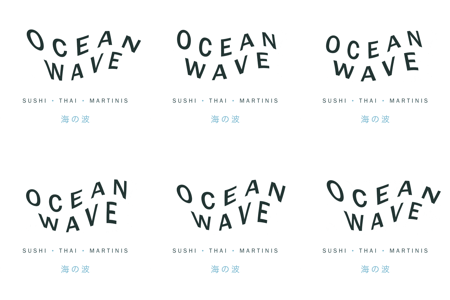
Vigor, inspired by the ocean, designed an identity that would effectively communicate the brand’s level of culinary and beverage expertise. This modern interpretation of Asian fusion supported and complimented the new interior design while establishing a unique visual language that informed every touchpoint from print through digital.


Rejuvenated by oceanic inspiration and modern japanese aesthetic
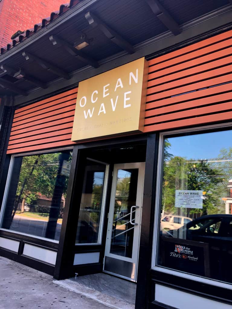
OceanWave’s updated identity came to life across the various touchpoints including menu suite, website, and facade design. Vigor’s creative direction was inspired by colors of the ocean and specifically the hamachi, or Yellowfin Tuna. Combined with a reserved, modern design aesthetic inspired by Japanese style, the brand created a contemporary vibe that correlated to the newly renovated interior ambiance.
American and Japanese were successfully melded with one-liners and the introduction of Japanese characters throughout the design. This established OceanWave’s authenticity and positioned it as unique when compared to other sushi restaurants.
