Asian fusion cuisine meets American Barbecue smokiness in this new fast casual/QSR concept. Collaborating with the client team behind the concept, we were able to craft a brand identity that communicates the unique vibes from each culture. This melting pot approach to the visuals, communications, and concept is a true expression of the American Dream.
Location
Year Completed
Team Size
Services
Challenges
- Design an identity that communicates both core cultures: Chinese and Southern American.
- Create uniqueness that’s worth talking about in market
Key Insights
Melding the two cultures using design cues created many opportunities to pull on commonly known icons. We had to make certain to side step any Communist iconography that is inherently tied to popular Chinese visuals, and create connectivity with Americana. Simply graphically designing the standard issue touch points, the need to craft something memorable was prevalent.


A melding of Asian and American cultures
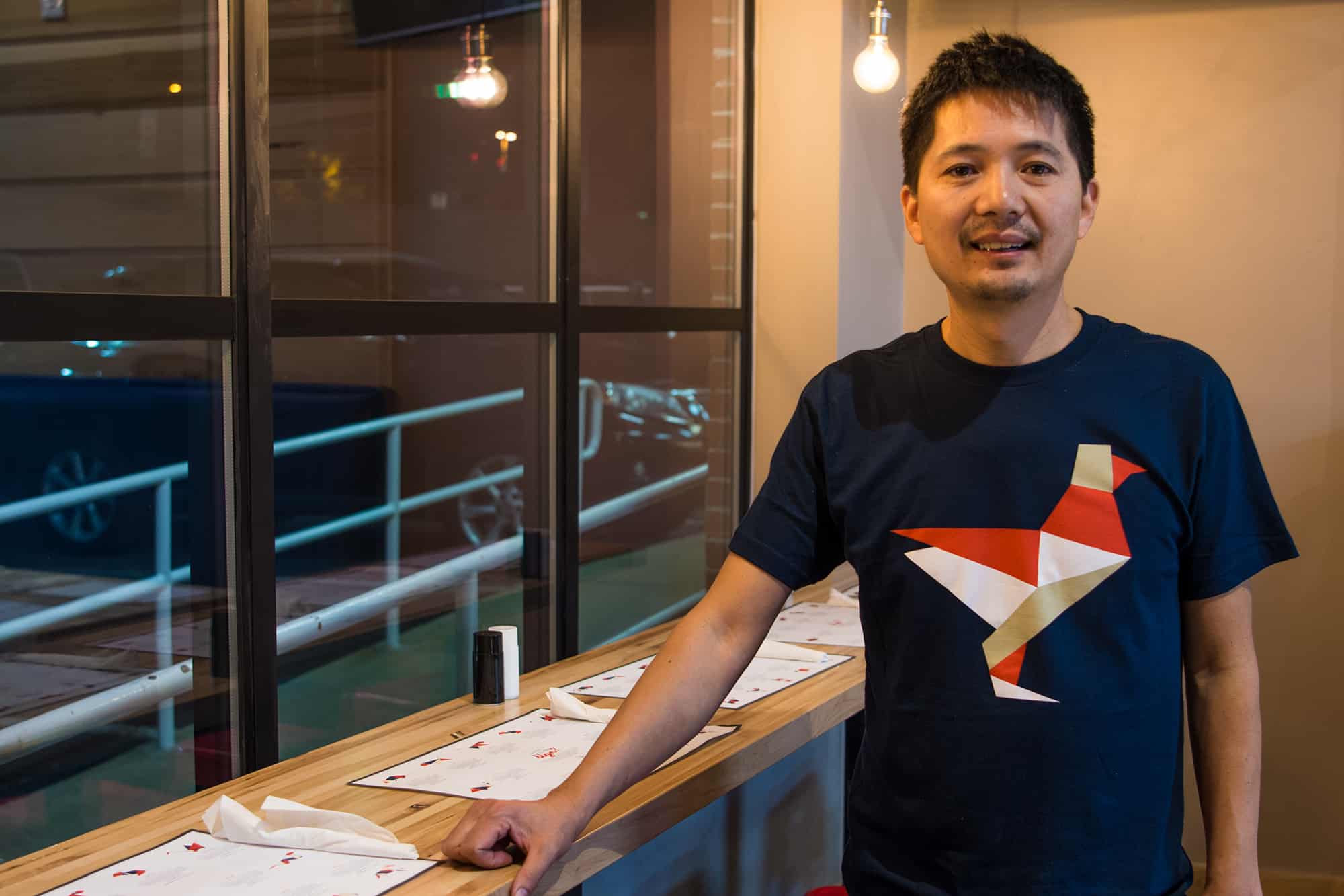
We started by approaching the items commonly found at your standard issue Chinese restaurant. Zodiac placemats seemed to offer a unique opportunity for modernization and Americanization.
Furthermore, the introduction of unique participation-driven thinking across the print materials upgraded a typical menu into something worth talking about. The takeout menu’s design was created to be easily folded into an origami crane – a classic symbol of hope and healing.
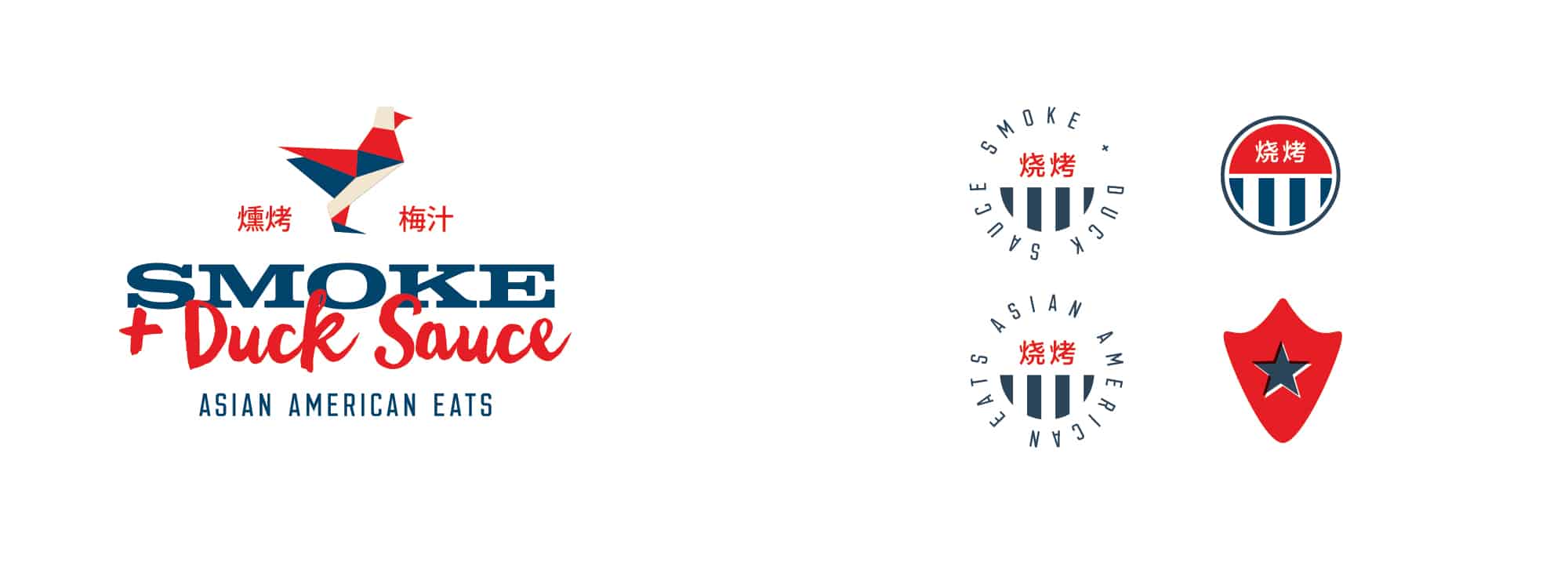
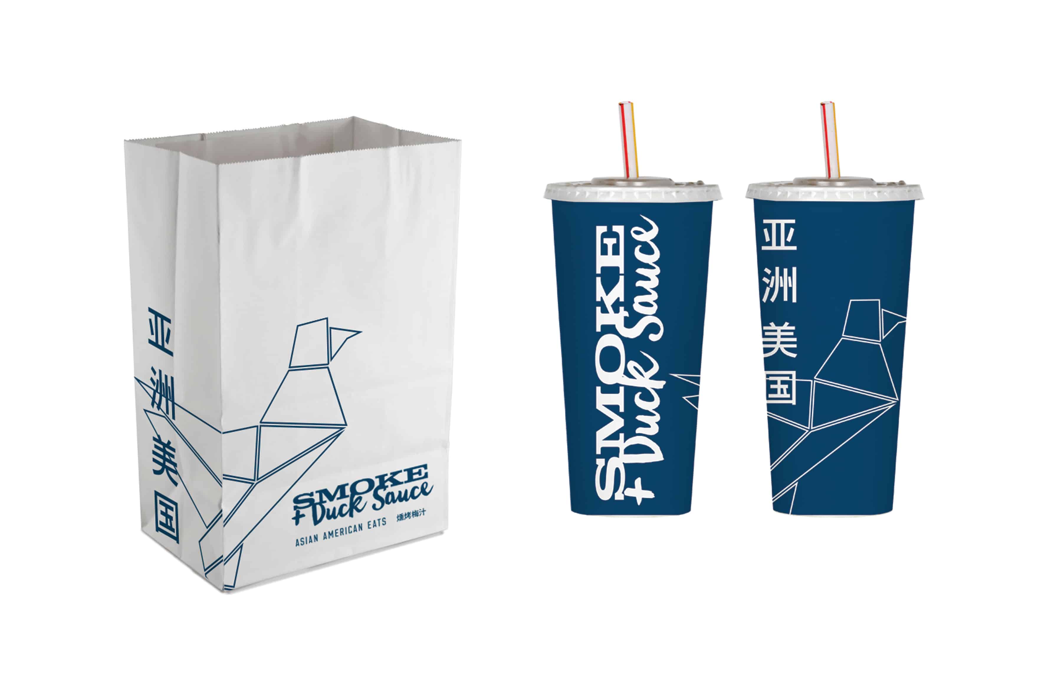
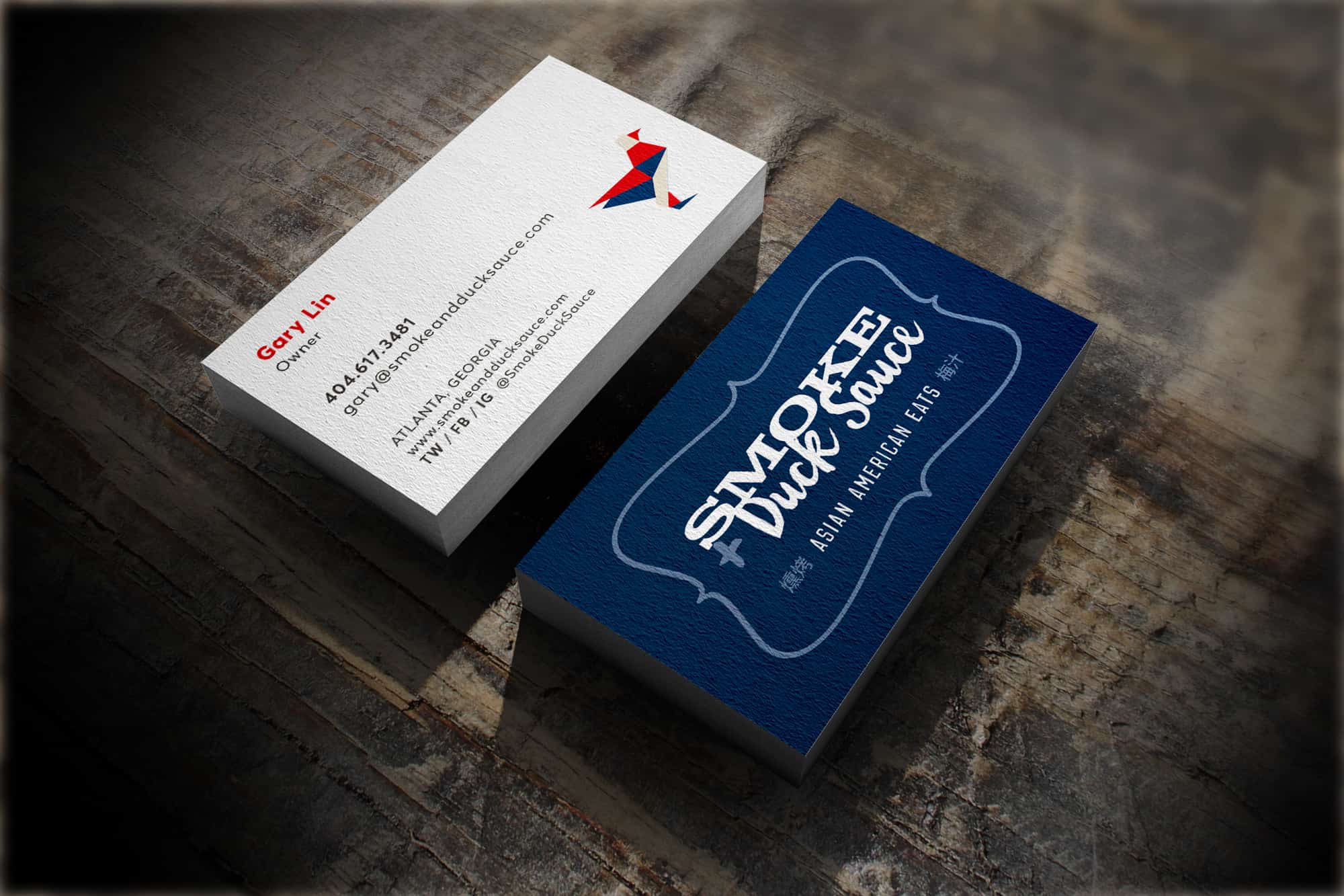
The brand identity pulled influence from chinese ink and rice paper character design and textures offset by strong woodcut inspired typography. Both type treatments are vastly different, yet mix quite well which subtly communicates the food’s inspiration.
Finally, the identity is spearheaded by an geometric duck meant to mimic the style of origami. This unforgettable mark influenced the design aesthetic across other touch points, especially the design of each zodiac animal on the placemats.
Strong reds, blues and beiges came together to communicate the colors of both cultures to complete the brand’s essence throughout each experience.

