
After the fall of NYC’s famous ramen concept, the owners had a new vision and challenge: to craft an authentic café experience as found in the Naples region of Italy. They tapped Vigor with a short timeframe and vision of bringing Italian street food to life in manhattan.
Although Italian food is quite common on the streets of NY, authentic Italian experiences are a lot fewer. When you strip away the “fuhgeddaboudit” pizza and pasta joints, you’re with very little in the way of true Italian. The financial district is well traveled so they know what a real European experience looks, feels and sounds like. Therefore, taking our cues from what exists in Napoli today, would read perfectly well in the city of New York.
The restaurant’s focus was clear and there were plenty of reasons to believe its driving passion. However, nothing had been done in market to start telling the story.
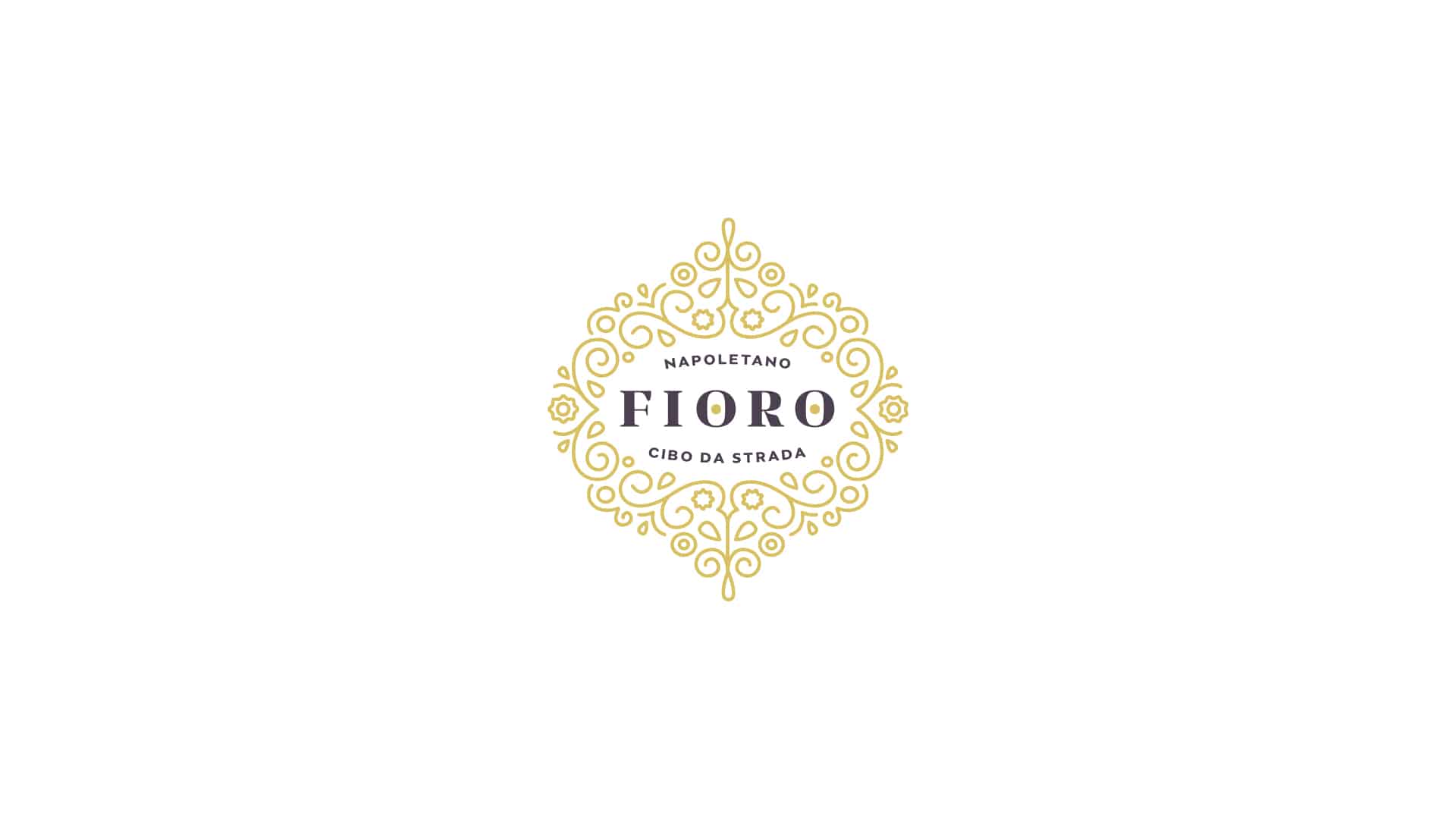
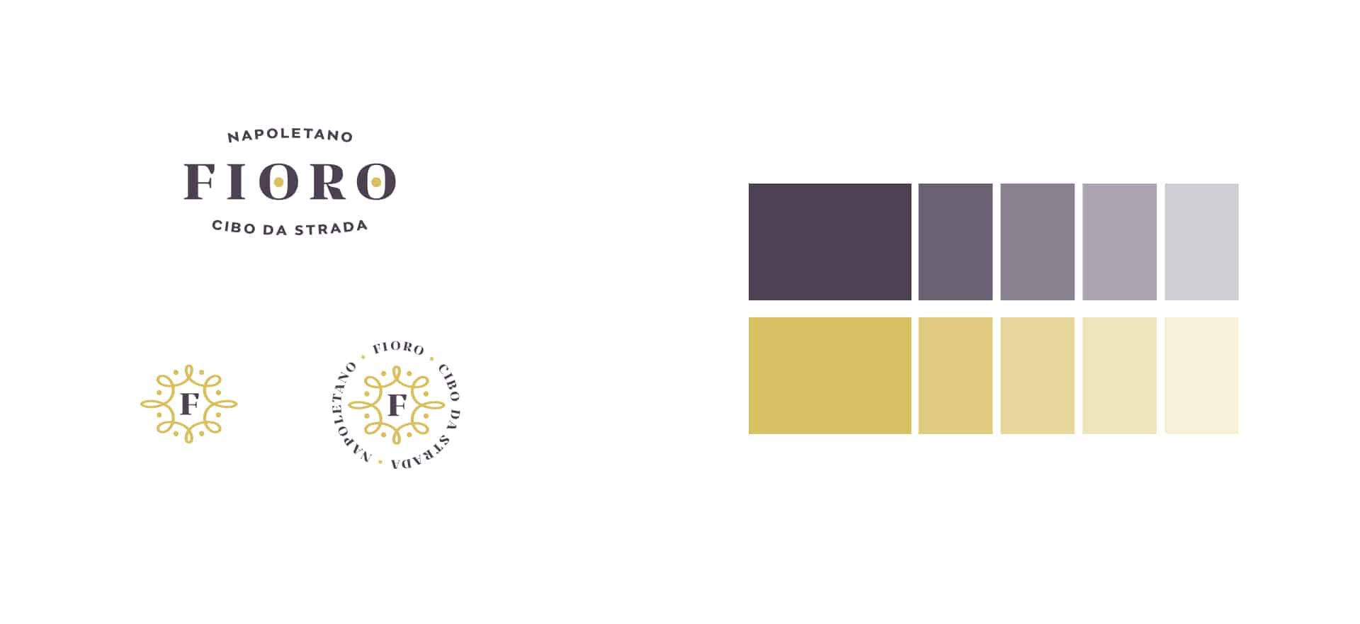
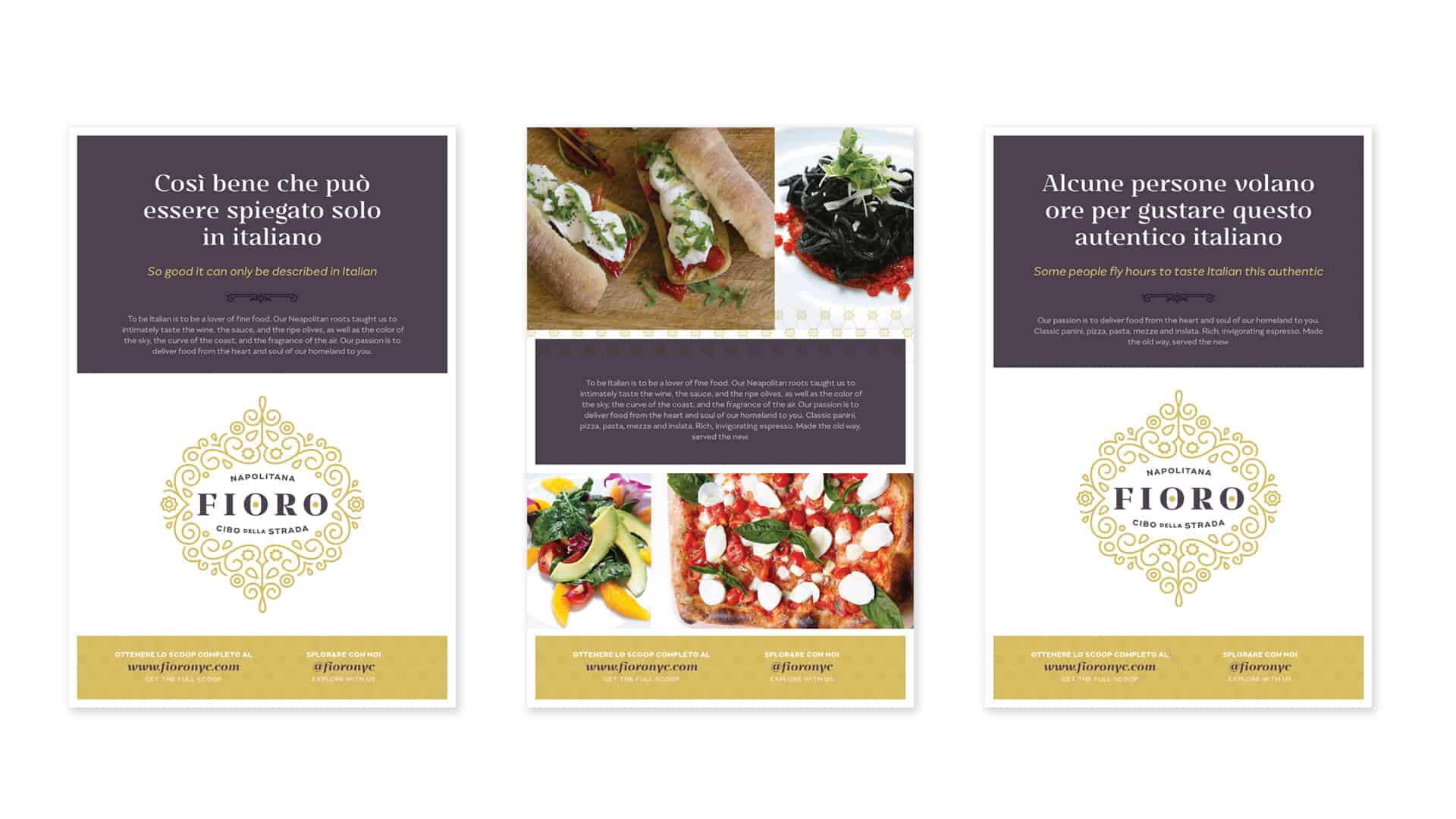
The name “Fioro” is a portmanteau of two Italian words: Fiore and Oro (flower and gold.) This name was a metaphor for the uniqueness of this experience, and it also informed the design aesthetic.
We pulled inspiration from art nouveau and other classic art movements to create an identity with gold floral filigree as the defining characteristic. Strong, serif typography would help carry the brand’s visual direction by giving a feeling of authenticity with an honest, no-nonsense direction.
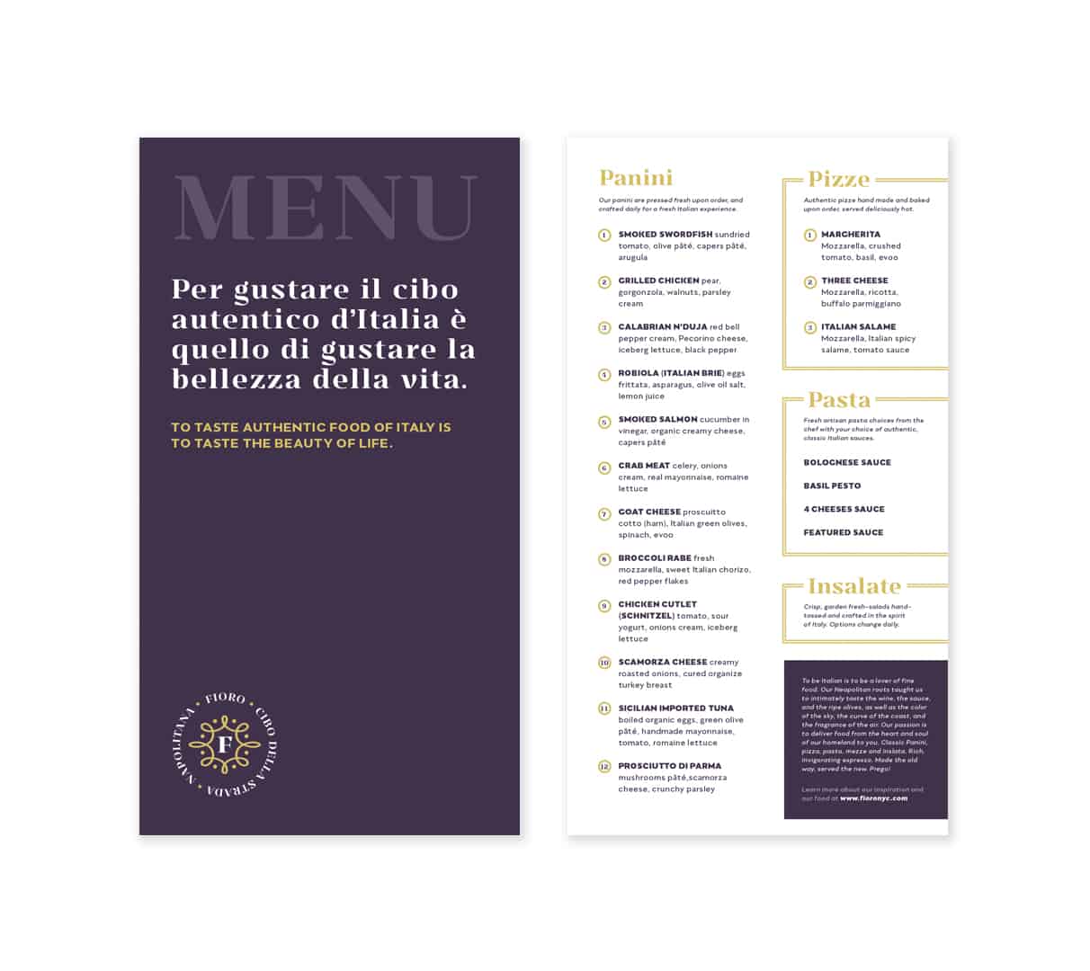
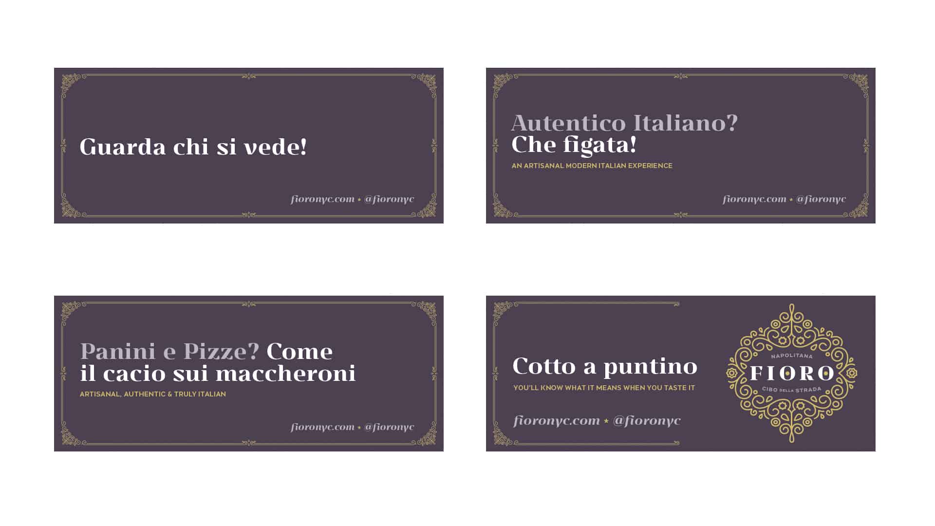
Marketing touch points for the restaurant introduced common and uncommon Italian into the visual vernacular of the market. The idea being that a restaurant this delicious and genuine could only be explained in its native tongue. This bi-lingual idea carried through the rest of the touch points for the brand inside and outside the four walls.
Sign up for branding and marketing insights and get our expertise delivered to your inbox.
"*" indicates required fields