Craft cider had yet to hit the St. Louis area. An ambitious man from the area dreamt of creating the city’s first ciderworks. With a passion for cider, and a glint of hope, the founder of Brick River Cider tapped the Vigor team to bring the vision to life.
Location
Year Completed
Team Size
Services
Building the foundations of a new cider brand
At the time of engagement, the cider brand-to-be had no name, logo, or strategy. Our initial efforts were able to extract the essence driving the founder’s passions. It was all about reconnecting to the roots of our cities. That’s found in the farmlands surrounding urban areas. There is a symbiotic relationship between urban and rural areas that has been lost through time especially in the cider industry. Most larger cider brands source their apples from China and other countries making them definitively un-local.
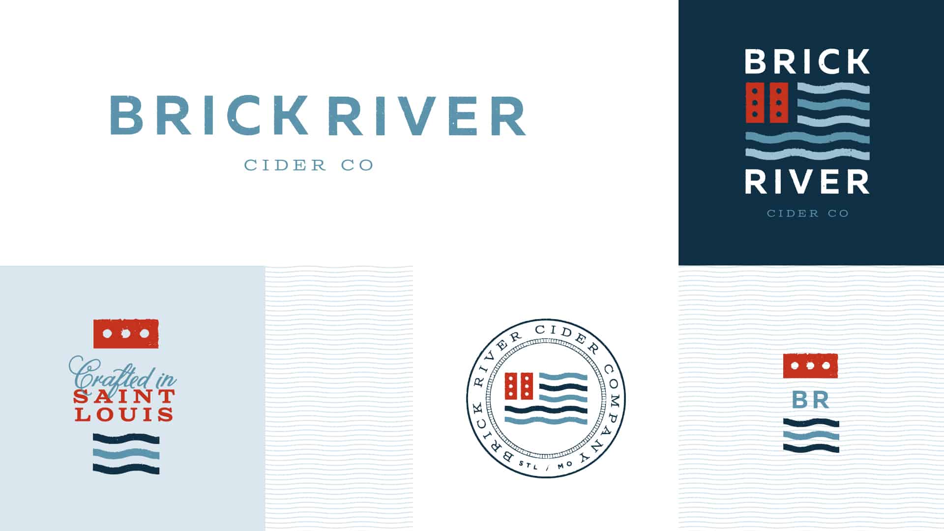
That passion fueled the thinking for the name and initial logo designs. “Brick River” is a metaphor for classic roads that link the city to its roots. It’s a nod to the ciderworks’ home of St. Louis, lovingly nicknamed the “Brick City.” And it pays homage to the great American river that meanders through her, the Mississippi.
Brick River’s logo continues to reinforce the passion for the American Dream with a patriotic influenced design. It’s a direct visual representation of bricks and waves of a river, but positioned in a way that nods to the American flag.
Pressing out the rest of the brand
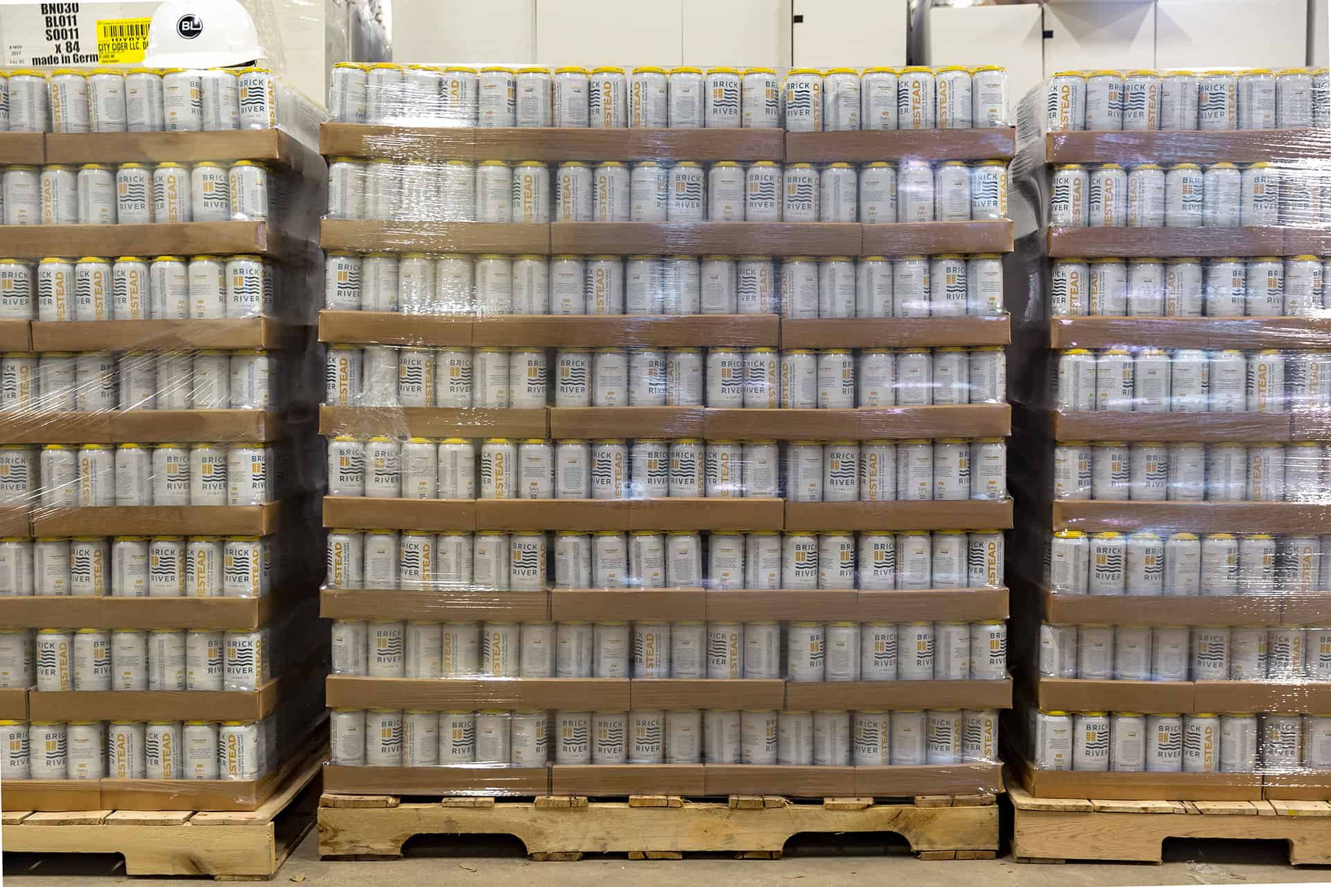
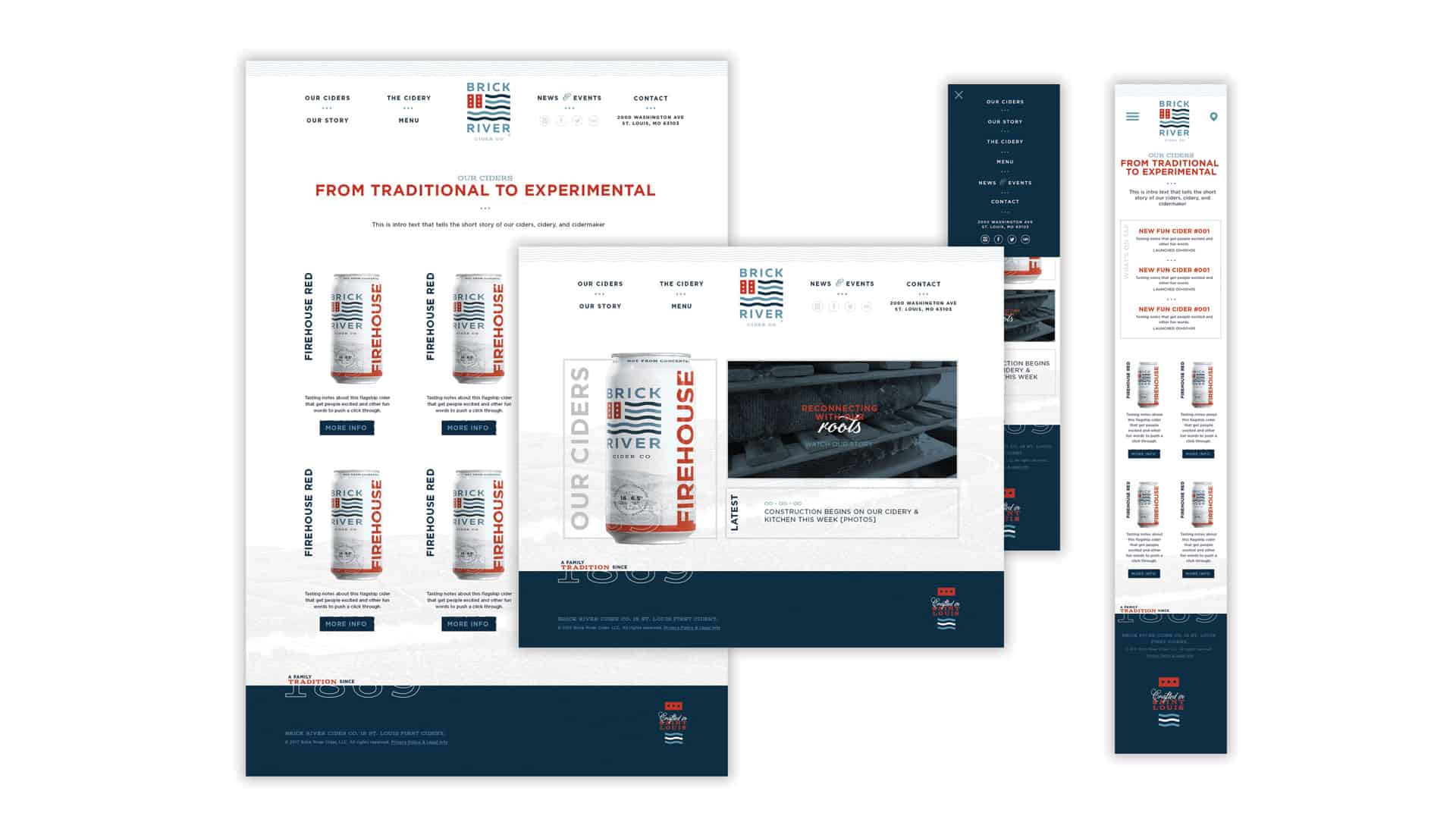
With Americana as the focus we designed numerous touchpoints that drove the story forward. The ciderworks’ packaging and tap handles were the most important elements of focus since they’d lead the charge with retail and brand awareness.
We introduced a woodcut/scratchboard style illustration of a non-descript midwestern city surrounded by rolling hills of farms and orchards, flanked by a beautiful river. This illustration’s classic style helped reinforce the roots-focused brand.
Combined with classic typography that dared to mix three different styles, the packaging and touchpoints created an overarching visual brand narrative that’s unique to the craft cider industry where apple imagery dominates.
