Sweetening the moment for an Arizona fast food staple
eegee’s QSR restaurant rebranding
Home » Projects » eegee’s QSR restaurant rebranding
In 2019, Vigor and eegee’s met for the first time. eegee’s (always lowercase) was a hyper-local QSR with 25+ units—all in Tucson, Arizona. A year later, eegee’s is breaking all-time sales records and planning an aggressive expansion in Phoenix for 2021.
What happened in the middle is a great example of how Vigor can reinvigorate brands that have history, essence, and fans, but lack the strategy, creative, and marketing muscle needed to unlock their full potential.
From our discovery workstreams came a collaborative definition of the brand’s purpose, its unique position in the market, its data-supported patron, and the unique personality we’d express to connect with them. Using that foundation as a lens, we were able to effectively evaluate the eegee’s identity was was currently in play.
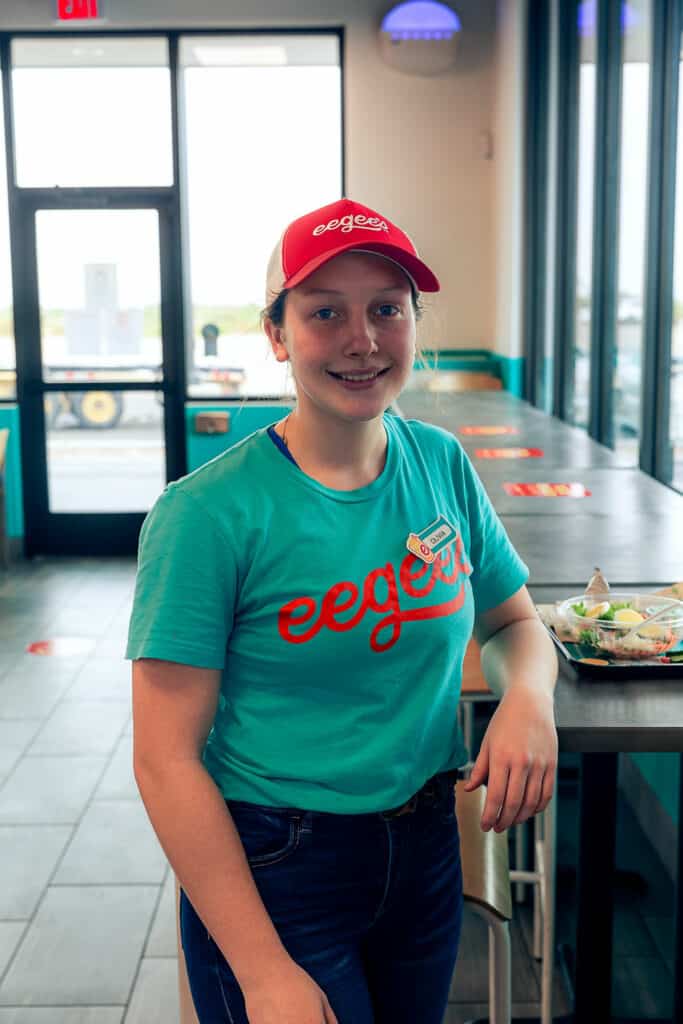
eegee’s, although a beloved staple in the Tucson market, was simply not living up to its true nature: fun-loving, chilled out, and kind of quirky. The brand’s identity (above) was a mishmash of styles that felt more like a gas station than an offbeat QSR. From the core identity elements like the logo and mark through interior touchpoints, eegee’s was begging to realize its purpose of sweetening the moment.
With the critical platforms in place, Vigor got to work at evolving the brand’s visual and verbal identity, and the full on experience from top to bottom.
Re-imagining the brand's visual identity
Fueled with insight and passion from the strategy, and informed by surgically-precise market surveys, Vigor built a visual language that fully expressed what makes eegee’s the offbeat, warm, easygoing brand that Tucsonans had loved for over 40 years. Starting with the core logo’s typographic restructure, Vigor brought to the brand’s essence to reality.
The result was a brand that patrons in growth markets could learn to love much more quickly. All of this was accomplished during two transitions in eegee’s marketing leadership, with Vigor providing a common thread during these transitions.
Sweetening up the experience
Next, Vigor led the complex process of updating the various touchpoints—from experiential through menus through packaging—that eegee’s patrons interact with every day. During this design phase, Vigor leveraged deep F&B industry knowledge by reviewing menu data and helping to establish prioritization of the product mix.
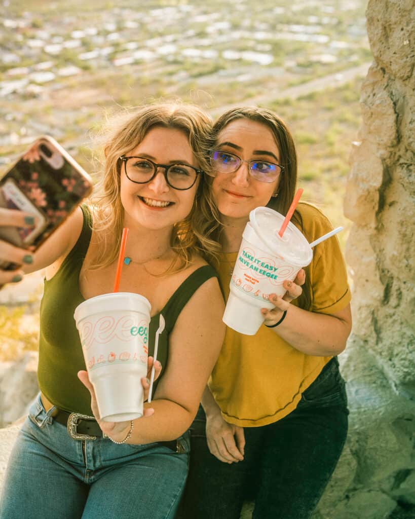
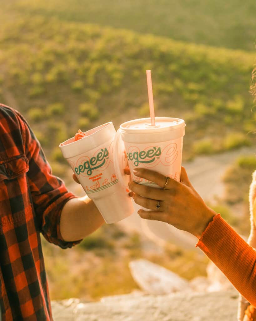
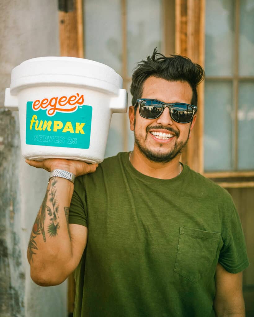
We approached the packaging as another means of establishing a cohesive brand experience. From iconic fry containers through the wraps for eegee’s sub, we established a more robust visual identity that communicated this brand’s vibe.
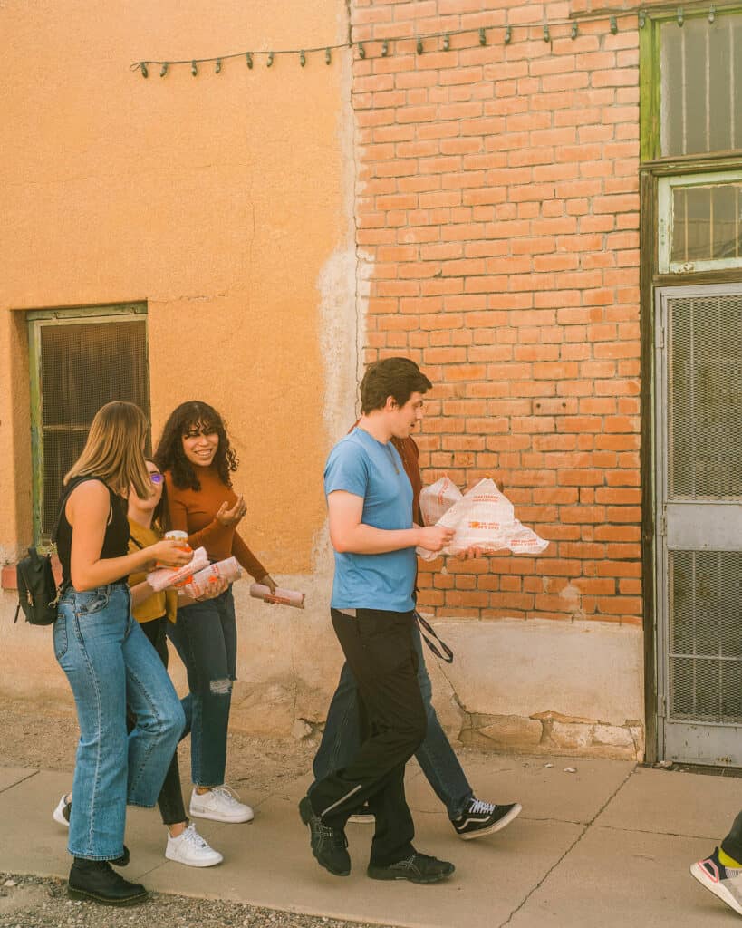
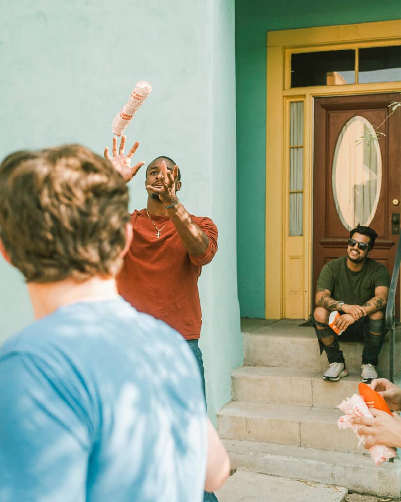
Immersed in Instagrammable moments and offbeat vibes
As we finished up the core elements of the brand, the Vigor and eegee’s teams turned our sights to the first unit to adorn the new look. In collaboration with architectural partners, we crafted the best-in-class eegee’s prototype. That prototype informed the finalization of the design to launch next (shown above.)
From the interiors through exterior, Vigor focused in on the Patron’s journey and various need states to optimize the experience. When a Patron was in an ordering needstate, we established clear promotional areas. When they were in a dining experience, we created a physical space that projected the eegee’s personality traits in a non-promotional way.
The most notable elements of the interior design was the hero wall where we created glory around the eegee’s mantra: take it easy, have an eegee. This wall was primed for Instagram moments.
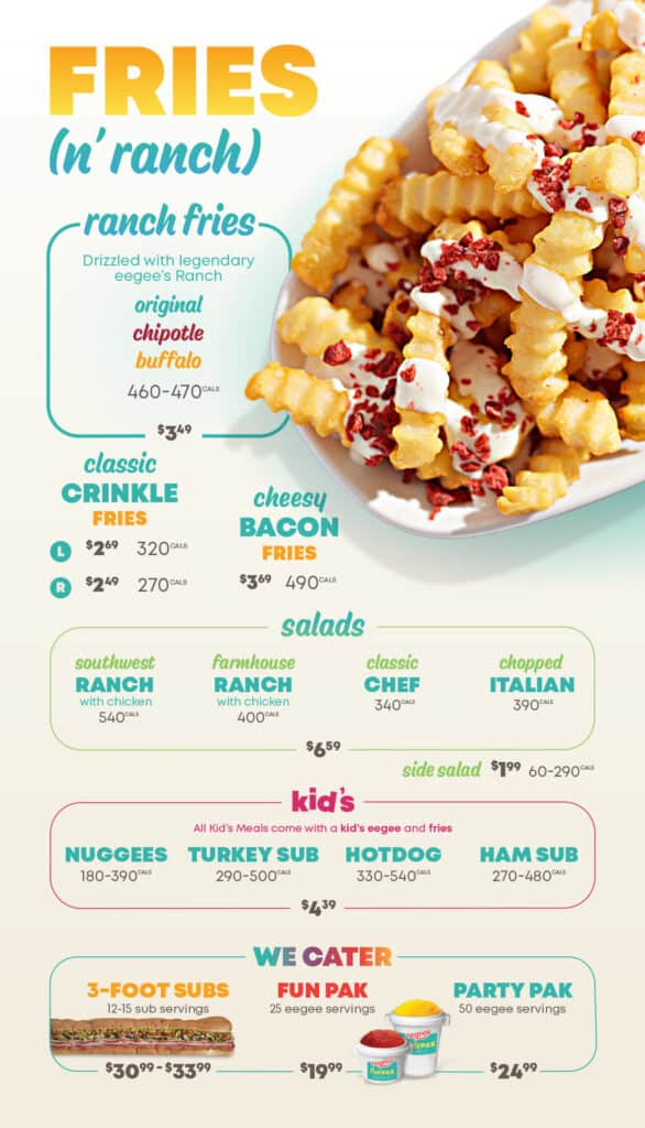
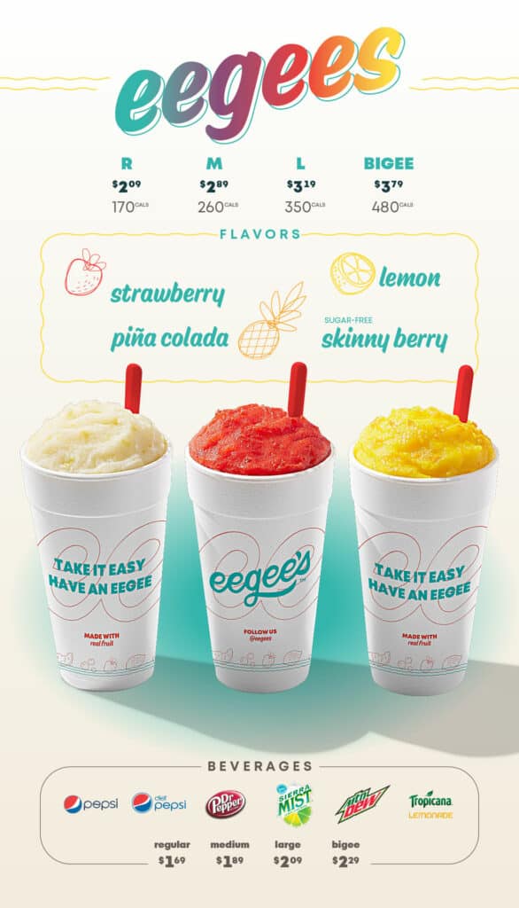
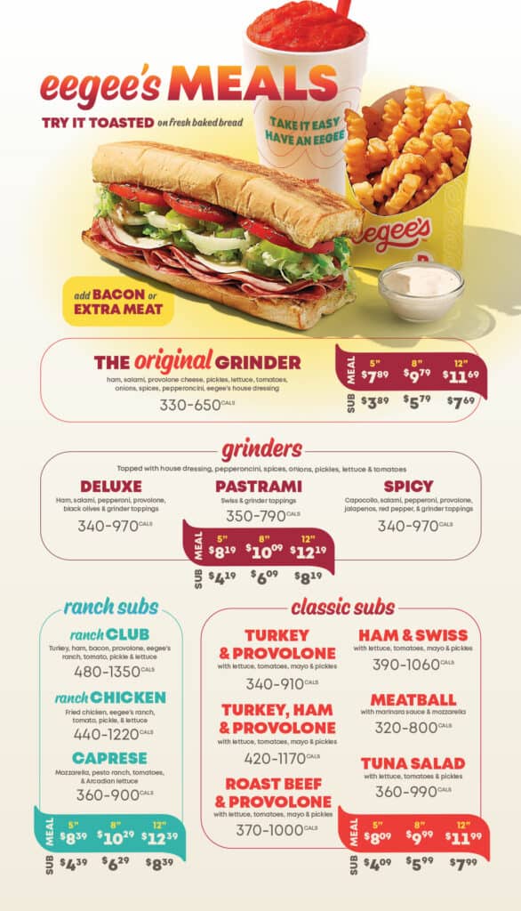
A menu optimized for speed and maximized for revenue
The final piece of the puzzle was to redesign the menu systems. Most importantly was the menu for the drive through experiences. But this effort was no easygoing walk in the park.
After a deep dive into the data, Vigor was able to identify clear indicators of what was working and what was sinking the experience. We came back to the team with a plan for engineering the menu to optimize for speed, and maximize the revenue.
From that strategy we redesigned the menu to be a full expression of the new eegee’s identity and personality. The results were more than the eegee’s and Vigor teams could’ve imagined which sparked a full roll out across the network. A large leap from the apprehensions that were prevalent at the start of the initiative.
Results
eegee’s new look and experience launched into the market during the COVID-19 pandemic. Despite this major set back, the brand’s new location broke all company sales records from opening onward. The new menu systems saw a measurable increase in revenue which was not aided by any price increases or shifts in costing.
New prototype design
more than previous sales record
+0%
Menu engineering and redesign
Increase in sales at unit level
+0%
Vigor brought a fully collaborative process to the table where they leveraged data, profound industry experience and expertise to guide this team and brand to the next level.
This website uses cookies to improve your experience. We'll assume you're ok with this, but you can opt-out if you wish. Cookie settingsACCEPT
Privacy & Cookies Policy
Privacy Overview
This website uses cookies to improve your experience while you navigate through the website. Out of these cookies, the cookies that are categorized as necessary are stored on your browser as they are as essential for the working of basic functionalities of the website. We also use third-party cookies that help us analyze and understand how you use this website. These cookies will be stored in your browser only with your consent. You also have the option to opt-out of these cookies. But opting out of some of these cookies may have an effect on your browsing experience.
Necessary cookies are absolutely essential for the website to function properly. This category only includes cookies that ensures basic functionalities and security features of the website. These cookies do not store any personal information.
Any cookies that may not be particularly necessary for the website to function and is used specifically to collect user personal data via analytics, ads, other embedded contents are termed as non-necessary cookies. It is mandatory to procure user consent prior to running these cookies on your website.