
The landscape of the mall foodcourt has changed leaving brand struggling to grasp at anything to remain competitive. Great Wraps was no exception and through years of an ad-hoc p-mix strategy and brand identity redesigns, the brand faced obsolescence. Vigor was charged with repositioning the brand from product through identity and environmental experience.
Before jumping into the offering and the visual communications, we had to establish the new face of the mall foodcourt audience. By engaging in live observation and intercepts, coupled with secondary market research, we were able to get a finger on the pulse of the audience and their behaviors. What we found was a cost conscious consumer set who desired true value without sacrificing flavor. When reviewing the brand’s current product mix, it was easy to see that value was drastically lacking, and the flavors were misaligned with the audience’s desire. Great Wraps’ menu was an ad hoc collection of “whatever will sell” leaving it with no uniformity and no easy to way categorize in the consumer mind.
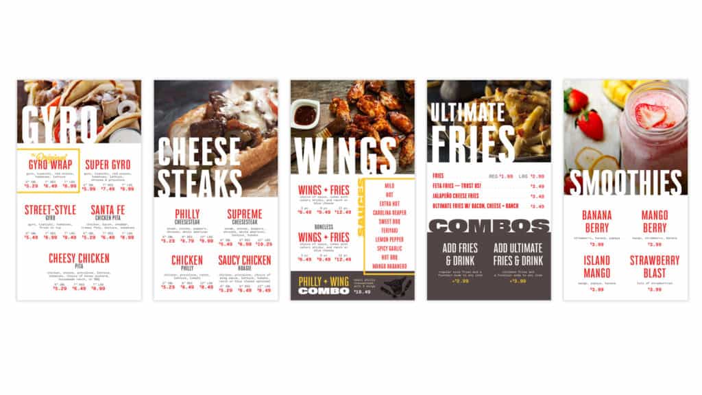
To remedy the misalignment and confusing offering, we made a series of menu mix adjustments with the focus of “street food.” This allowed for flexibility in product mix with underlying “cool factor” benefits.
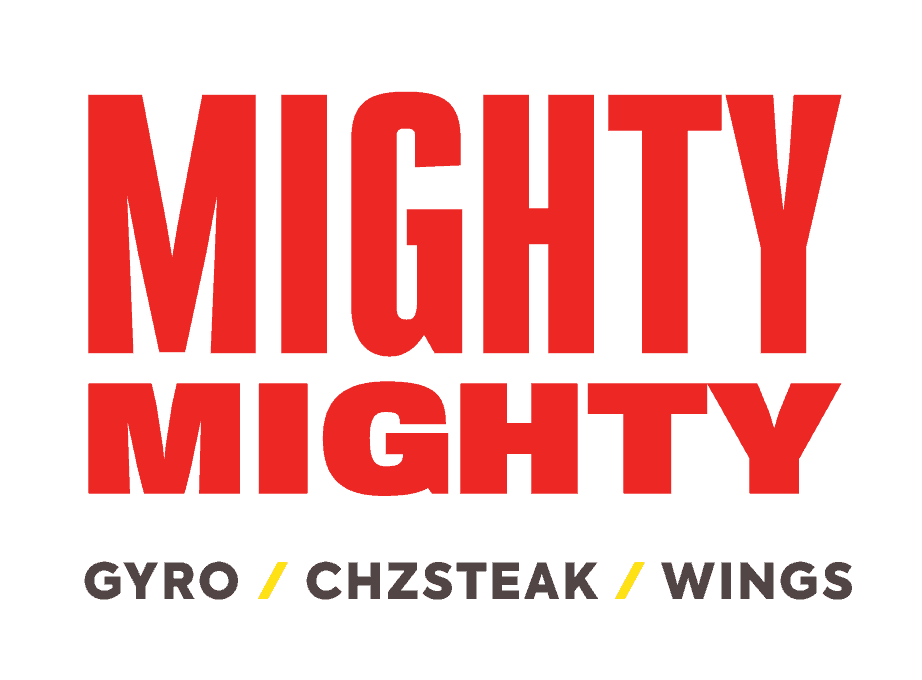
The next focus was to adjust the brand to one that was actually attractive to the market. We had to create something that reflected a bit of their lifestyle and attitude in a way that made a statement. Our suggested solution was a renaming from “Great Wraps” to Mighty Mighty.
Mighty Mighty instantly communicated attitude while establishing the beginnings of a tone of voice the brand could own in market. The entire identity was built upon the Mighty Mighty mantra of big food and big flavor which tapped the audience’s true desires.
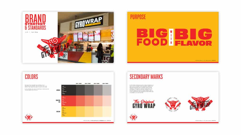
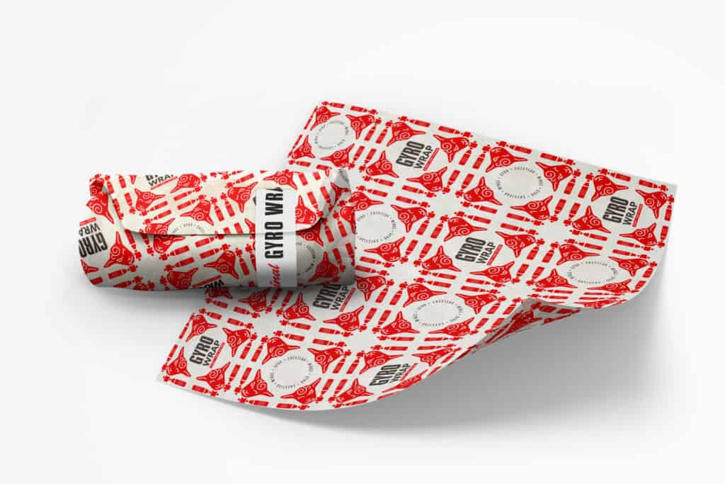
The environmental component used raw materials with unexpected injections of color and typography to create a street-style, semi-irreverant visual tone. A snarky, mischievous lamb became the brand’s spirit animal and mark. This was a depiction of our attitude and a nod to the core product on the menu: the gyro. This lamb was quickly adopted by the company and named “Mighty Mike.”
Strong, bold typography was selected for in-your-face headlines that allowed the brand’s marketing to shout. Supported by a monospace type, this suite of typography families furthered the vibe of devil-may-care attitude.
As the space was in construction, the company ran into some snags with the new name. Due to pre-existing contracts, a rename was not an easily implemented tactic. Rather than revert back to Great Wraps, we collectively decided to reclaim the original brand name, Gyro Wrap.
Gyro Wrap had a cult-like following at one time in Georgia, and it pinned our number one menu item front and center. The logotype treatment for Mighty Mighty was altered to suit the Gyro Wrap name, and Street Food Kitchen underscored a broad, yet well categorized offering to the public.
Gyro Wrap was relaunched in March of 2018.
Sign up for branding and marketing insights and get our expertise delivered to your inbox.
"*" indicates required fields