Crafting a multi-cultural culinary brand experience
PanaNova fast casual restaurant rebranding
Home » Projects » PanaNova fast casual restaurant rebranding
With an injection of investment capital, a single unit fast casual brand sought to embark on a rapid growth trajectory. Before the journey could begin, the restaurant had to address crucial issues with its name, identity, and brand as a whole. Together we evolved the restaurant’s components to create a fully baked concept primed for successful growth.
Location
Myrtle Beach, South Carolina
Year Completed
2017
Team Size
Vigor 5 / Client 4
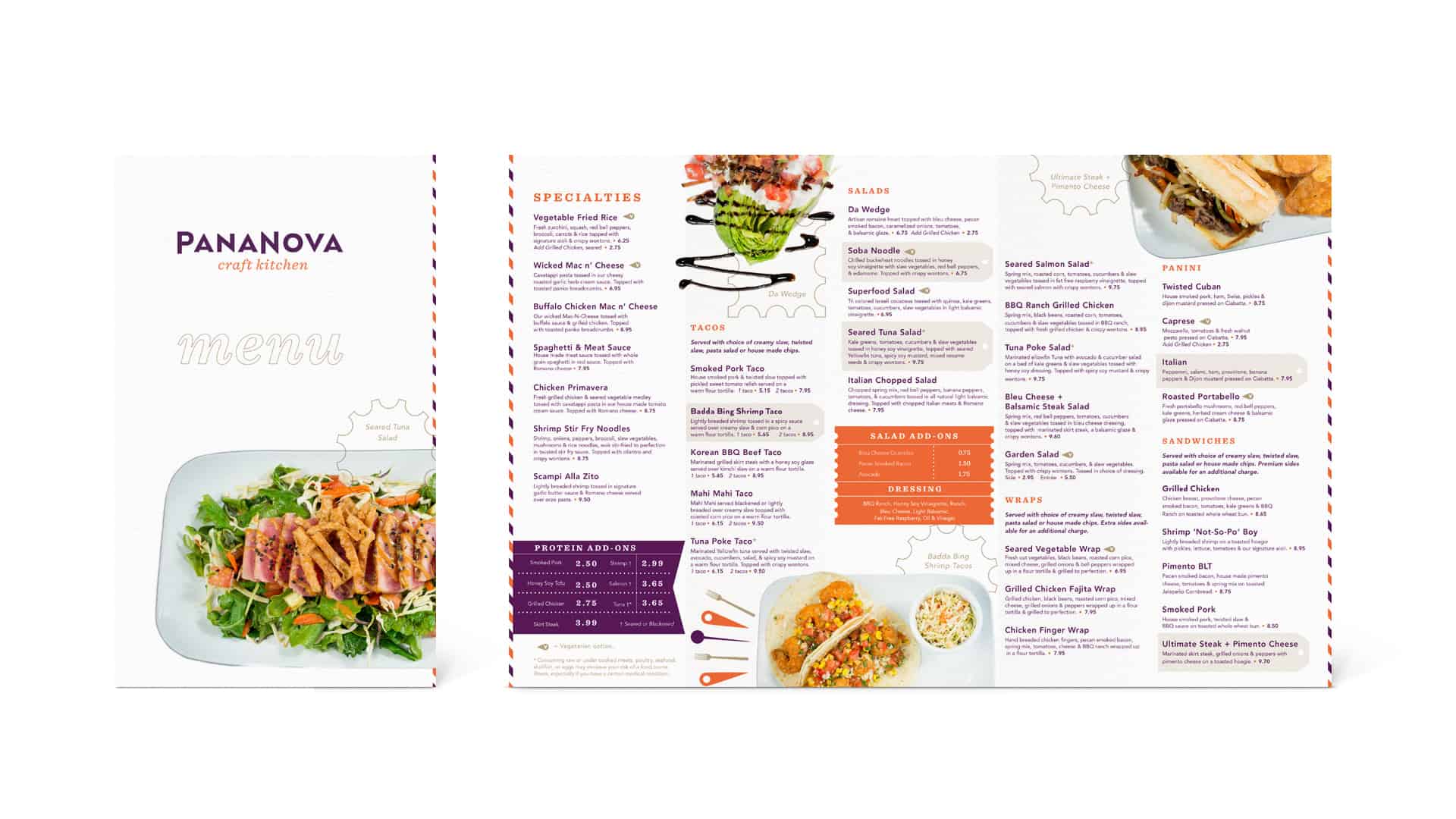
Services
Brand Strategy, Concept Development, Narrative, Naming, Identity Design, Menu Systems, Wayfinding/Signage, Culinary/Beverage Consulting, Campaign Creative, Art Direction
Building a more amazing restaurant brand
Z’s Amazing Kitchen had successfully planted itself in the North Myrtle Beach area. Built on a vast menu inspired by a multitude of cuisines, and a passionate focus on customer service, the concept had positioned itself for growth. However, the name and the logo created numerous critical issues with regard to readability and legality.
Through research and brand development processes, Vigor was able to identify what made Z’s a successful and unique concept. It was the uncompromising approach to food, service, and new ideas. They had a vast menu but executed it fantastically. Their personality was charming and genuine. These truths lead to the creation of their brand name – a Latin-based portmanteau of “pana” and “nova.”
“Pana” means “all, or everything.” “Nova” means “new.” Combined they create a sense of the Mediterranean with an air of mystery and fascination. This highly memorable and legally ownable name set the table for a new identity that would capture their audience’s attention and hearts.
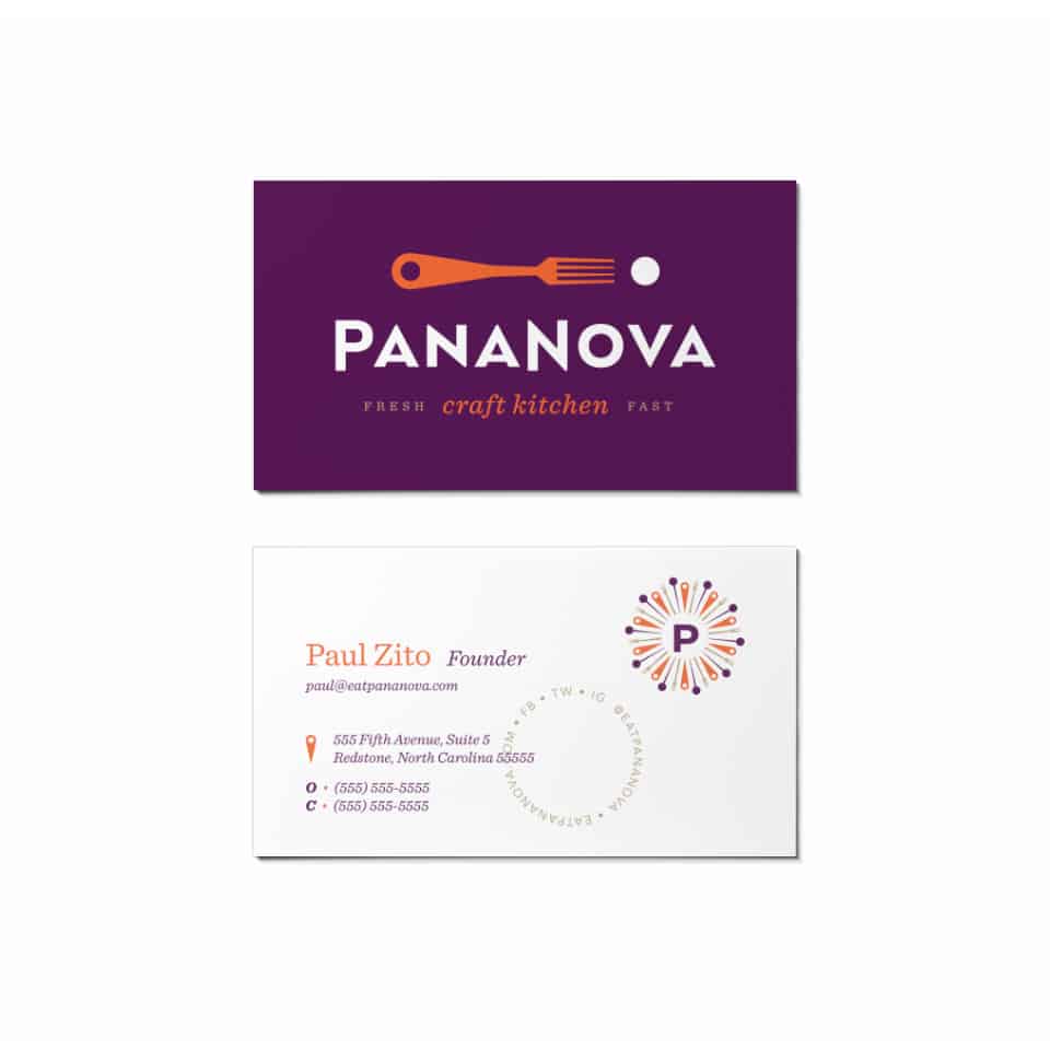
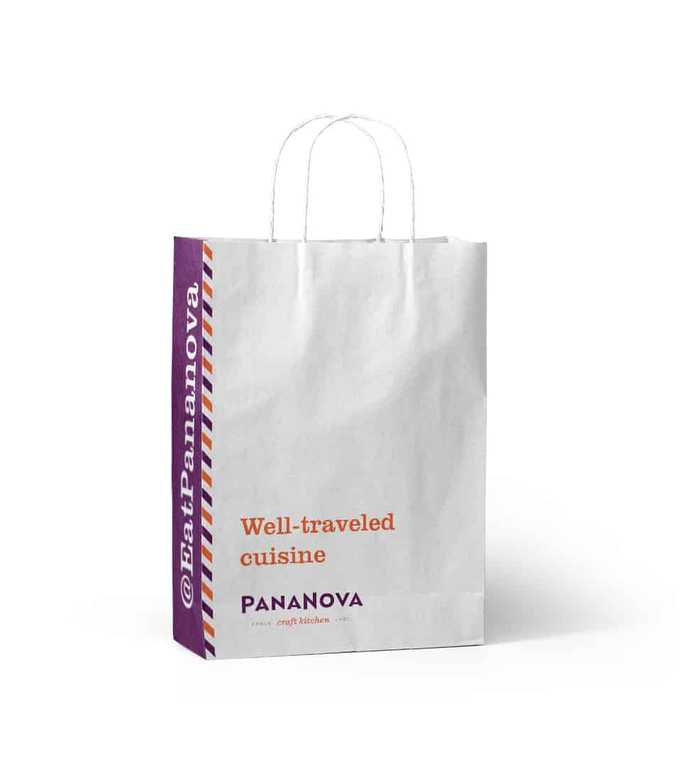
A well-traveled brand
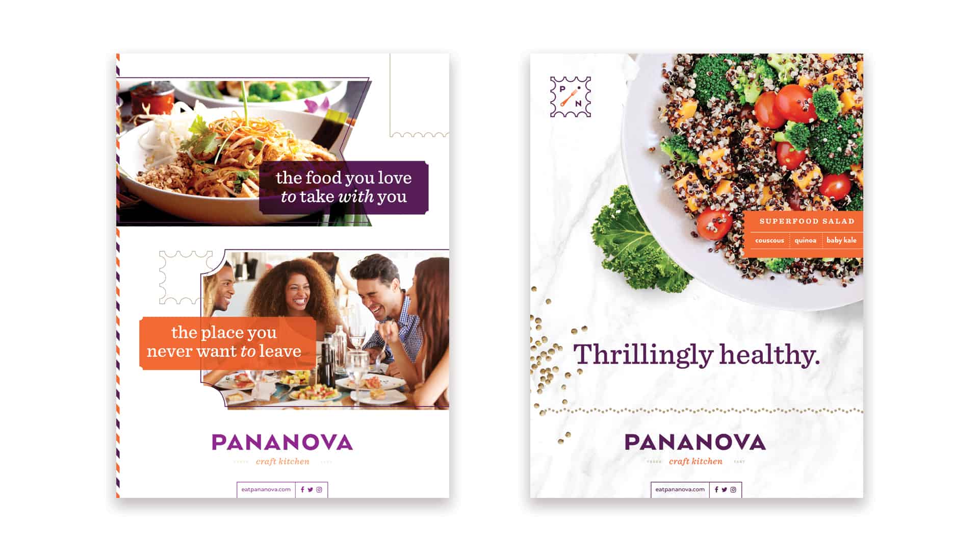
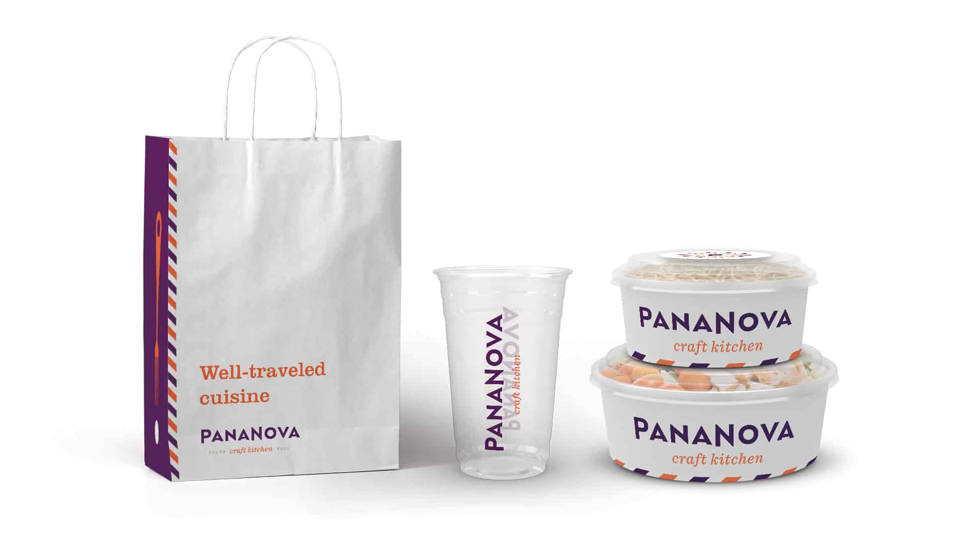
With the restaurant’s brand strategy in place and a new name set in stone, Vigor took to crafting an identity that would tell the deeper story. Inspiration was found in classic travel and correspondence mainstays.
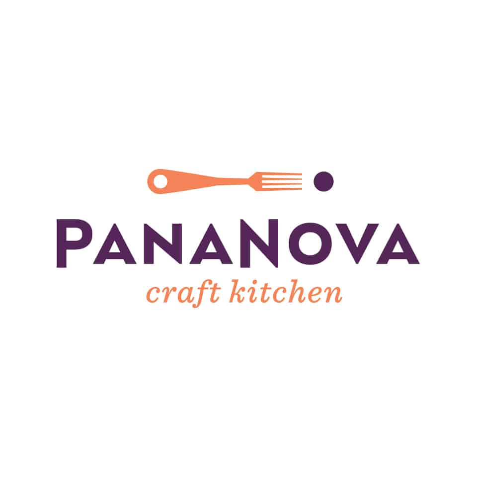
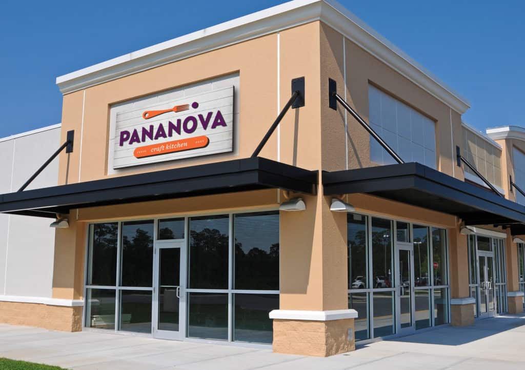
The core brand mark derived from a digital map pin melded with a fork. The addition of the dot served as a metaphor for a morsel of food while creating an exclamation point to symbolize the surprisingly vibrant flavors and experience. The brand typography was crafted from an art-deco era typeface which shares the era of human flight becoming a tangible luxury.
Secondary marks and graphic elements helped create a visual language based on travel and correspondence devices. From stamps to luggage tags, the shapes create a fun set of graphic elements that allow the brand to build and grow from touchpoint to touchpoint.
The color palette is a representation of regality and vibrant warmth. These colors were pulled directly from superfood ingredients like aubergine, wild caught salmon, and quinoa.
This website uses cookies to improve your experience. We'll assume you're ok with this, but you can opt-out if you wish. Cookie settingsACCEPT
Privacy & Cookies Policy
Privacy Overview
This website uses cookies to improve your experience while you navigate through the website. Out of these cookies, the cookies that are categorized as necessary are stored on your browser as they are as essential for the working of basic functionalities of the website. We also use third-party cookies that help us analyze and understand how you use this website. These cookies will be stored in your browser only with your consent. You also have the option to opt-out of these cookies. But opting out of some of these cookies may have an effect on your browsing experience.
Necessary cookies are absolutely essential for the website to function properly. This category only includes cookies that ensures basic functionalities and security features of the website. These cookies do not store any personal information.
Any cookies that may not be particularly necessary for the website to function and is used specifically to collect user personal data via analytics, ads, other embedded contents are termed as non-necessary cookies. It is mandatory to procure user consent prior to running these cookies on your website.