Location
Year Completed
Team Size
Services
Hooking into the deeper meaning
In fact, the brand’s identity was a cluttered hipster-style design template that did little to portray the unique purpose and attributes of SlapFish. Furthermore, the brand’s tagline of “modern seafood shack” missed the mark on positioning the brand in the consumer’s view.
Once we dug into the nuances of SlapFish, it became clear where they were truly unique. Their passion for sustainability as an ideal, not just a marketing ploy, was baked into the entire concept starting with its founder, Andrew Gruel. When pressed to discuss the concept, Gruel gets passionate with a bit of well-deserved anger towards brands that claim sustainability but don’t deliver. It was from this emotion we found the brand’s true passionate purpose: Honest Flippin’ Seafood.
Honest suggests that others aren’t creating a sense of trust and transparency for the brand. Flippin’ has a double meaning: quite literally a live fish which ties to the name, and a “safe” play on a commonly used curse word giving the brand a much-needed edge.

Shoring up the chaos
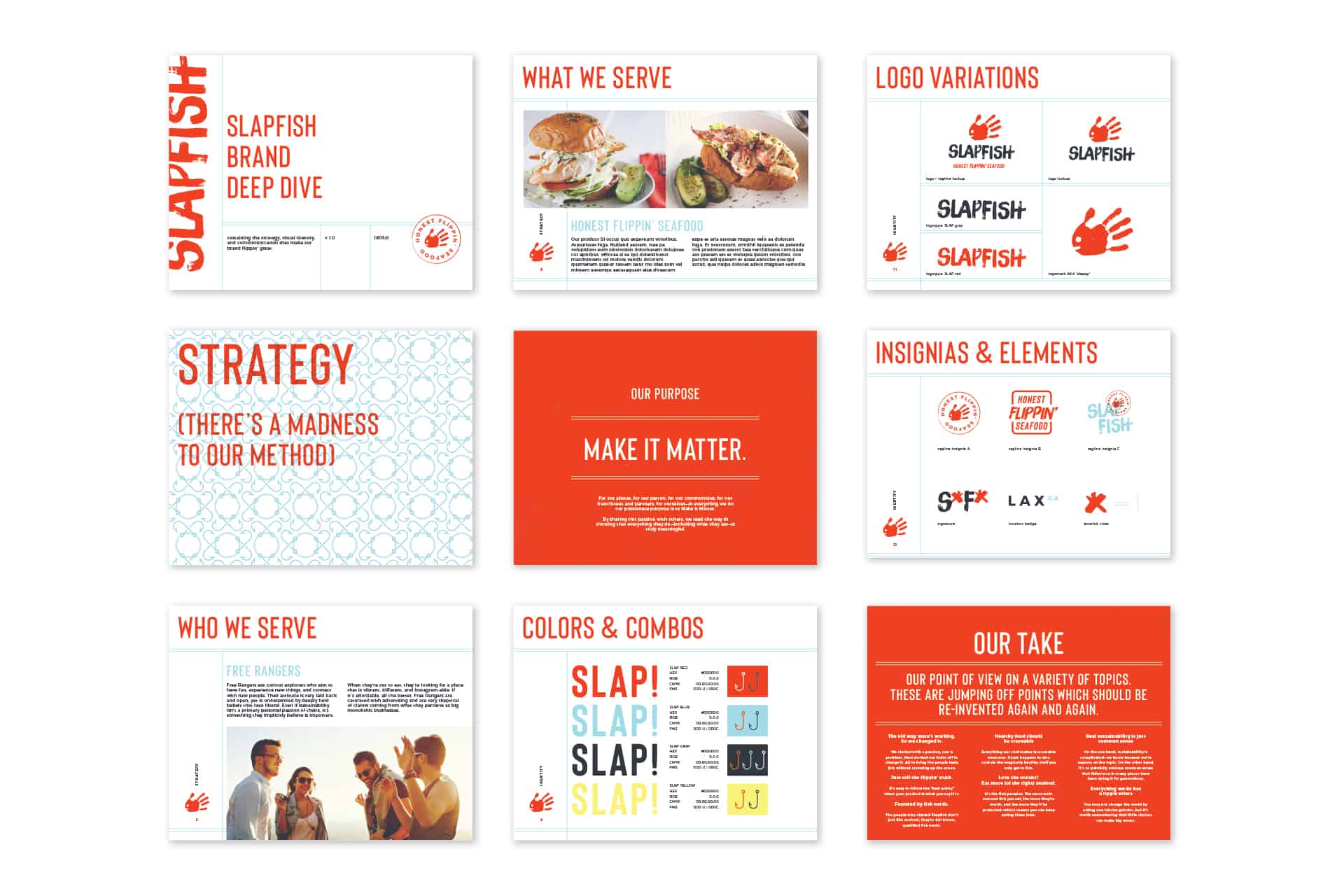
With the passionate purpose set, we started in on evaluating and evolving the brand’s core identity. This started with the brand mark, a literal slap mark made into a fish.
The mark came with a nickname of “the bloody hand” and wasn’t indicative of the brand’s true personality. We were able to shift this by turning the frown upsidedown and making the core color more vibrant and less blood-colored.
The typography had a dated look with a distressed treatment that didn’t have a purpose. We departed from it and replaced it with a shoreline shack inspired, handpainted typographic treatment and style. This tied the brand to its roots of seafood shack without having to blatantly say it.
Finally, the brand’s color palette was shifted away from the drab, washed-out look to a more vibrant, energetic vibe.


Releasing a local catch
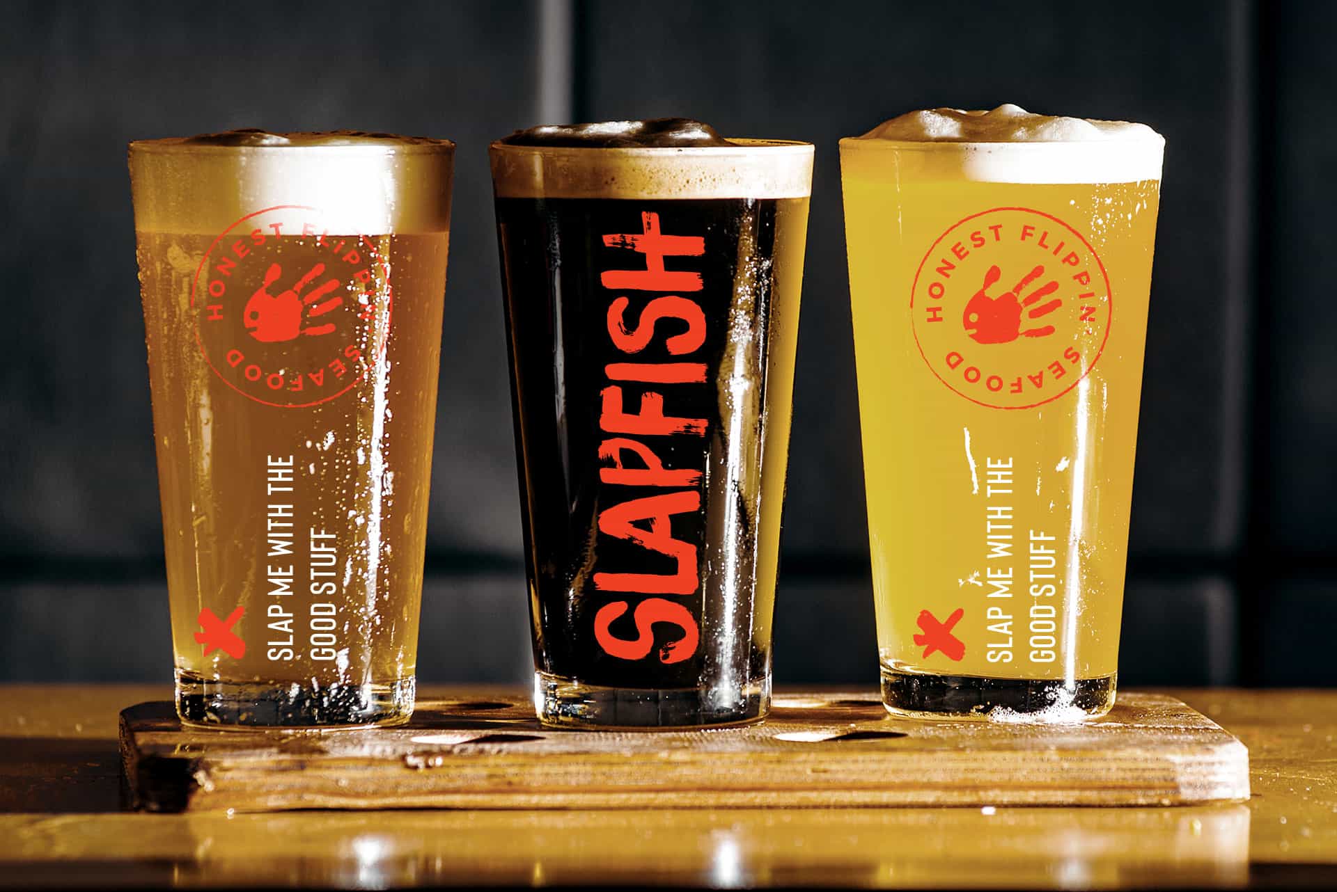
Through the multiple brand touchpoints the SlapFish personality came alive. No longer was it an overly hipster fledgling brand. SlapFish came into its own with a brazen, irreverent attitude that dared to challenge other seafood restaurants. The bold identity played out with clever one-liners across the packaging and merchandise touchpoints, while building a look that was ownable by the brand.
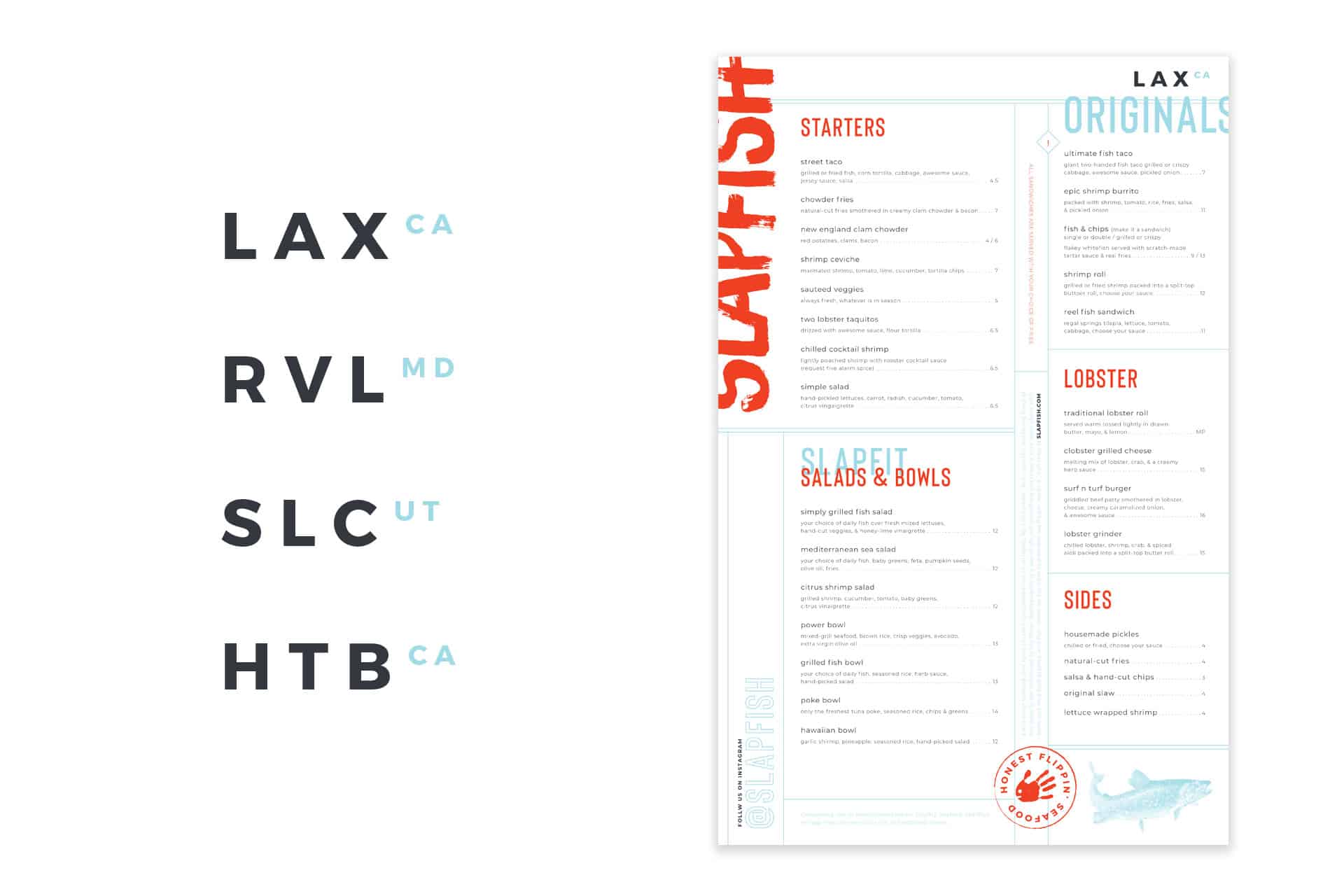
The menu designs empowered the brand to be regionally rooted in key areas that were designed to be altered for the market. An illustration of a fish in the lower left was an opportunity to showcase the regionally popular animal. In the top right, we created a graphic language for establishing the location in a truly SlapFish kind of way.
